

In our practice, we have continued to explore ways in which the man-made and the natural can co-exist - integrating architecture into the environment, abstracting architecture in response to nature, or introducing nature into architecture. In these explorations aimed at enhancing the natural attributes of architecture, a natural architectural view integrating man, architecture and nature has gradually taken shape.
“Natural landscapes and ecological environments
are not necessary to maintain the emotional connection between people and
nature, but that man-made spaces that offer a unique experience of living with
nature can also evoke a sense of reflection and yearning for nature. ”
——Zhu Peidong
In order to build a deep foundation of dialogue
with nature in the everyday urban site, we envisage a new architectural
prototype based on the fractal geometry of nature – the smallest structural
unit in the construction process as the basic spatial unit, which, with a
certain “self-similarity”, grows and clusters in response to the intervention
of site, function and circulation, thus building up the architectural form –
this evolution of the building from unit to whole is similar to the natural
growth of a living creature in response to the laws of nature. The clear
structural units can be seen as the basic cellular units, while the inherent
logical order of construction constitutes the law of growth and gives the
building the possibility to continue to “grow” like a living creature, with the
superimposition of human needs and real plants.
Location: Changsha, Hunan
Design Firm: line+, gad
Chief Architect/Project Leader: Zhu Peidong
Design Team: Sun Xiaoyu, Yang Xiaoyu, Sun Jin
Floor Area: 2071 square meters
Design Period: October 2020 – December 2020
Construction Period: January 2021 – August 2021
Client: Greentown China Holdings Limited, Midea
Real Estate Holding Limited
Construction Drawings Collaborator: Chengdu JZFZ
Architectural Design Co., Ltd.
Interior Design: Interior Architecture Design
Studio
Soft Furnishing: Hangzhou Cuishi Design Co., Ltd
Landscape Design: Hangzhou Yajing Landscape
Design Co., Ltd.
Structure: Reinforced concrete frame construction
Material: GRC plate
Photography: CAAI_image · LI YI, MZ STUDIOS, Xi
Chen (model)
01
Place and Prototype
The site is located approximately 2km from the Songya Lake National Wetland Park in Changsha, Hunan Province, and is surrounded by two main urban roads in the east and north, a planned high-density neighborhood in the south, and an urban river spreading out from the Songya Lake wetland basin on the west, where artificial and natural fragmentation intertwine during rapid urbanization. Faced with the lack of context of the site, we intend to stimulate this everyday suburban landscape by inserting a small heterogeneous “hill” – the “Slab Hill”.
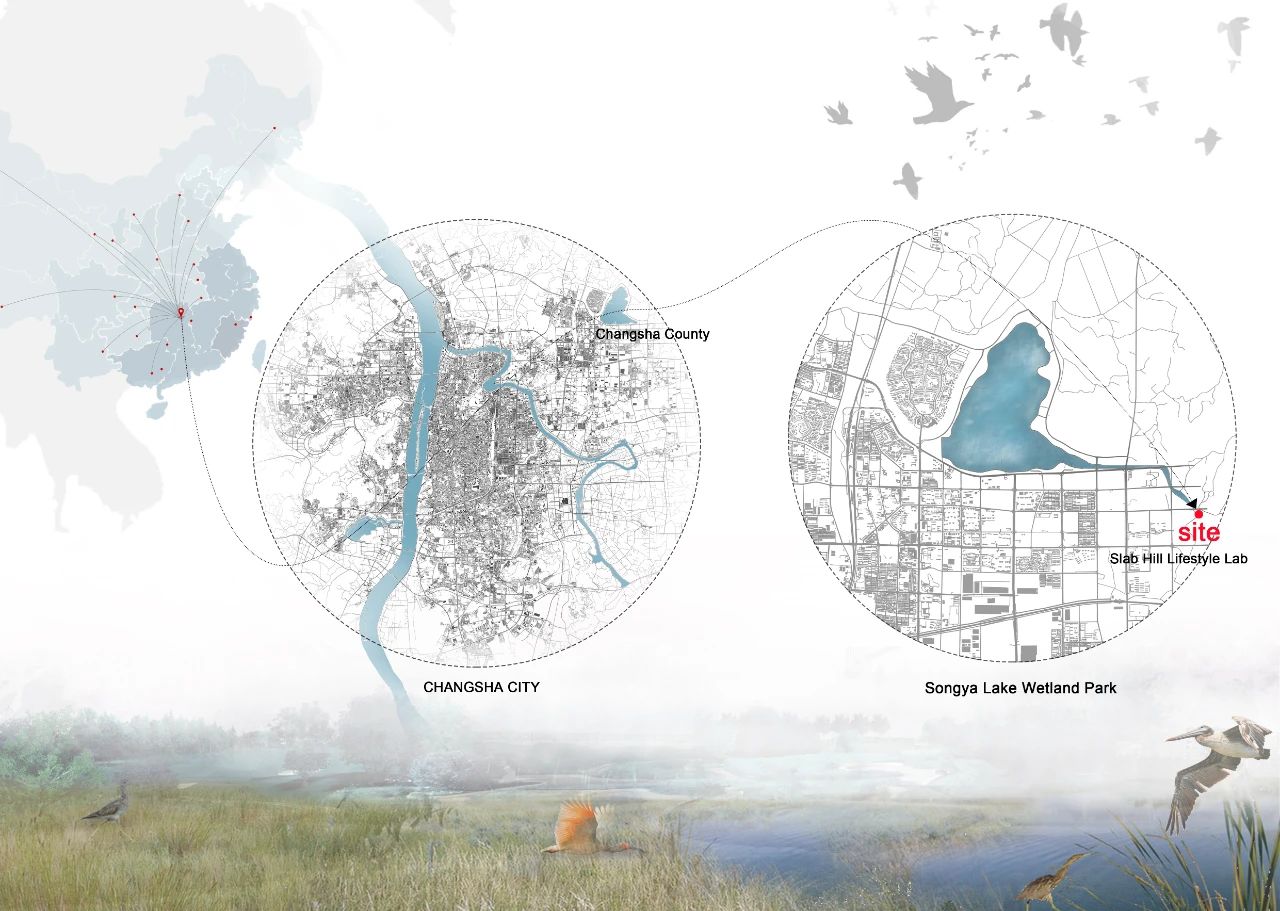
△ Location

△ Sketch

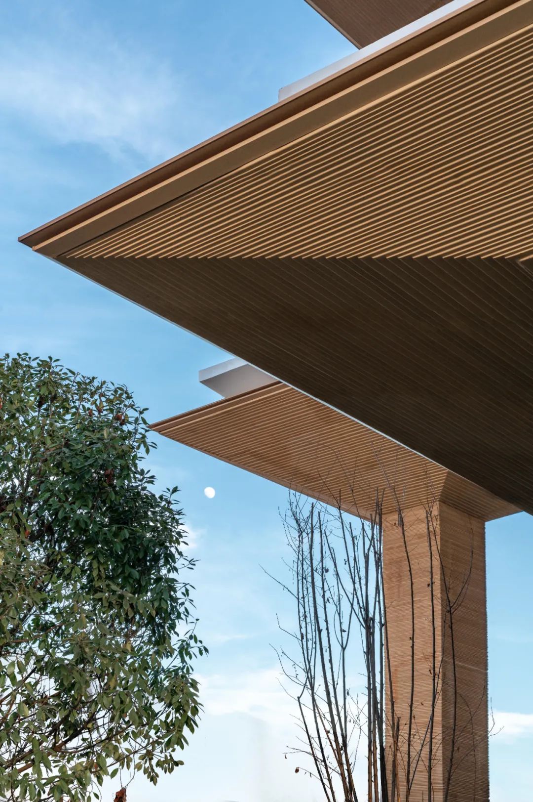
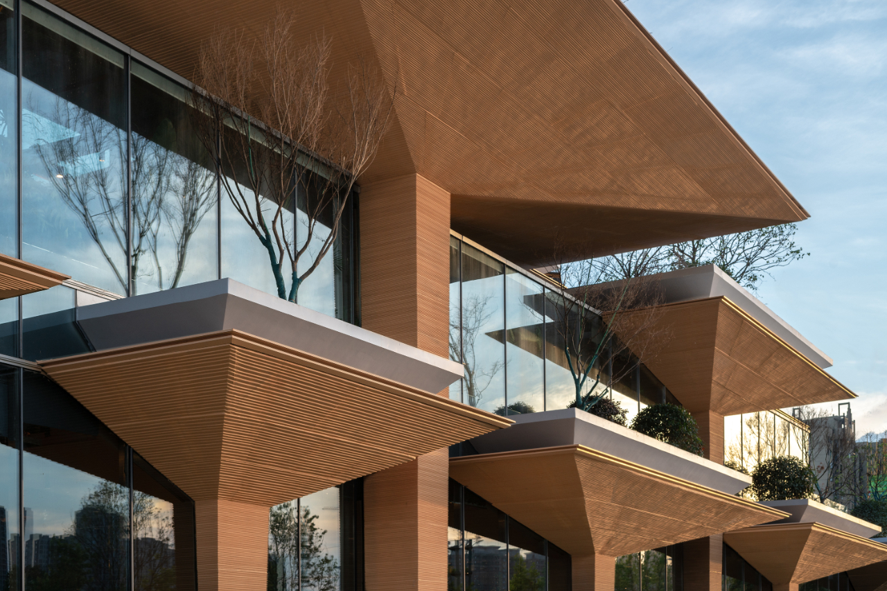
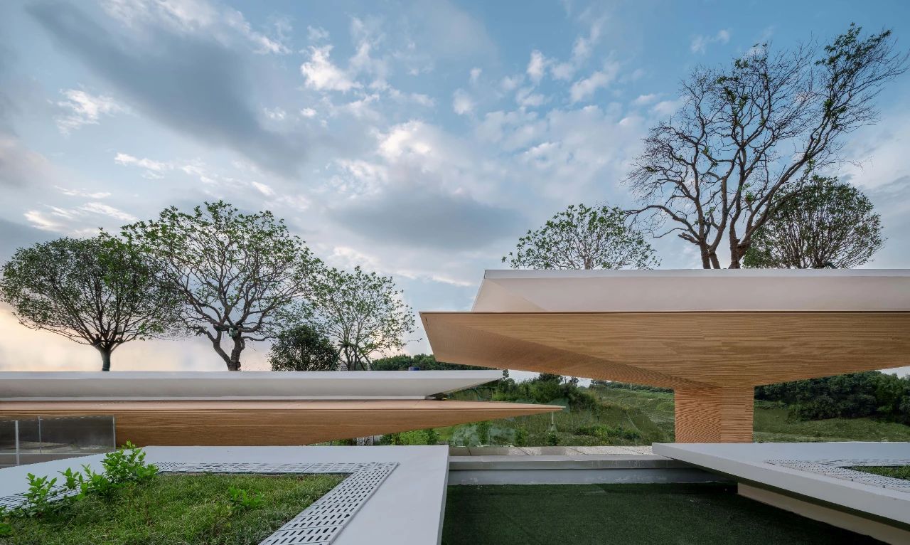
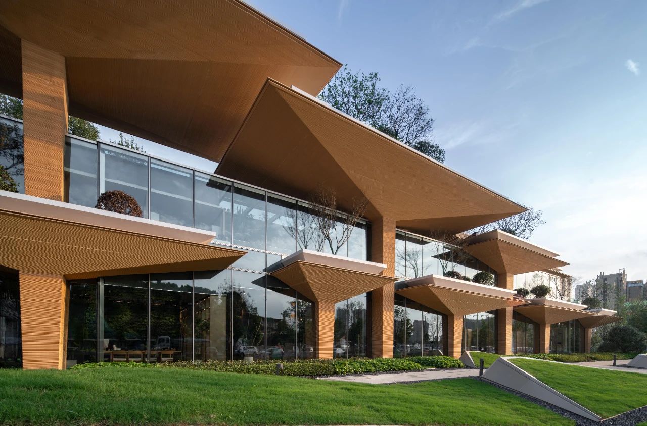
As the name suggests, the “Slab Hill” is an artificial hill based on an umbrella-shaped structural unit. The umbrella-shaped structure was chosen as a structural prototype because of its clear and simple “column-slab” structural support system and the sense of domain created by the large spatial coverage, and because umbrella shapes are common in the plant world – from small umbrella-shaped mushrooms to trees like Dracaena draco – which highlights the bionic traits.
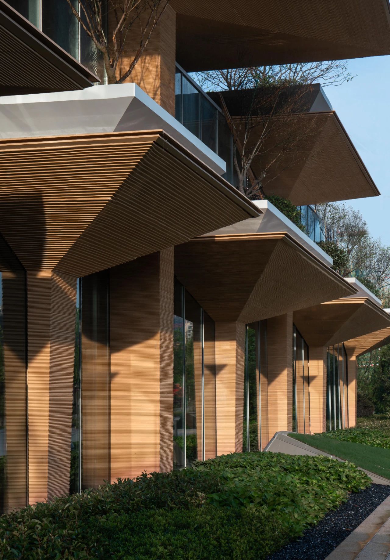
This choice also makes it logical that the umbrella structure system has both natural and rational properties.
02
Structure and Space
After identifying the structural prototype as the
basic cell unit, we formed three kinds of structural units of 6 x 6m, 6 x 12m
and 9 x 18m using 3m as the basic module. The design further revolves around
the need for spatial capacity, with the 45 umbrella structures meeting the
seismic requirements with a uniform canopy edge distance of 2m and a limited
number of connections, which are then combined in the same series of modules to
form a homogeneous “growable” plane.

△ Structure units
Due to site constraints and commercial capacity
requirements, some of the building functions need to be arranged vertically.
Considering the problem of floor slab placement in multi-storey buildings, we
reorganize the umbrella slabs in a staggered manner according to certain rules,
breaking the homogeneity through local alienation under a unified overall
spatial order, the repetitive yet changing spatial order is also linked to the
randomness of nature, producing a free and varied atmosphere of the place.
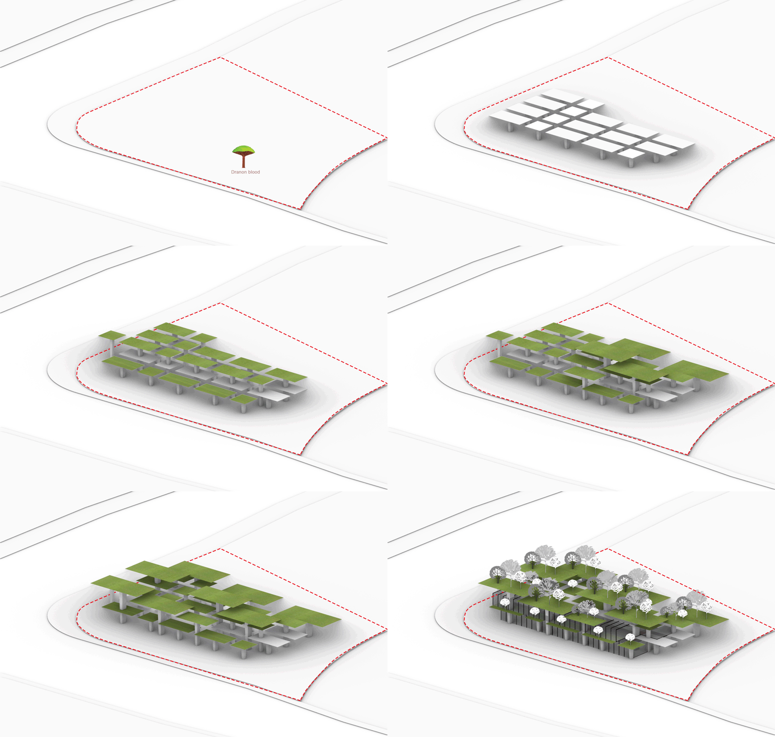
△ Generation analysis
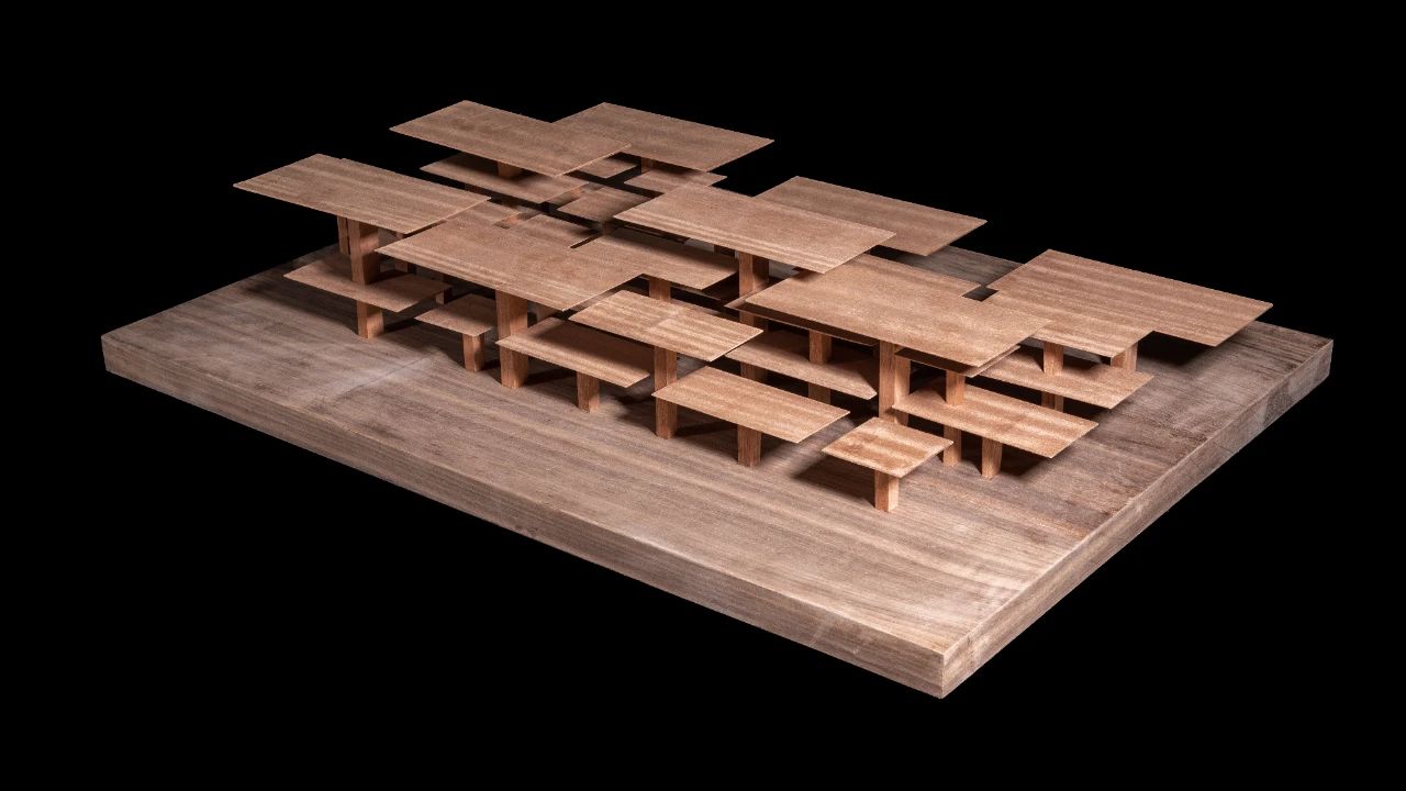
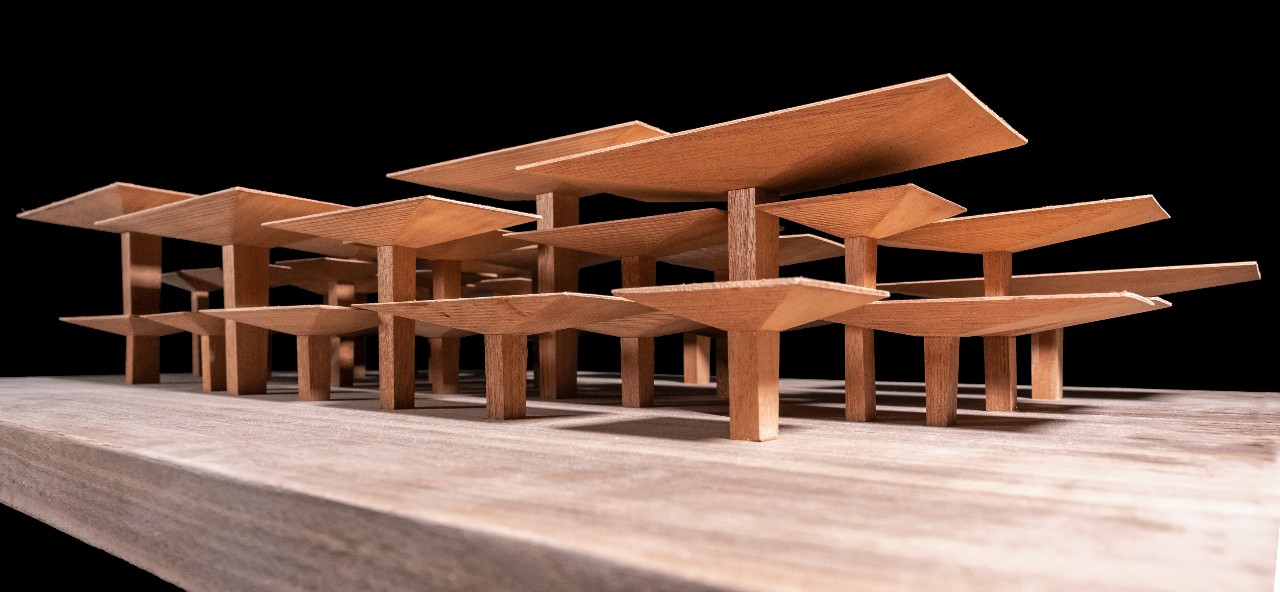
△ Model photo

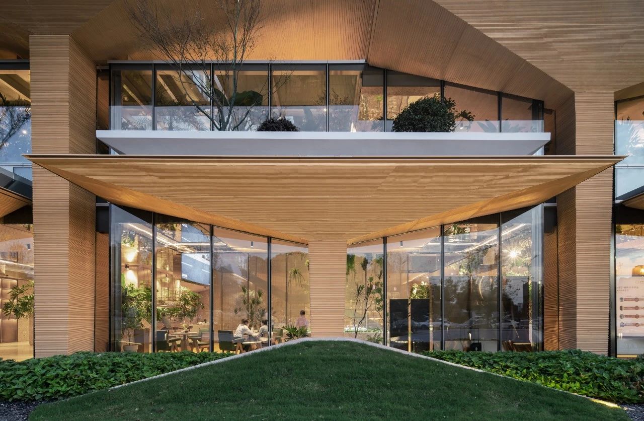
Multiple glass volumes are nested within the
existing structural plane to create a transparent and blurred spatial boundary,
allowing for a coherent and integrated visual experience of the interior and
exterior. Following the modal relationship of the column network, the glass
volumes are interspersed between the umbrella columns, and the recesses between
the volumes provide a complete structural presentation.

In the interior, to reinforce the
self-explanatory nature of the structural units, the umbrella slabs of the same
height are separated from each other, with minimal connections made by thin
panels where necessary, and the indoor equipment pipelines are converted and
concealed at the highest net height of the interior where the umbrella covers
intersect, achieving the integration of architecture, structure and equipment.
The different heights of the indoor and outdoor umbrellas are staggered or overlapped
so that natural light penetrates the glass roof through the gap between the
umbrella slabs, creating a special experience in the interior similar to a
semi-outdoor grey space.
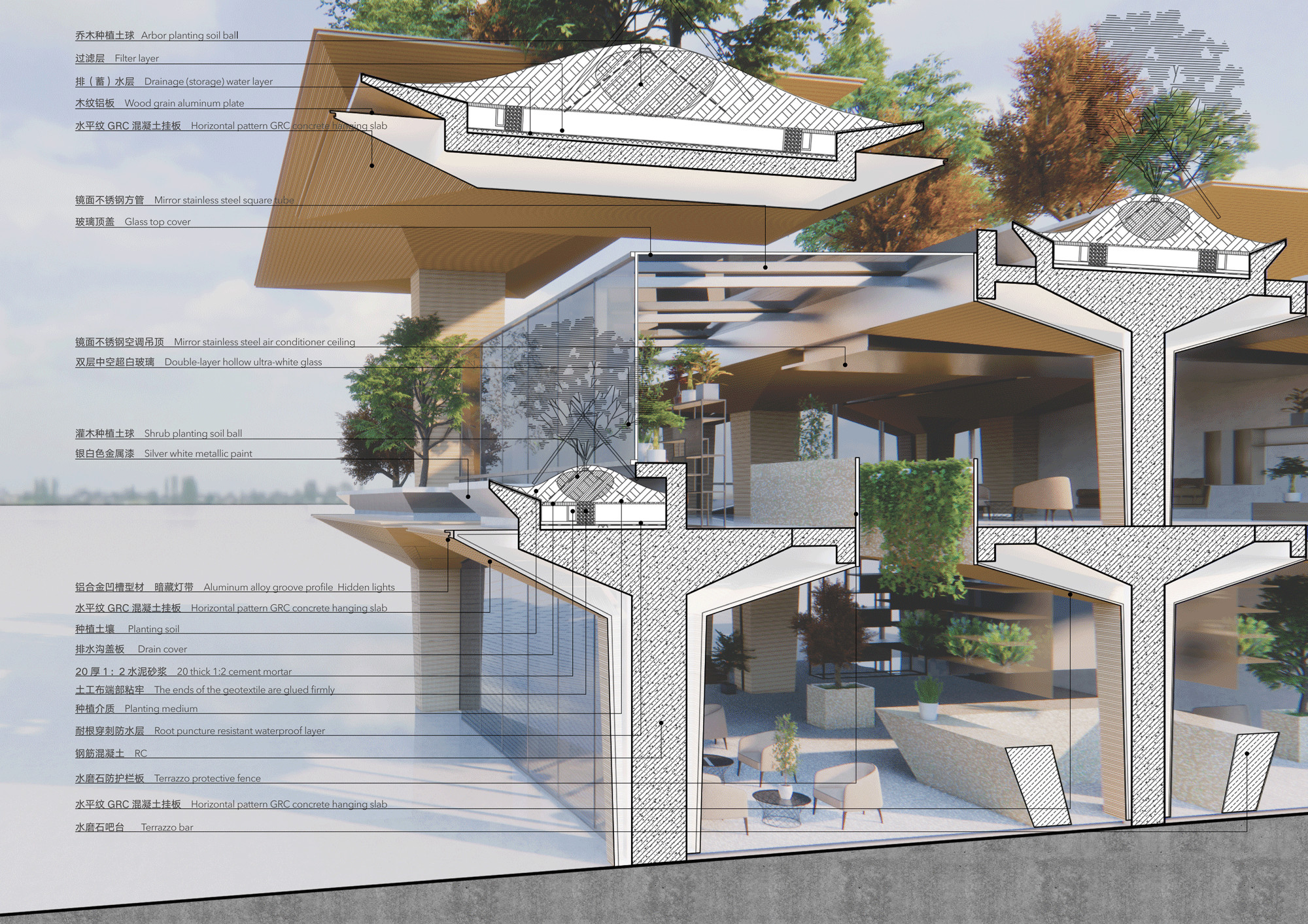
△ Section analysis
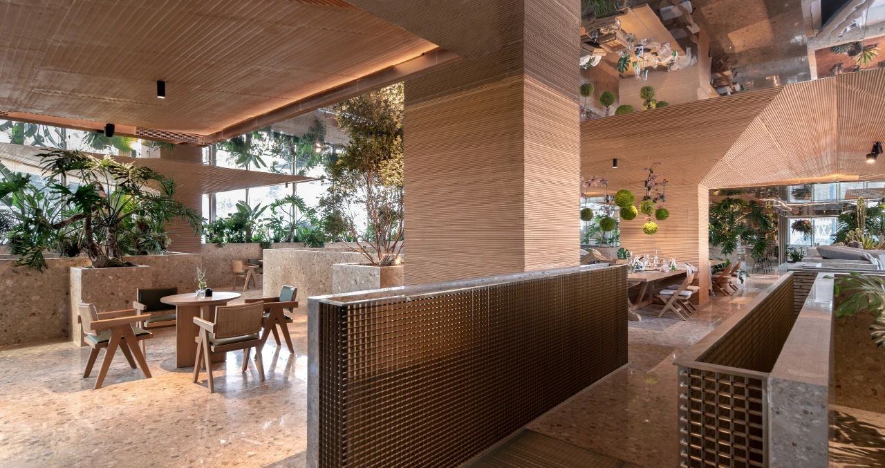
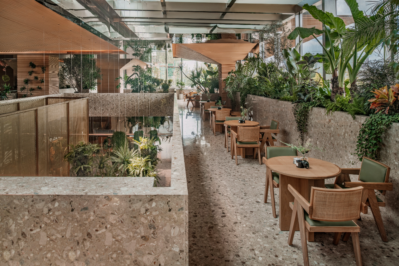
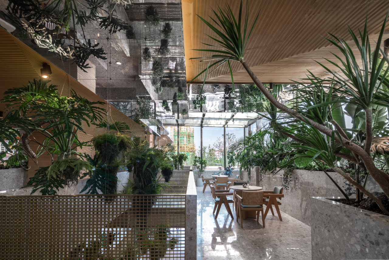
The repetition of similarity in the structural units and the realistic presentation of the building structure naturally generate a formal order of space under the isomorphic correspondence between structure and space. The umbrella structure, together with the plant units, constitutes a real visual element, and the spatial organization defined by the individual umbrellas generates a spatial perception that can be explored infinitely.
03
Materials and Construction
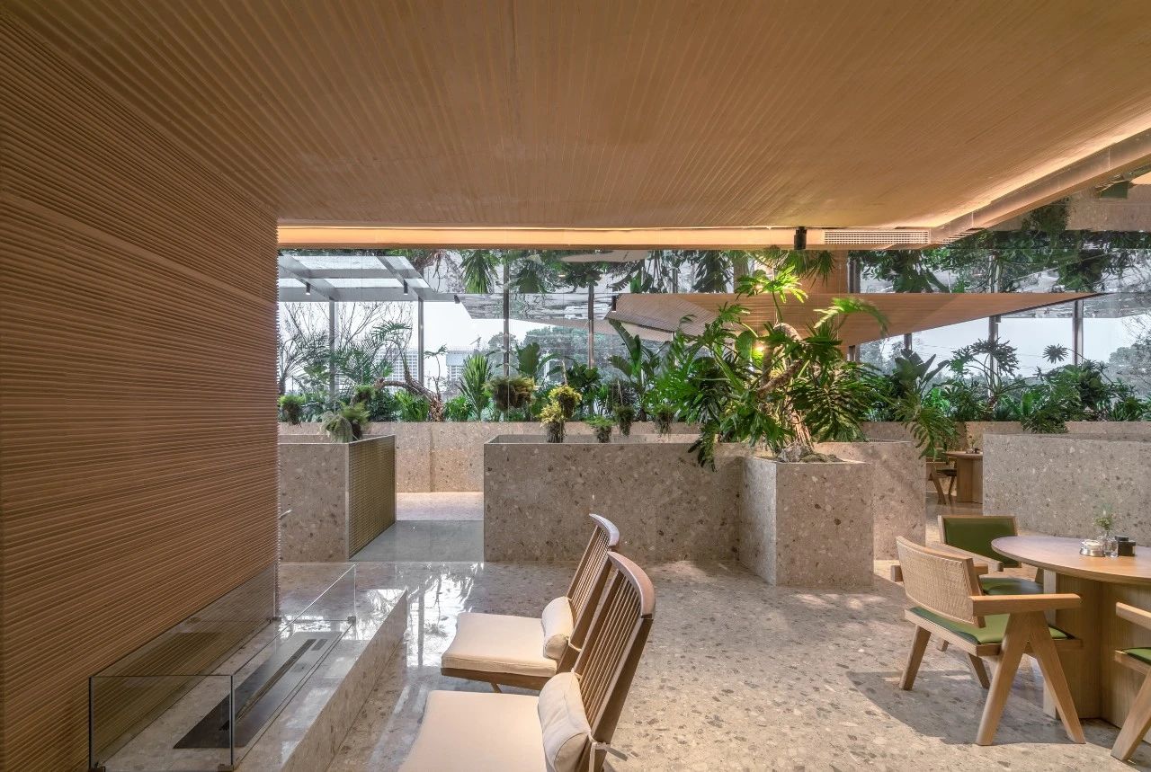
The GRC material texture of the umbrella units is
interpretive of the structure and we have chosen earthy colors that are close
to nature. In order to find the most suitable GRC texture density, we went
through several stages of computer simulation, 3D printing and physical
prototyping to precisely control the horizontal texture, thus achieving a
cascading texture.
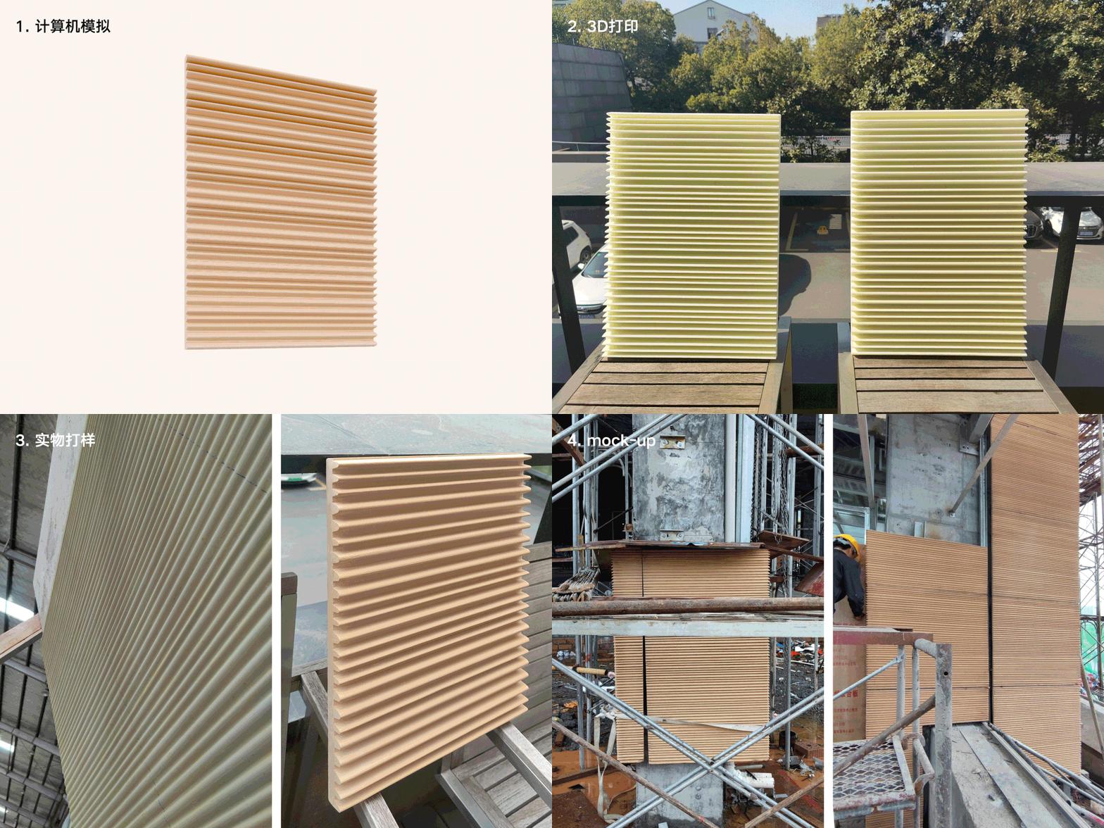
△ GRC挂板的多阶段探索
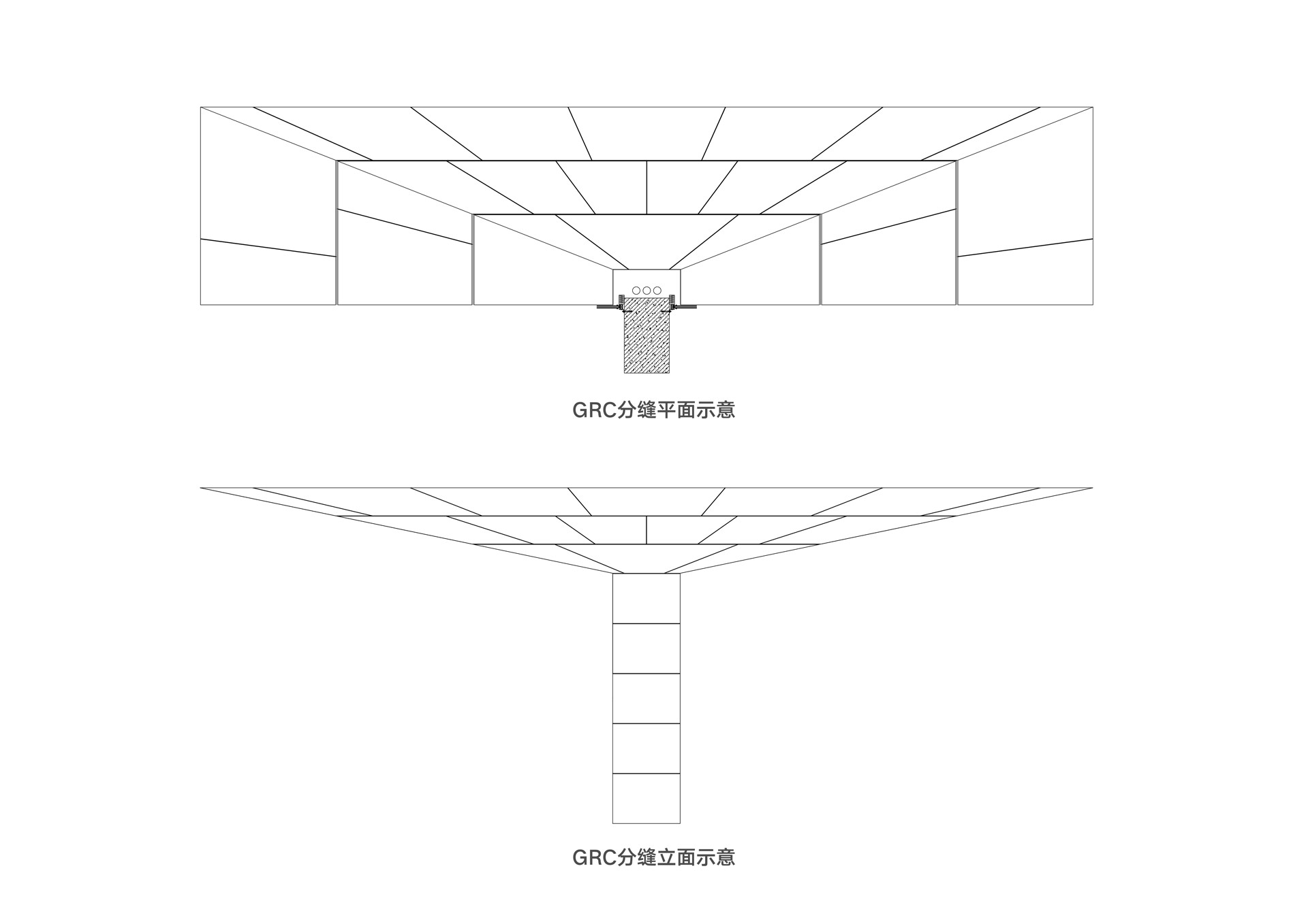
In the actual construction process, the concrete
is poured to form an umbrella structure, which is technically prefabricated
with separate open moulds for each umbrella structure in order to guarantee the
grain modulus of each unit, as well as with split seams designed to give the
conditions for open seam display and to circumvent the negative impact of
gluing on the visual quality.
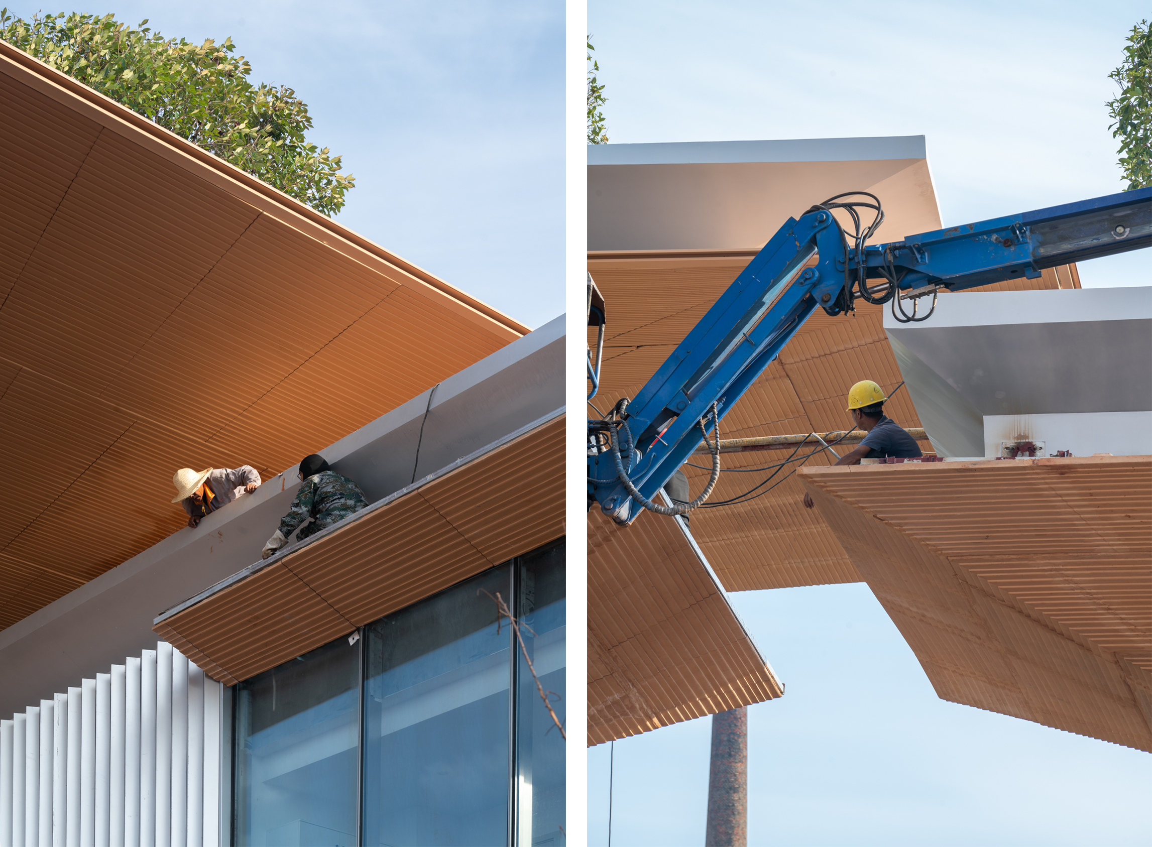
△ Material texture
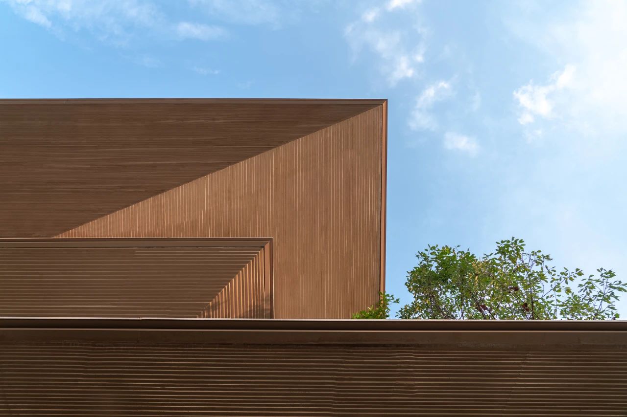
The horizontal texture of the GRC plate follows
the principle of horizontal slicing, i.e. the width and angle of the lines are
adjusted according to the inclination of the GRC plate, thus ensuring that the
upper surface of each line is horizontal and the lower surface is sloped
inwards, giving the impression of layers of horizontal sliced wood texture.
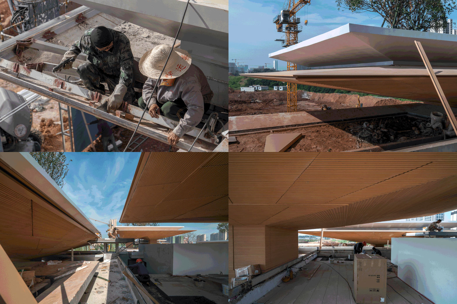
△ Construction process
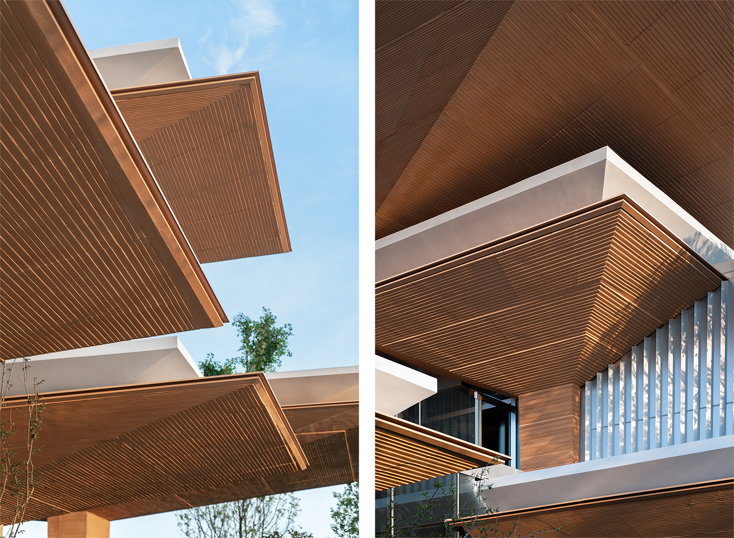
The glass curtain wall is basically supported by
T-beams as the keel and all interior partitions are clad in mirror stainless
steel. The continuous, vanishing interior interface weakens the presence of the
rods while emphasizing the extended display of the glass surface. The glass
curtain wall intersecting with the umbrella conceals the frames and components
within the joint recesses of the GRC curtain wall, ensuring structural
integrity and purity as far as possible.
04
Penetrate and Overflow
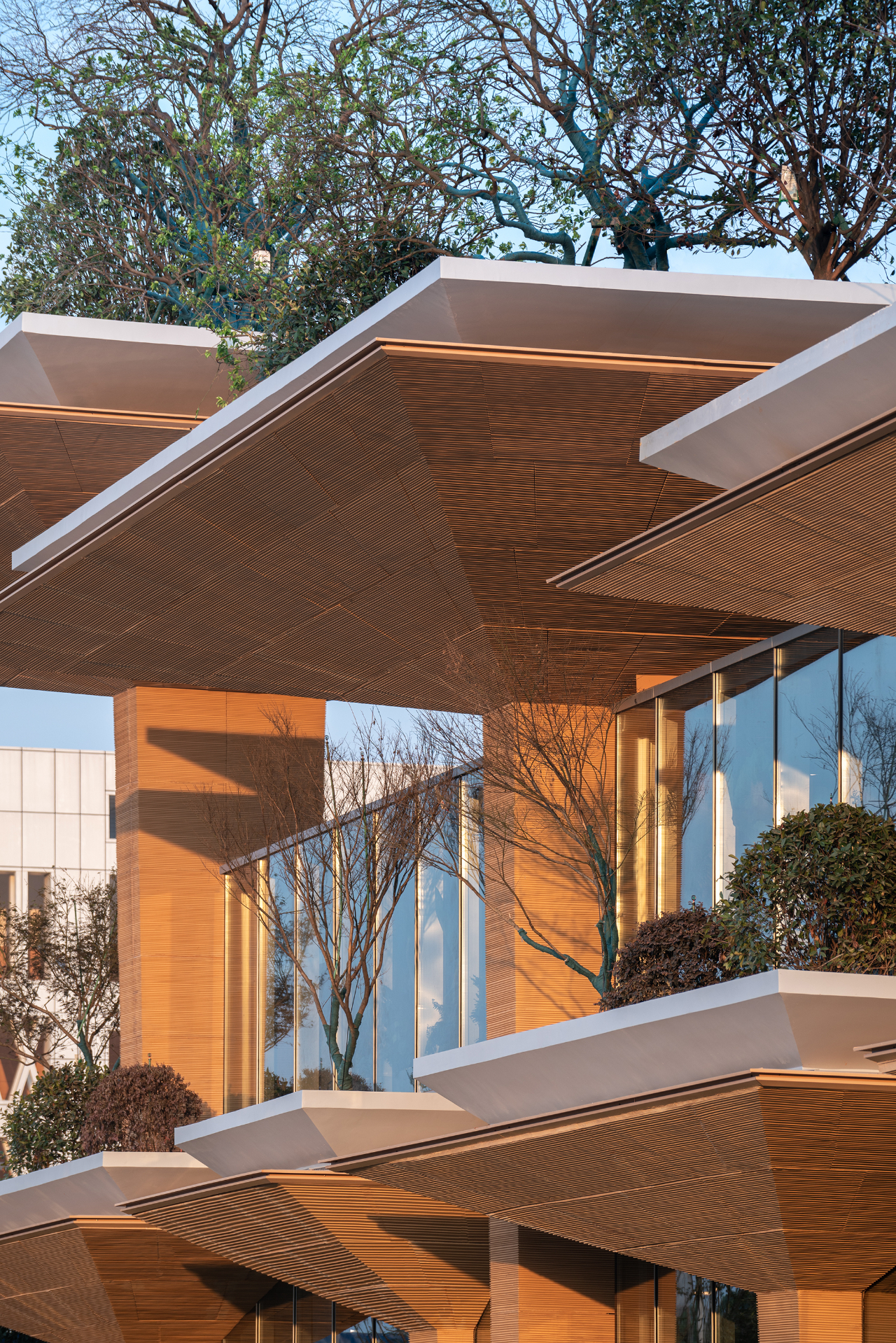
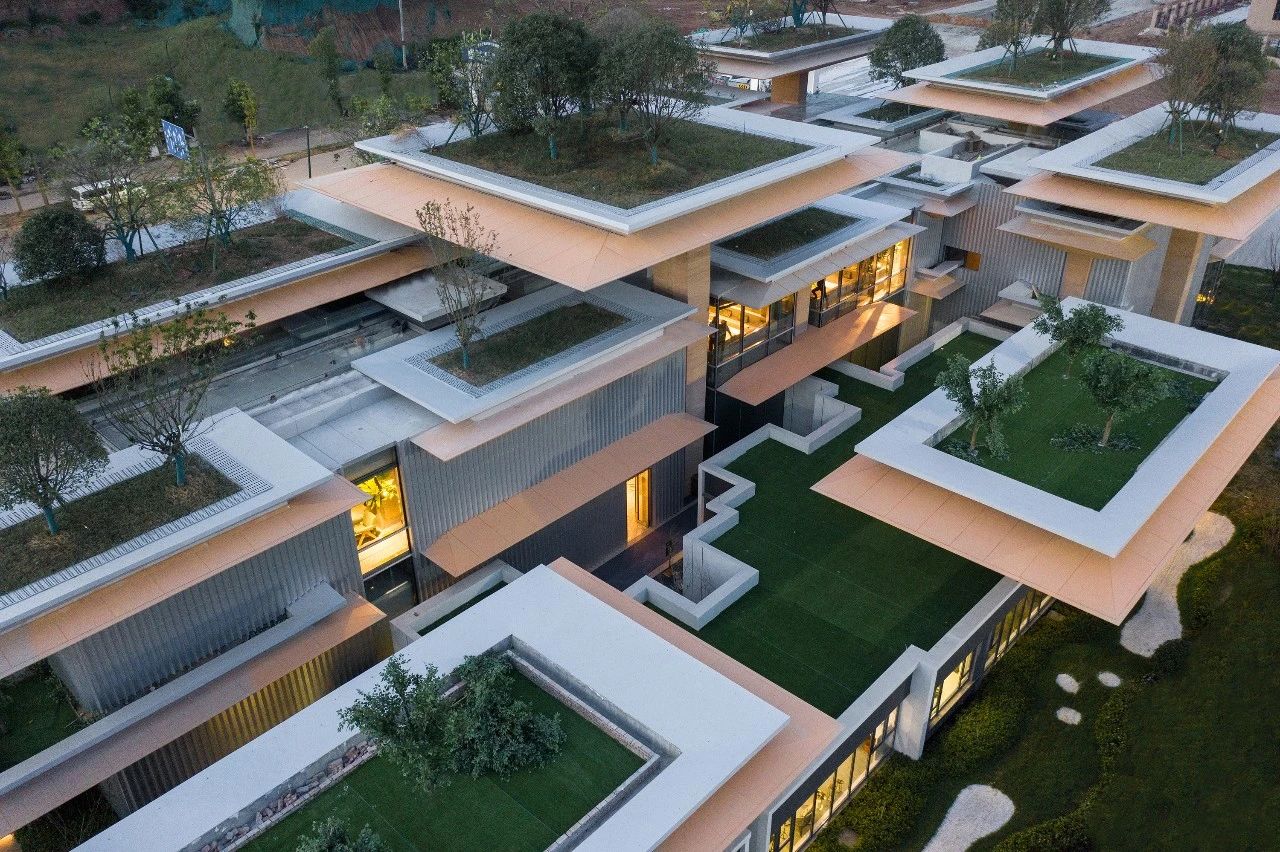
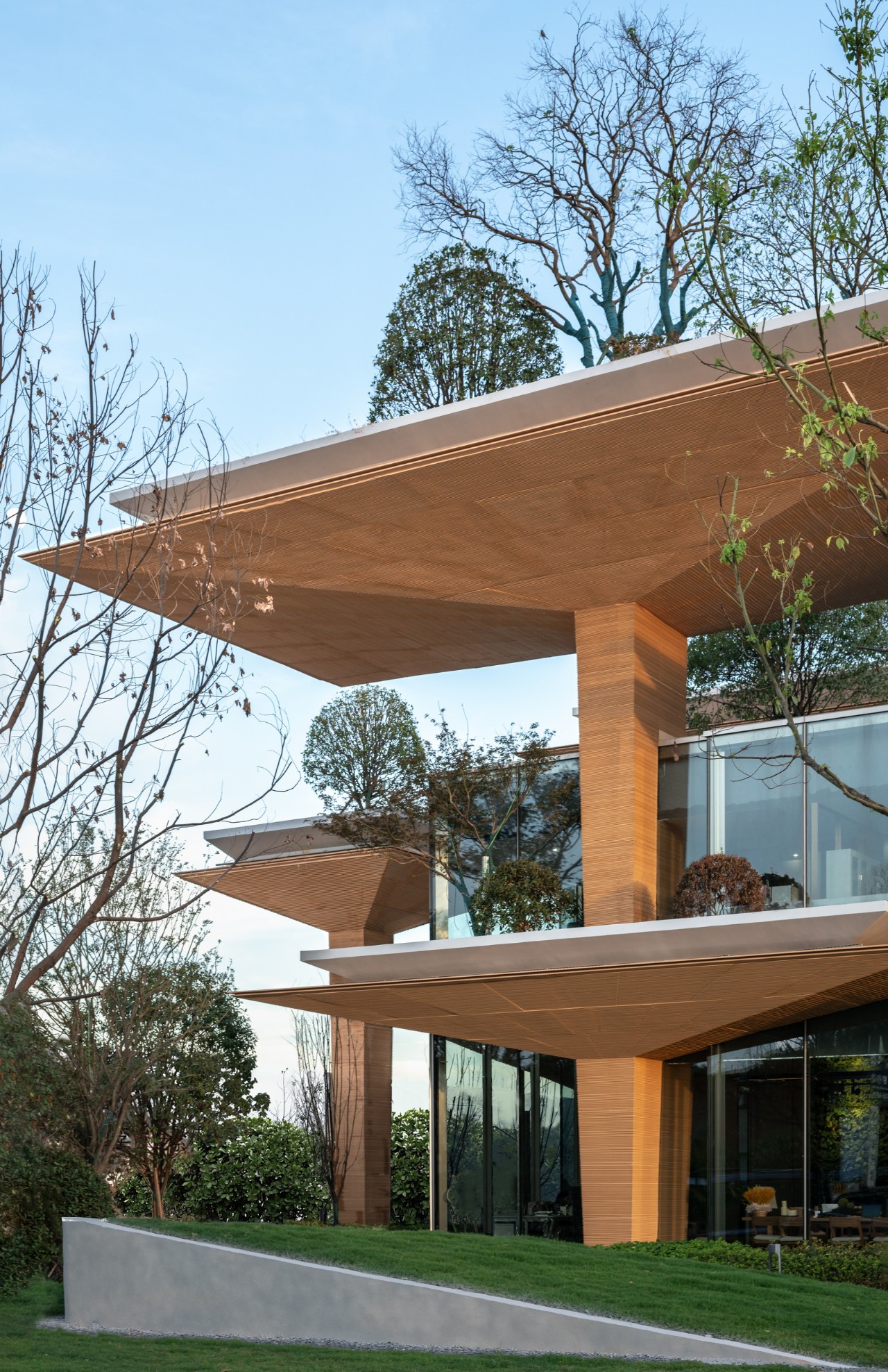
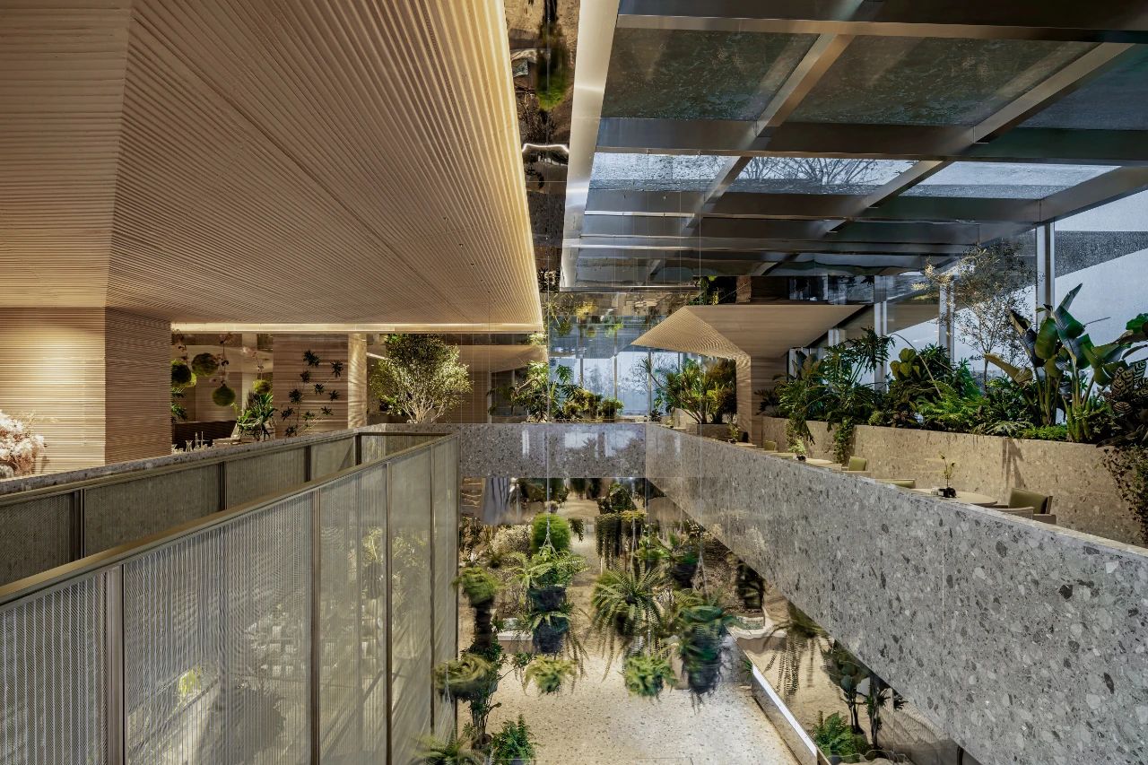
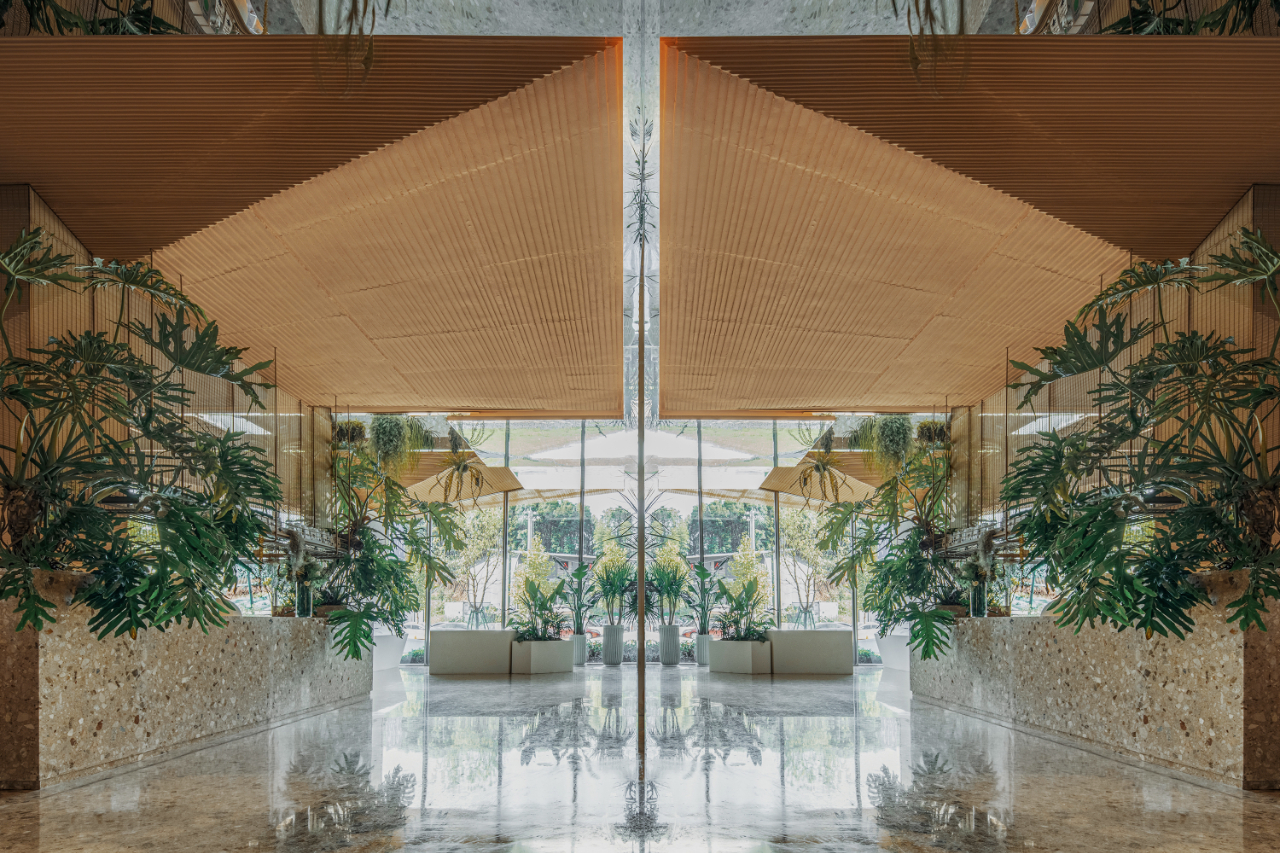
The staggered arrangement of the umbrellas at multiple heights and the flat slab create the conditions for the overlay of natural greenery. Through the cladding and planting on the façade and roof, the building is recognizable and clearly dichotomous in appearance – an artificial umbrella array of earthy colors intertwined with natural hills of greenery.
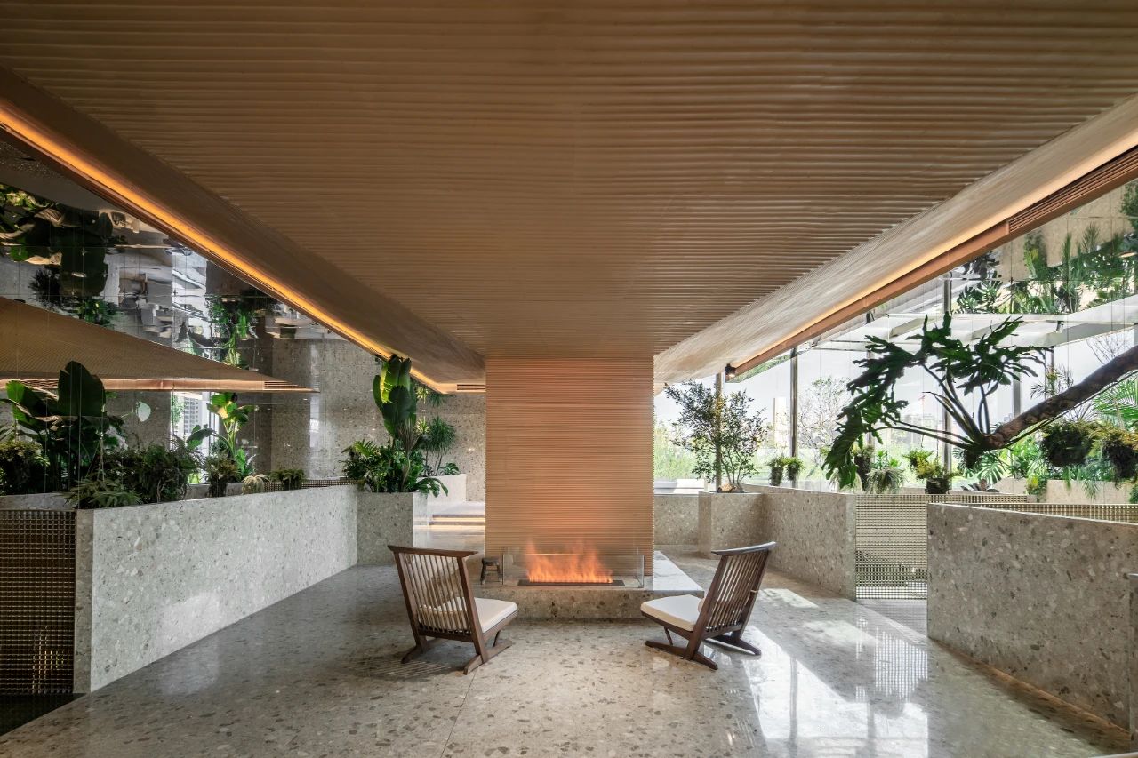
The concept of the Lifestyle Lab allows for a
blending of interior functions. Supported by a self-organizing structure, the
design dispels almost all of the interior walls and the plans between the
umbrella columns create a highly free, flowing spatial reorganization – the interior
functions follow the transformation of the spatial experience. The flooring
material is terrazzo, also in earth tones, with copper screens, wooden
furniture and bookcases in the same color scheme, where the architectural and
structural boundaries and the interior interface are naturally compounded.
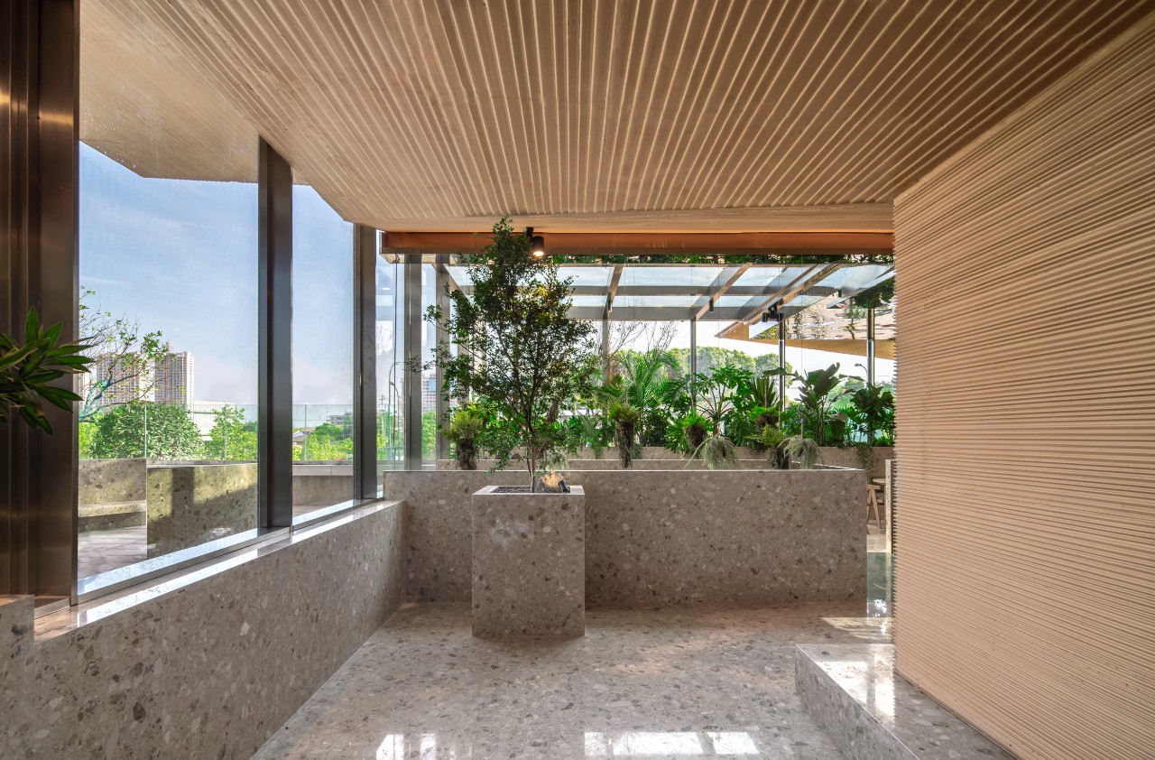
Under the plural and “freely” growing umbrellas,
a variety of businesses are also freely distributed and staggered, each of
which is organized around an umbrella, with the area of an umbrella and the business
displays underneath forming a content cell that continues to attract customers
to visit and linger.

△ Section
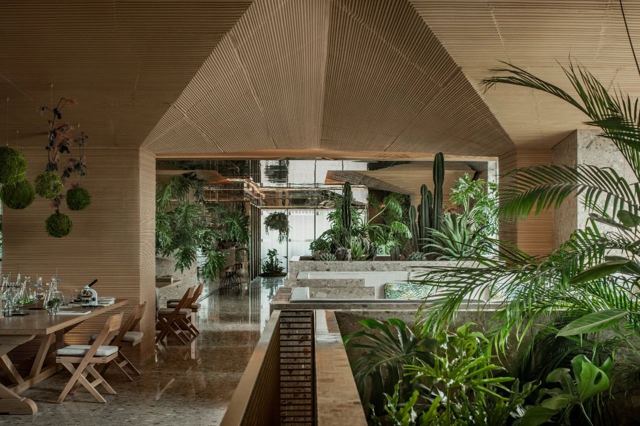
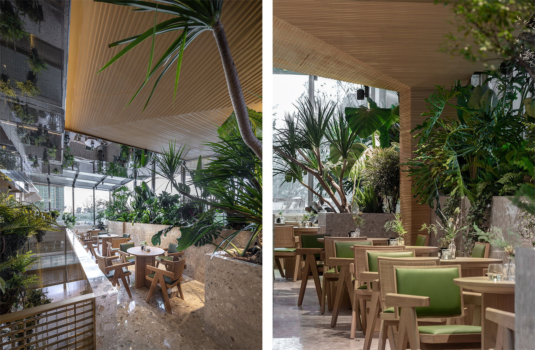
In the creation of the atmosphere of the place, the element of greenery as a living unit is also used extensively in the interior, with the visual introduction of the exterior greenery by the highly translucent ultra-white glass curtain wall and the superimposition of the highly reflective mirrored stainless steel on the indoor and outdoor plant landscape, creating a highly coherent atmosphere inside and outside the building. The real and visual greenery permeating and superimposing, creating a non-daily natural experience.
05
Remark
As Louis Kahn said, “It is the responsibility of
the architect to explore this deliberate realm of space, not just to accept the
conventional plan, but attempt at something that can be understood as valid
even if it is not conventional.”
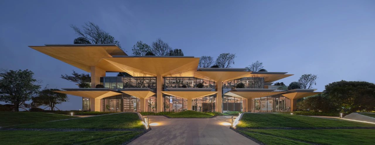
The “Slab Hill” is a spatial reconstruction abstracting and refining aesthetic values from the laws of nature based on the original intuition. It is simple – taking structural archetypes as the starting point and giving a new definition to naturally grown buildings that break away from the everyday practice of construction. It is also complex – here we attempt to construct a symbiosis that can simultaneously satisfy human emotion, penetration of nature and the need for construction, which, in a broader dimension, is a more complex ecosystem of land, demand, capital and ecology in the contemporary urban environment.
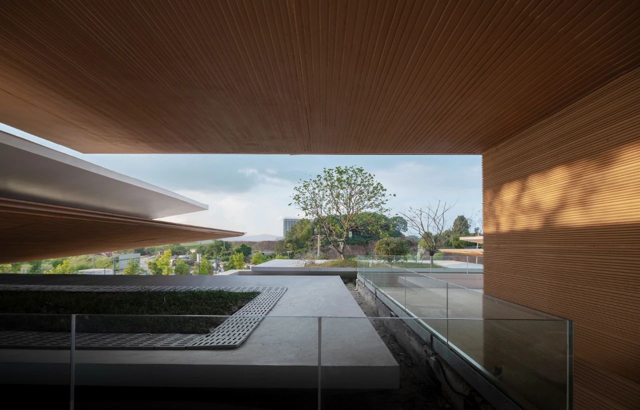
The construction of the project has come to an end, but the natural growth of the building has just begun. We believe that as the plants inside and outside the building continue to grow, the form of the “Slab Hill” will become more and more like a real “hill”. As the building matures and people enter and are transported by the interesting and vibrant scenes, the emotion and experience will give the building a real “life” and perhaps sow new seeds for the construction under daily sceneries that can be seen everywhere.

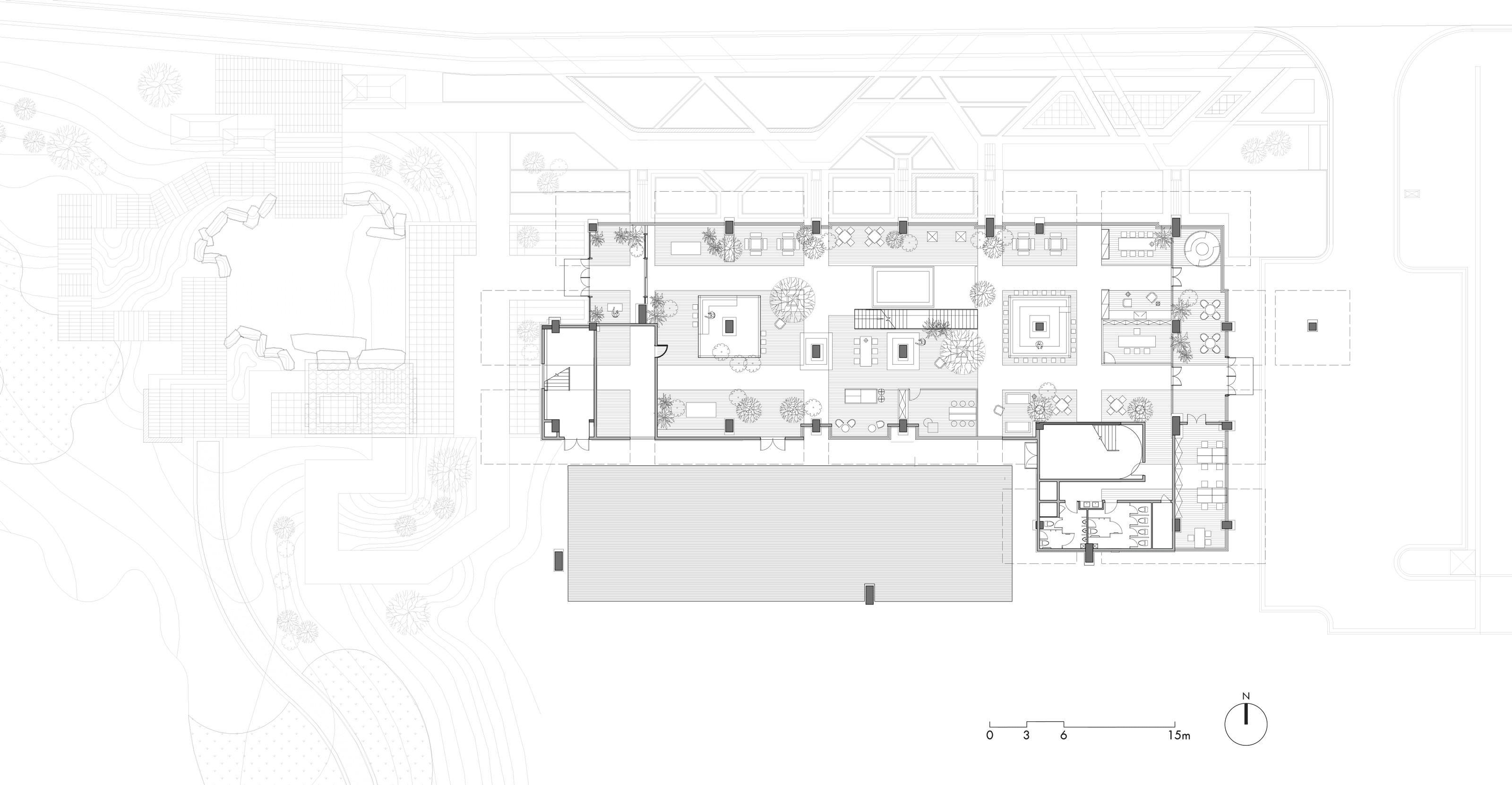
△ Ground floor plan

△ Second floor plan
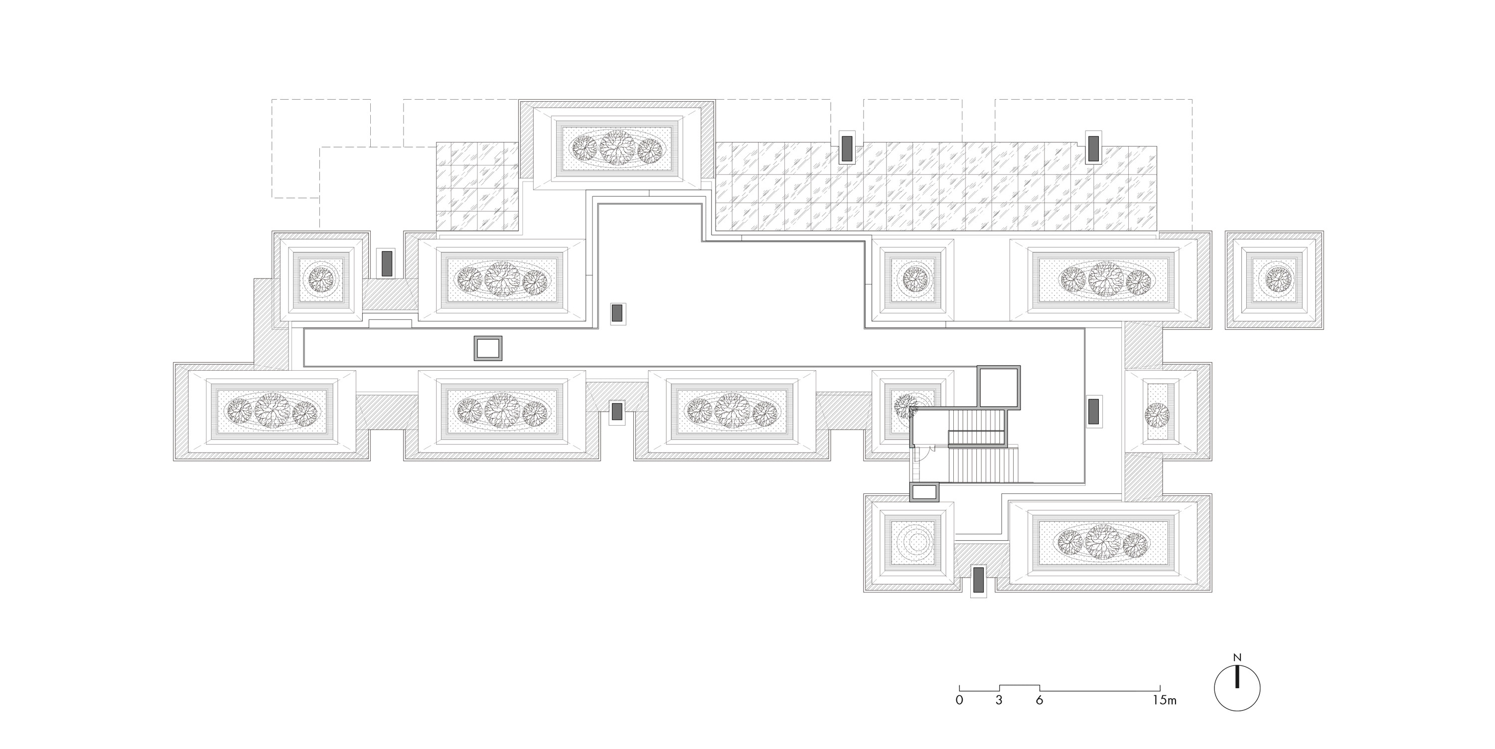
△ Third floor plan
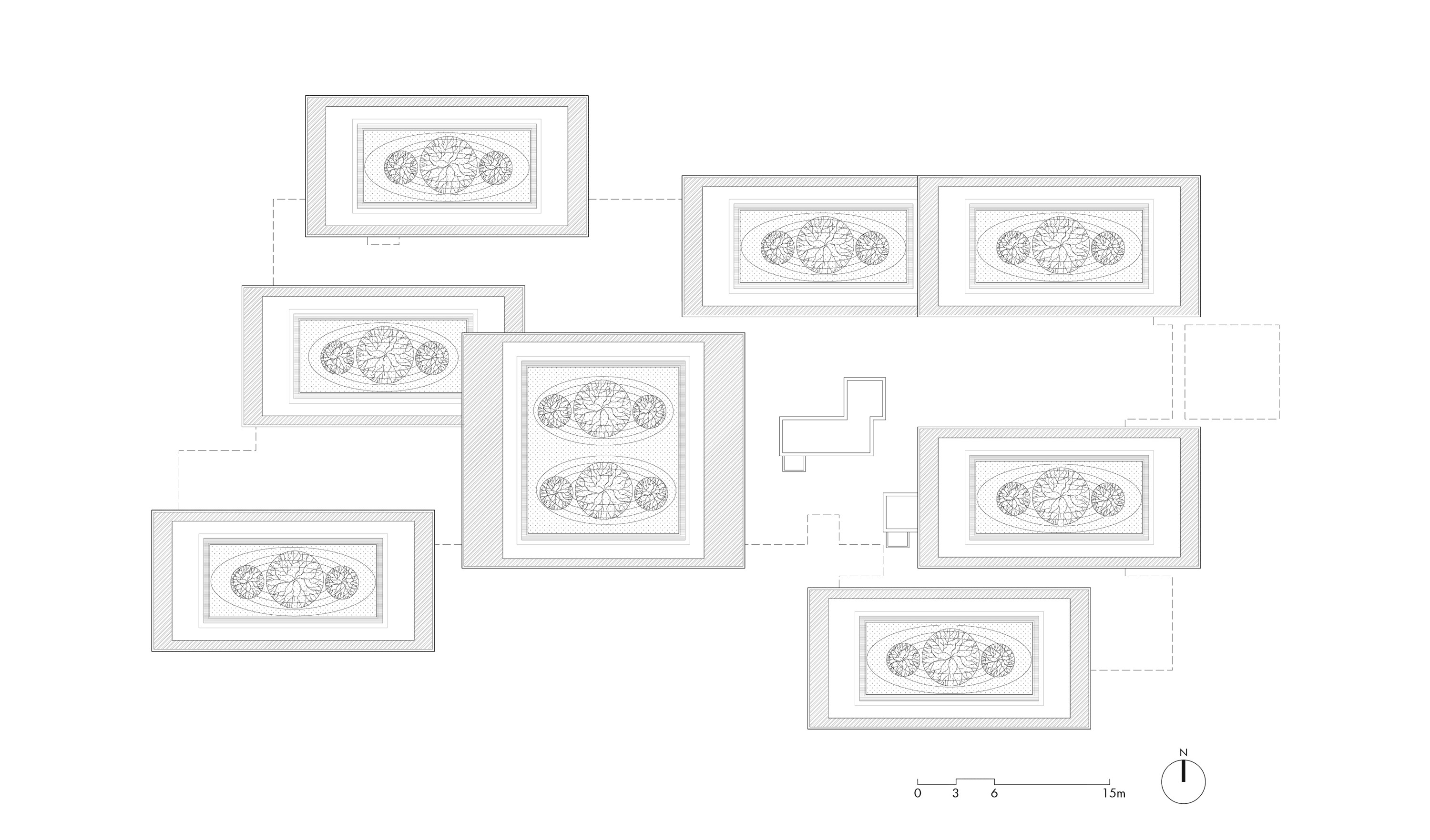
△ Roof plan

△ North elevation

△ East elevation and west elevation

△ South elevation