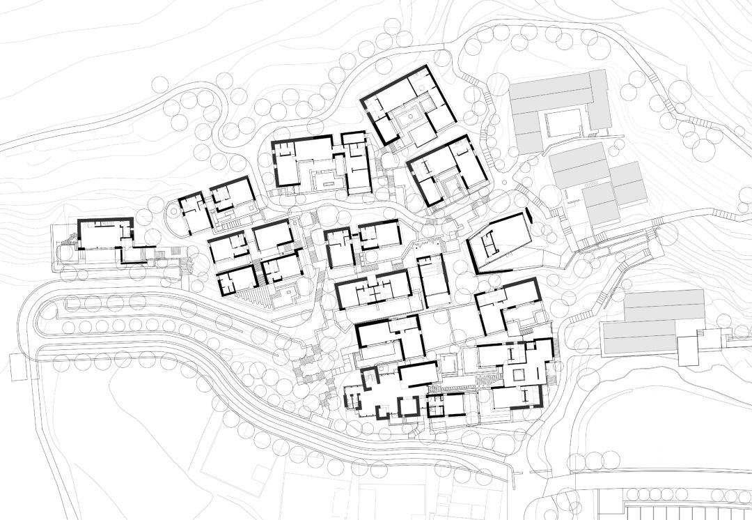

Dongximen Village, established in the Qing Dynasty, is at the foot of the range of Mount Tai. This small village grew silently for hundreds of years, until the villagers left and then gradually declined. In 2019, LuShang Group introduced the Pusu Inn here in an attempt to activate the village as a high-end resort.
During the design process, with respect for the original site, we use as little design techniques and materials as possible to naturally reveal the temperament of the site itself. The residential courtyards of the village are mostly distributed on steep hillsides, mainly L-shaped courtyards and three-section compounds with natural resources and old life memory. All the guest rooms are born out of these declining courtyards.
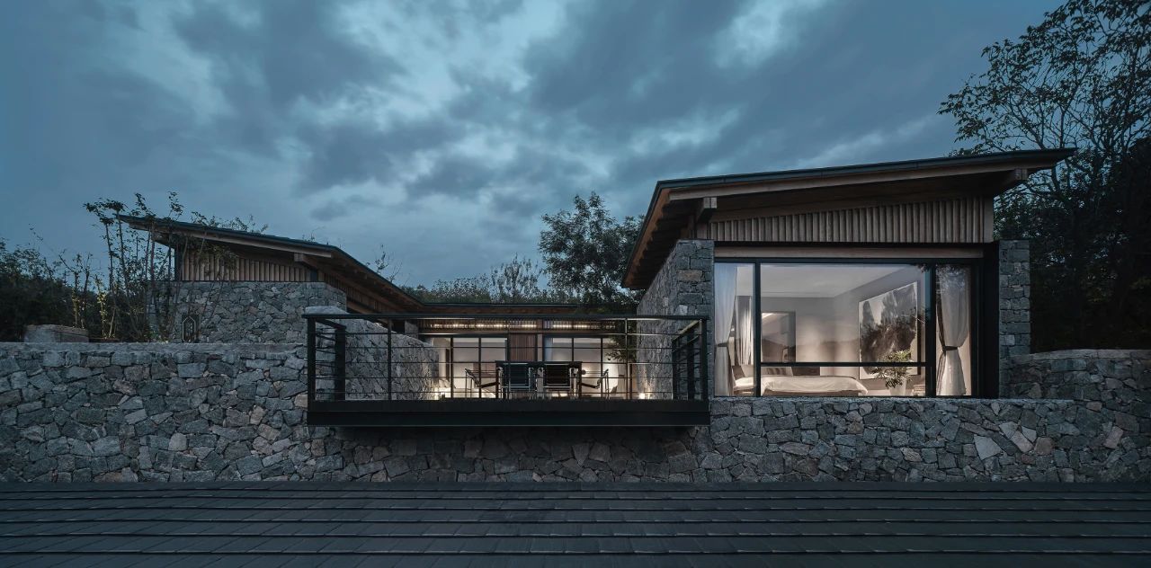
We retained the original texture and spatial relationship, and strengthened the introduction of the landscape and the centricity of the inner courtyard, based on which, incorporated the functions of guest rooms and public activities in groups. Those preserved rubble walls and reconstructed rubble walls have witnessed the heritage of the new and the old. Operating the floor plan, functions, terrain and orientation, make every building out of the ordinary. Visitors can not only enjoy high-quality vacation experience here, but also communicate with traditions.
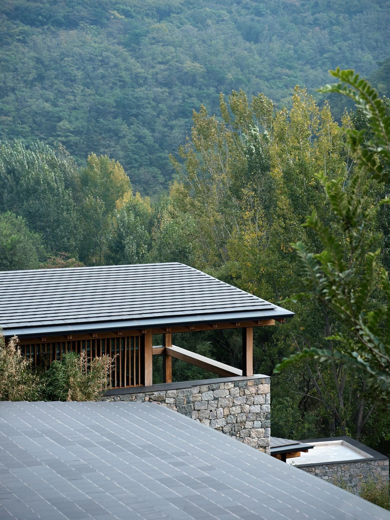
Dongximen Village, established in the Qing Dynasty, is at the foot of the range of Mount Tai. This small village grew silently for hundreds of years, until the villagers left and then gradually declined.
In 2019, LuShang Group introduced the Pusu Inn here in an attempt to activate the village as a high-end resort. During the design process, with respect for the original site, we use as little design techniques and materials as possible to naturally reveal the temperament of the site itself.

01 Retain the Memories
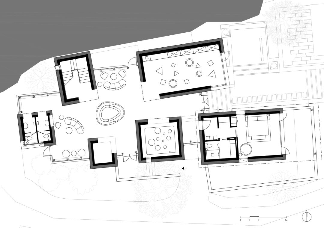
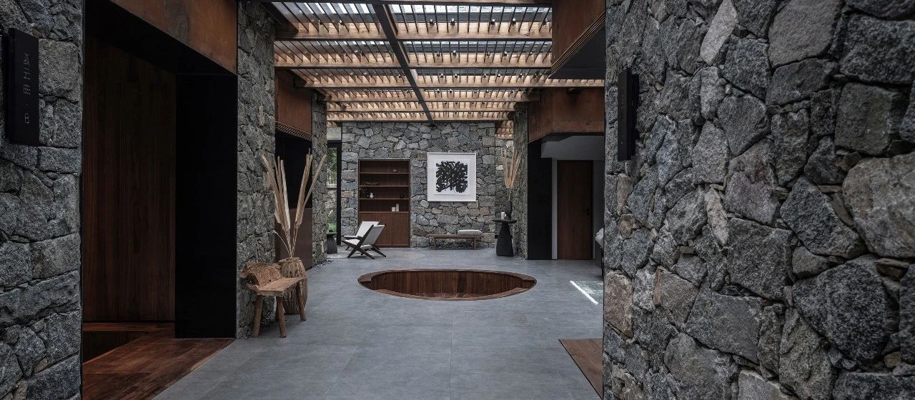
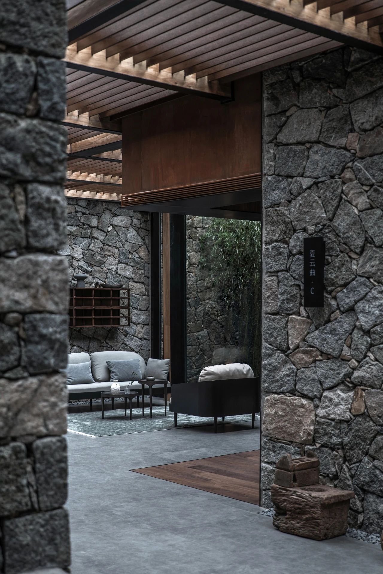
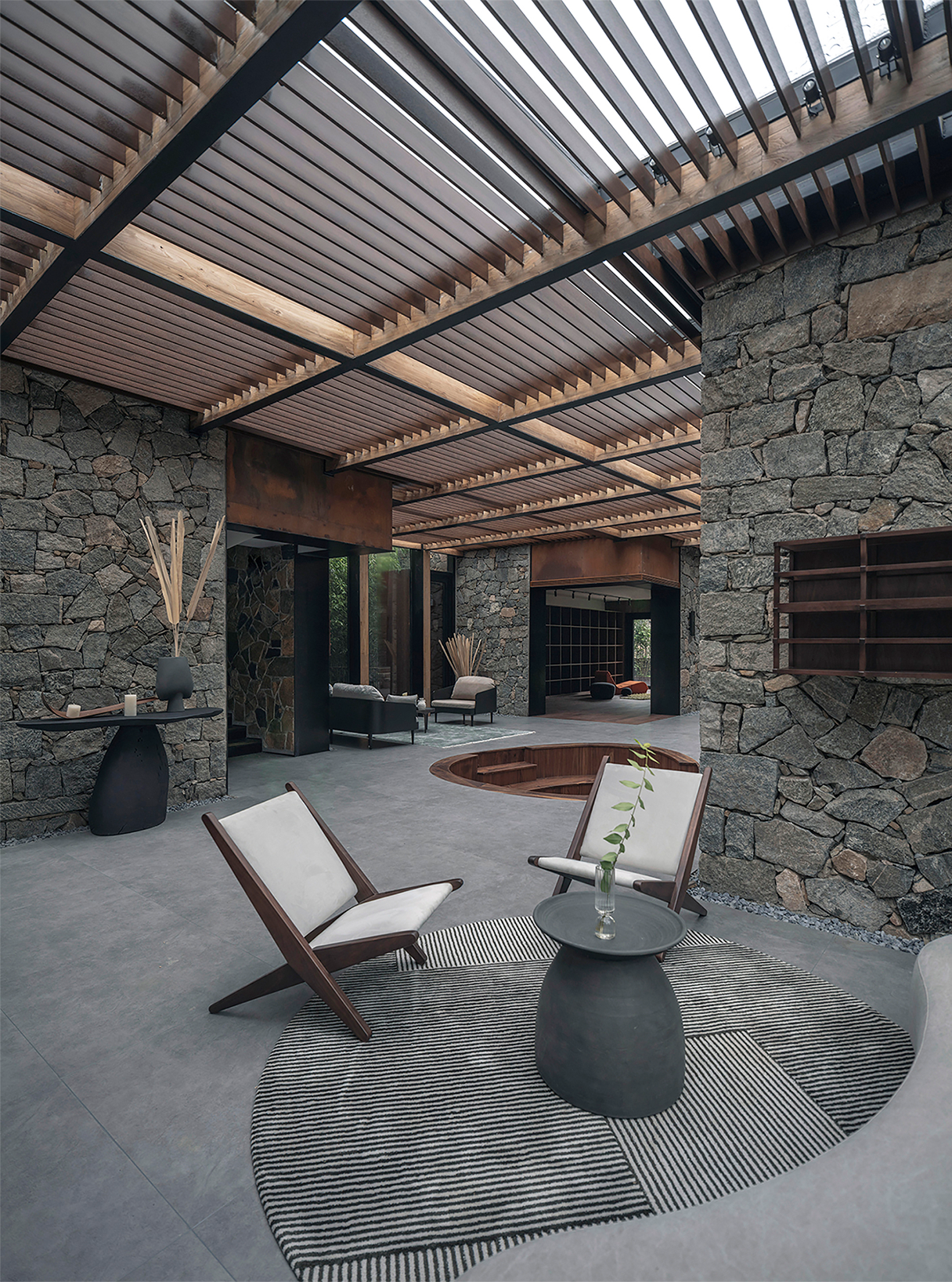
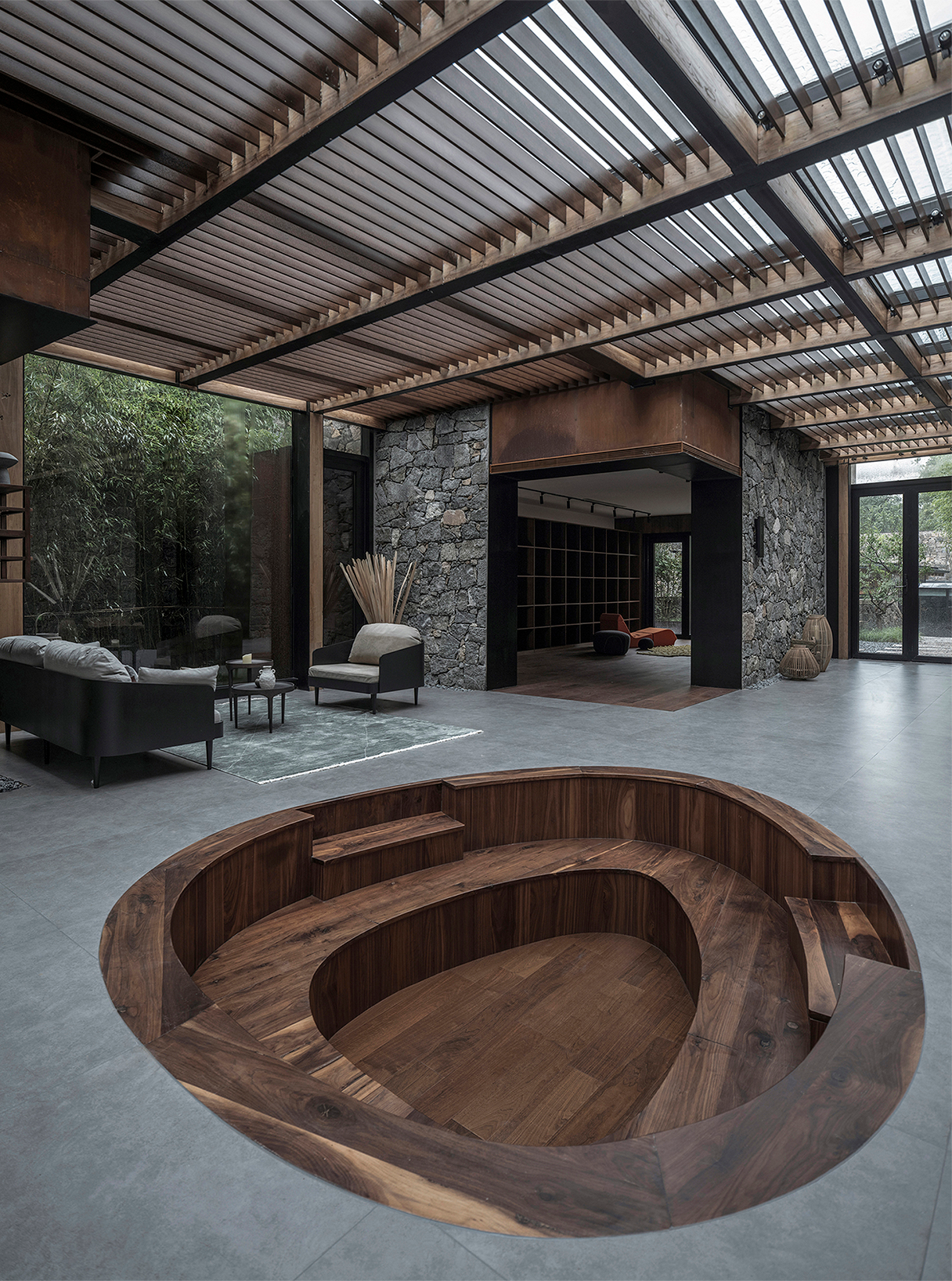
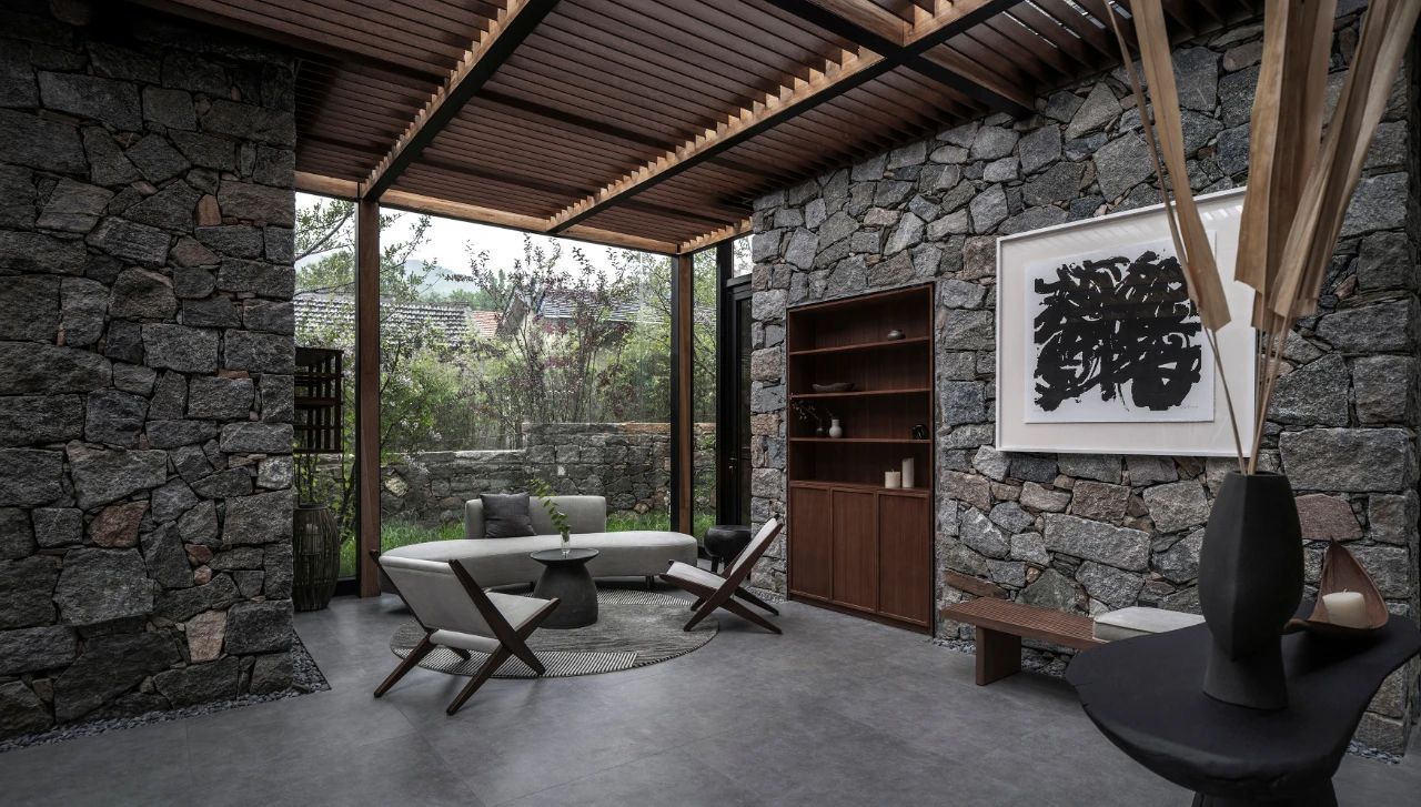
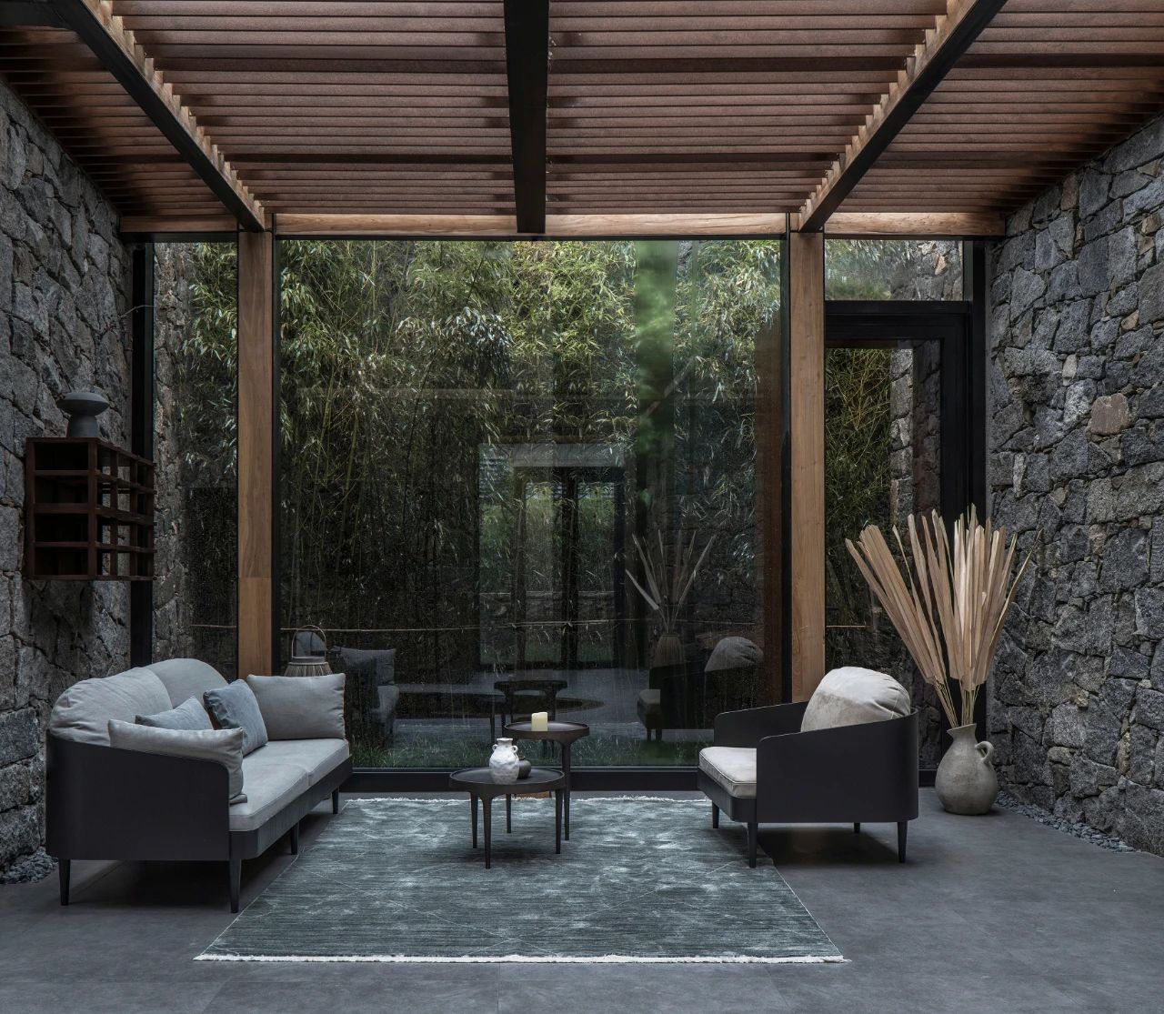
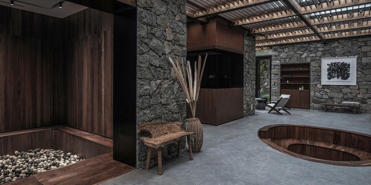
In the southwest corner, there were four utility rubble rooms. The relationship between them was the result of continuous change between the villagers' life and the natural mountain.
We renovated these long run-down rooms on the original scope, and establish a sunlight atrium by the glass roof to preserve the site texture and emphasize the building volume.
02. Renew the Traditions
The residential courtyards of the village are mostly distributed on steep hillsides, mainly L-shaped courtyards and three-section compounds with natural resources and old life memory. All the guest rooms are born out of these declining courtyards.
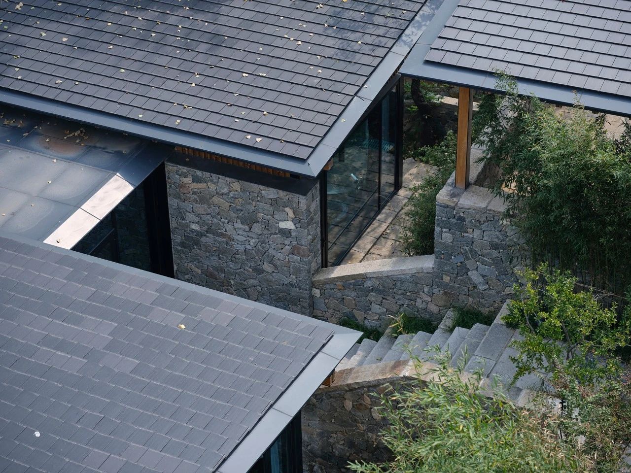
We retained the original texture and spatial relationship, and strengthened the introduction of the landscape and the centricity of the inner courtyard, based on which, incorporated the functions of guest rooms and public activities in groups. Those preserved rubble walls and reconstructed rubble walls have witnessed the heritage of the new and the old. Operating the floor plan, functions, terrain and orientation, make every building out of the ordinary.

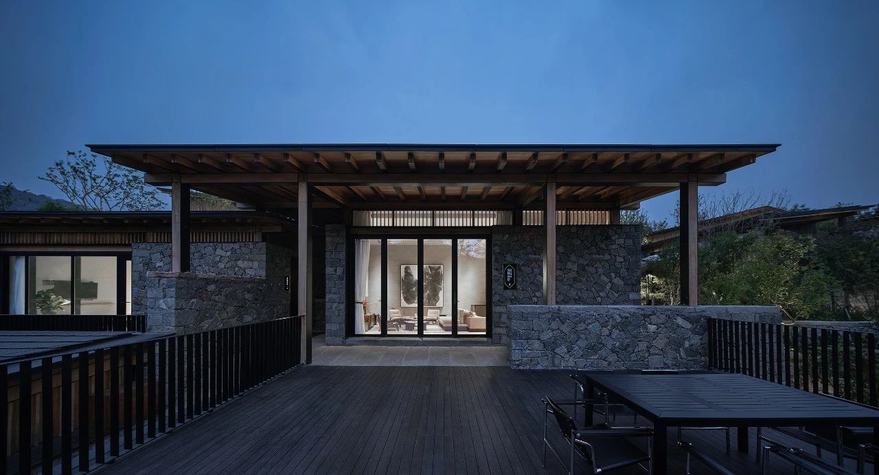
Visitors can not only enjoy high-quality vacation experience here, but also communicate with traditions.
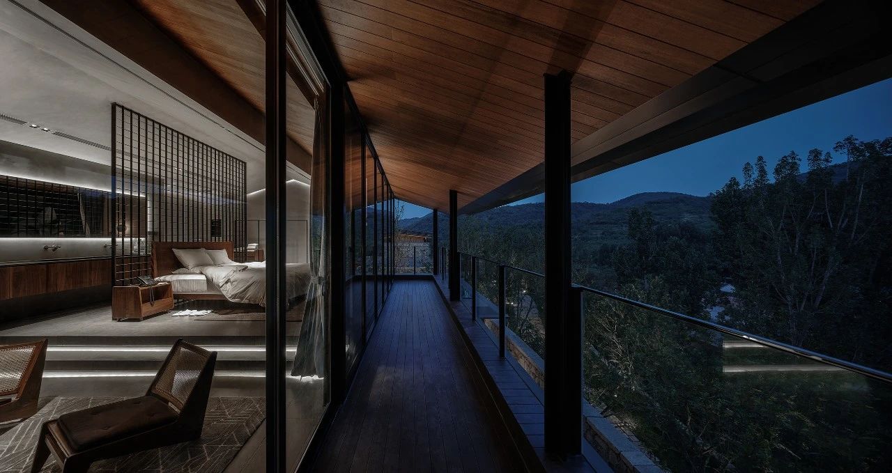
03. Hide in the Mountains - The Introduction of Landscape
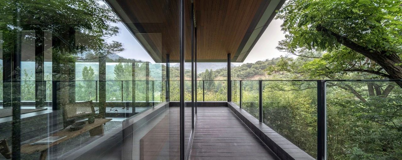
Escape from the urban reinforced concrete, just to feel the primitive nature. The natural beauty and the original courtyard space are the core of the entire living experience. With the existing rubble façade, the steel structure system makes it possible for the panoramic views and renders the demarcation between inside/outside ambiguous.
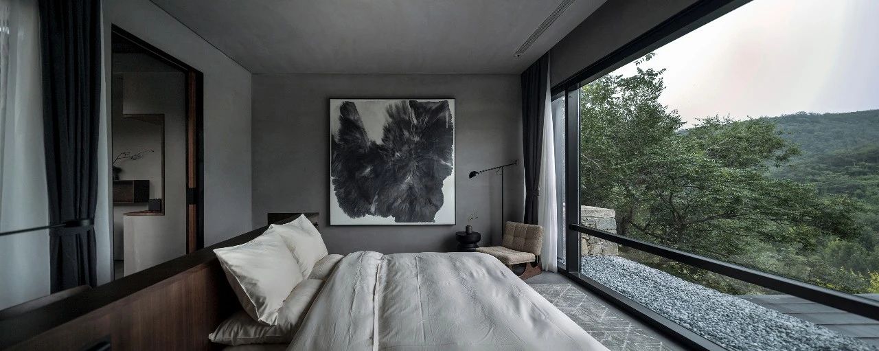
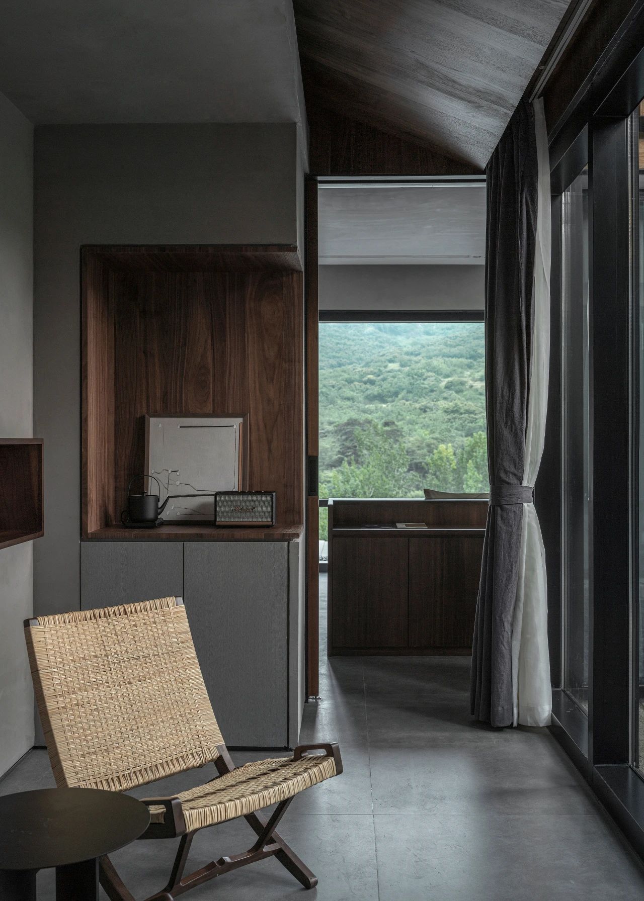
While maintaining views through the L-shaped glazed façade,make the visitors asleep in nature. And the terrace allows the visitors to get closer to nature.
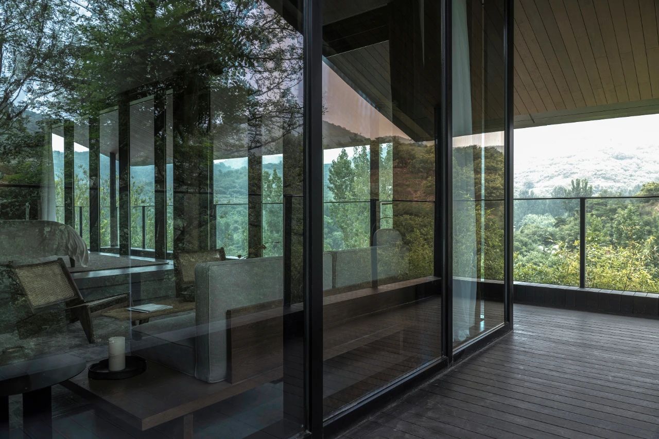
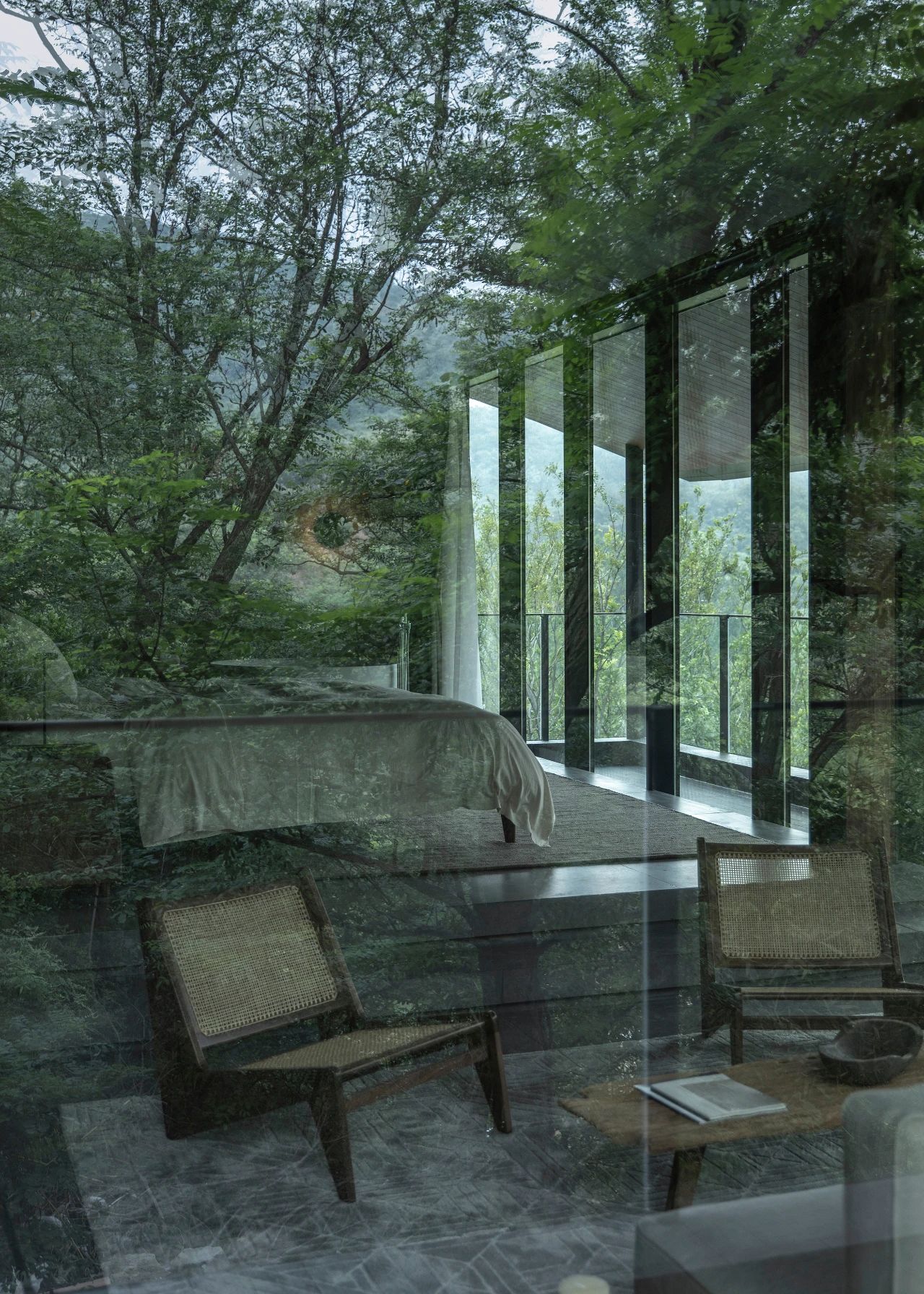
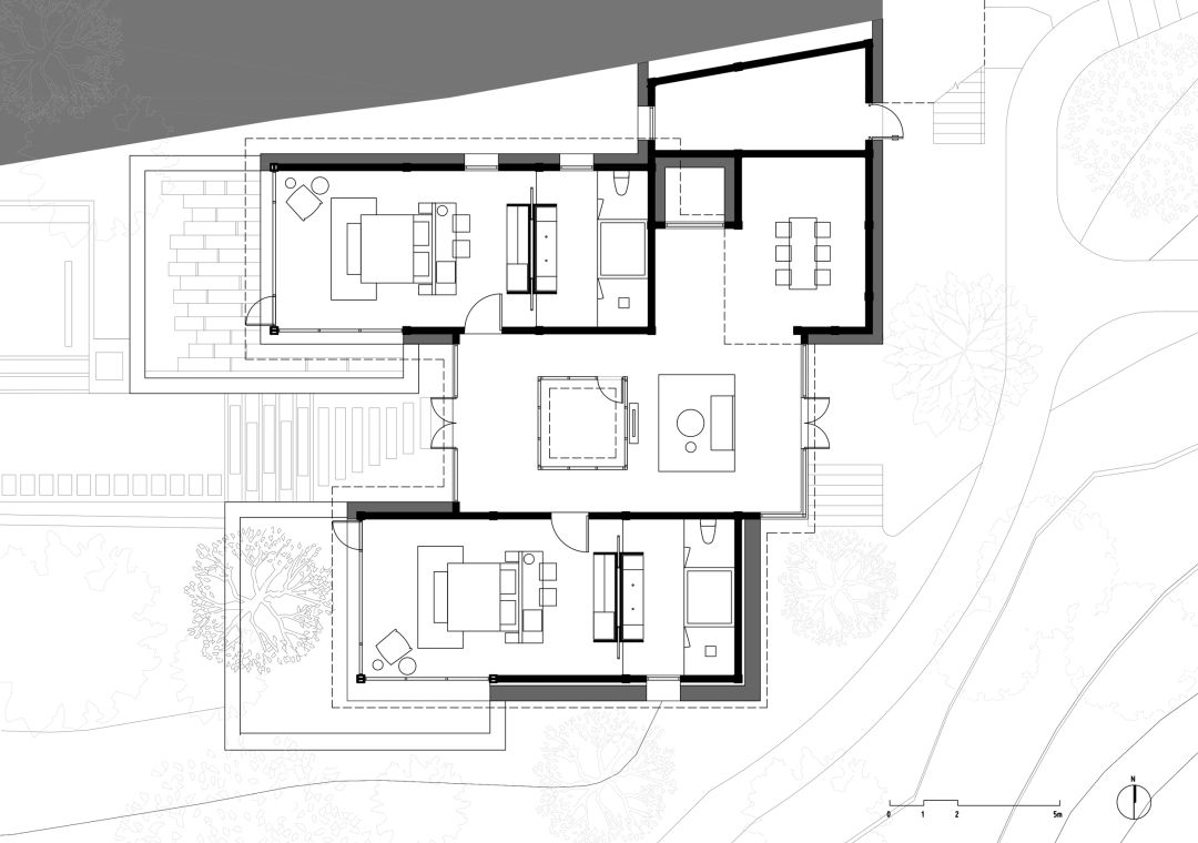
Each room is partially opened to the courtyard, and the sliding door of the public living room can be fully opened, at which time, the internal and external public spaces have no boundaries and are integrated into a whole.


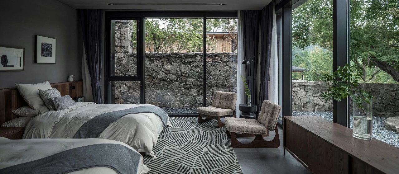
We hope to preserve the symbiotic relationship between the existing old elm tree and the courtyard, so the guest rooms are around this tree.

The bedroom, living room and bathroom form a C-shape and wrap the old tree.

04.Less is More - Space Processing Techniques
The pure geometric shape removes the deliberate decoration and modeling, restores the original state of the space, and brings a moment of tranquility to people.
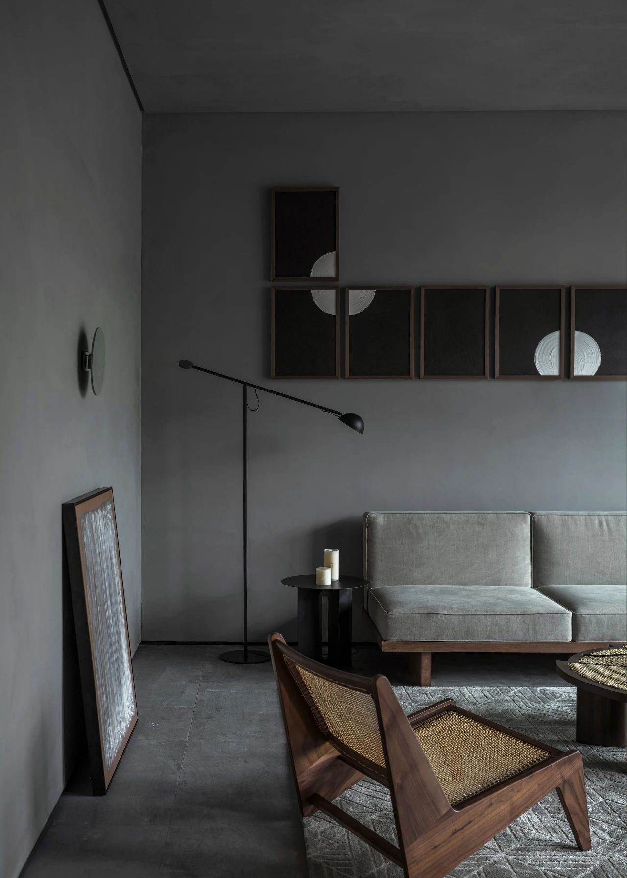
The original slope roof is separated two parts by the geometric shape. The flat roof dissolves the height difference to form a stable area and hide equipment to ensure the purity. And the roof above the passage is sloping. The two parts of the ceiling are made of different materials, which also implies dynamic and static.
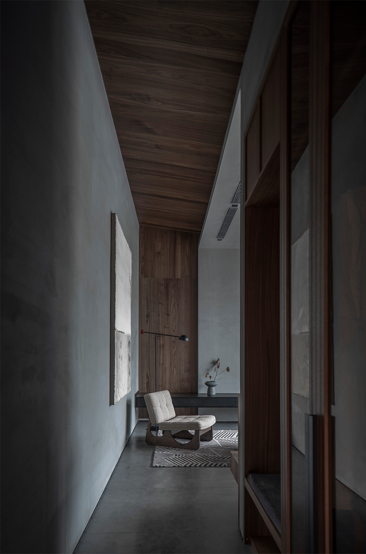
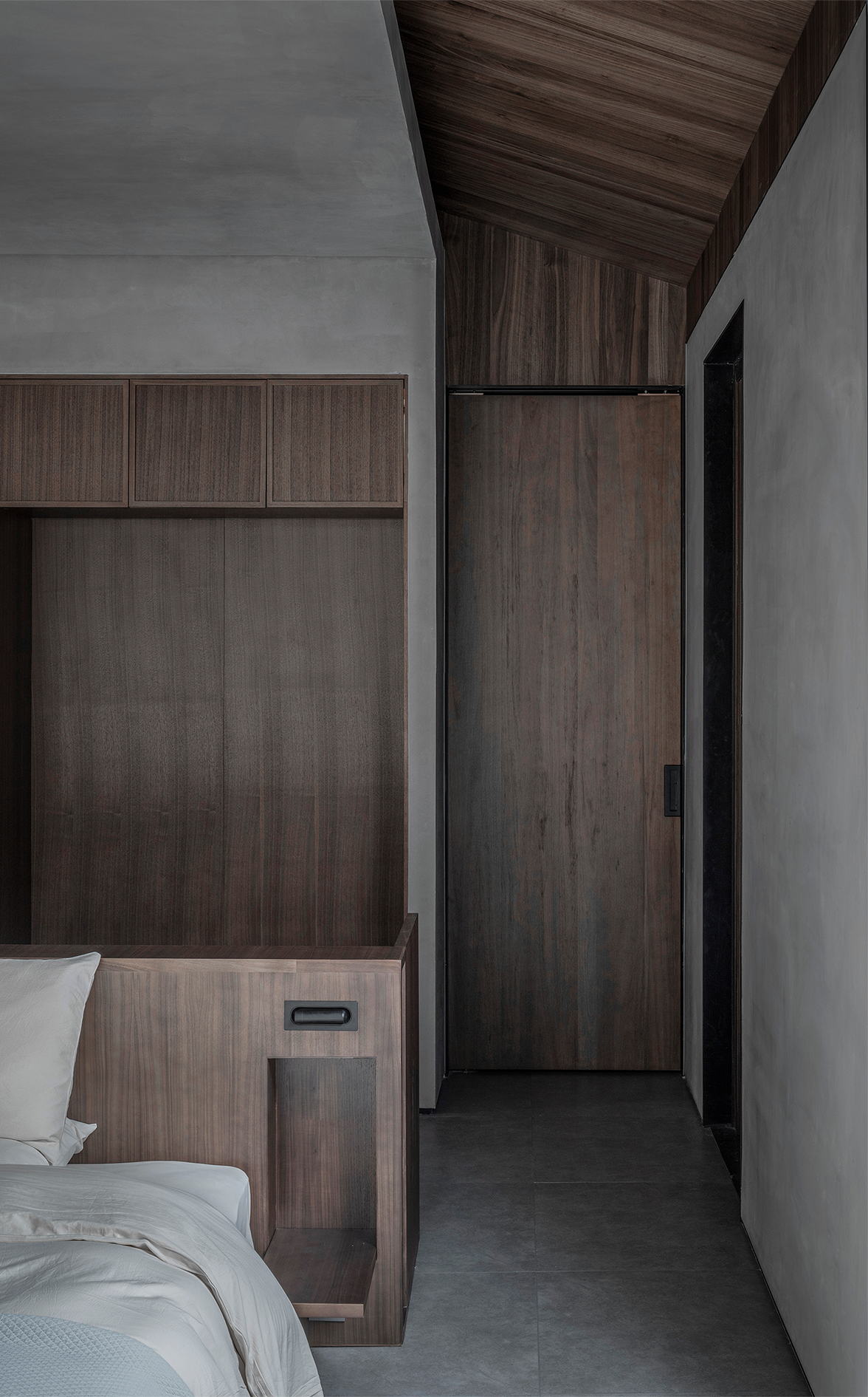
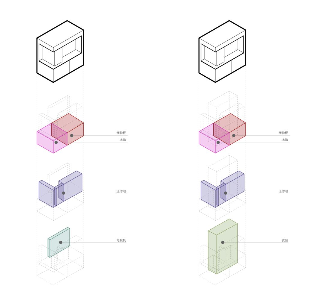
The mini bar, wardrobe, TV cabinet and hallway cabinet are effectively combined to separate the hallway, living space and bedroom space. Each area is both independent and interrelated.
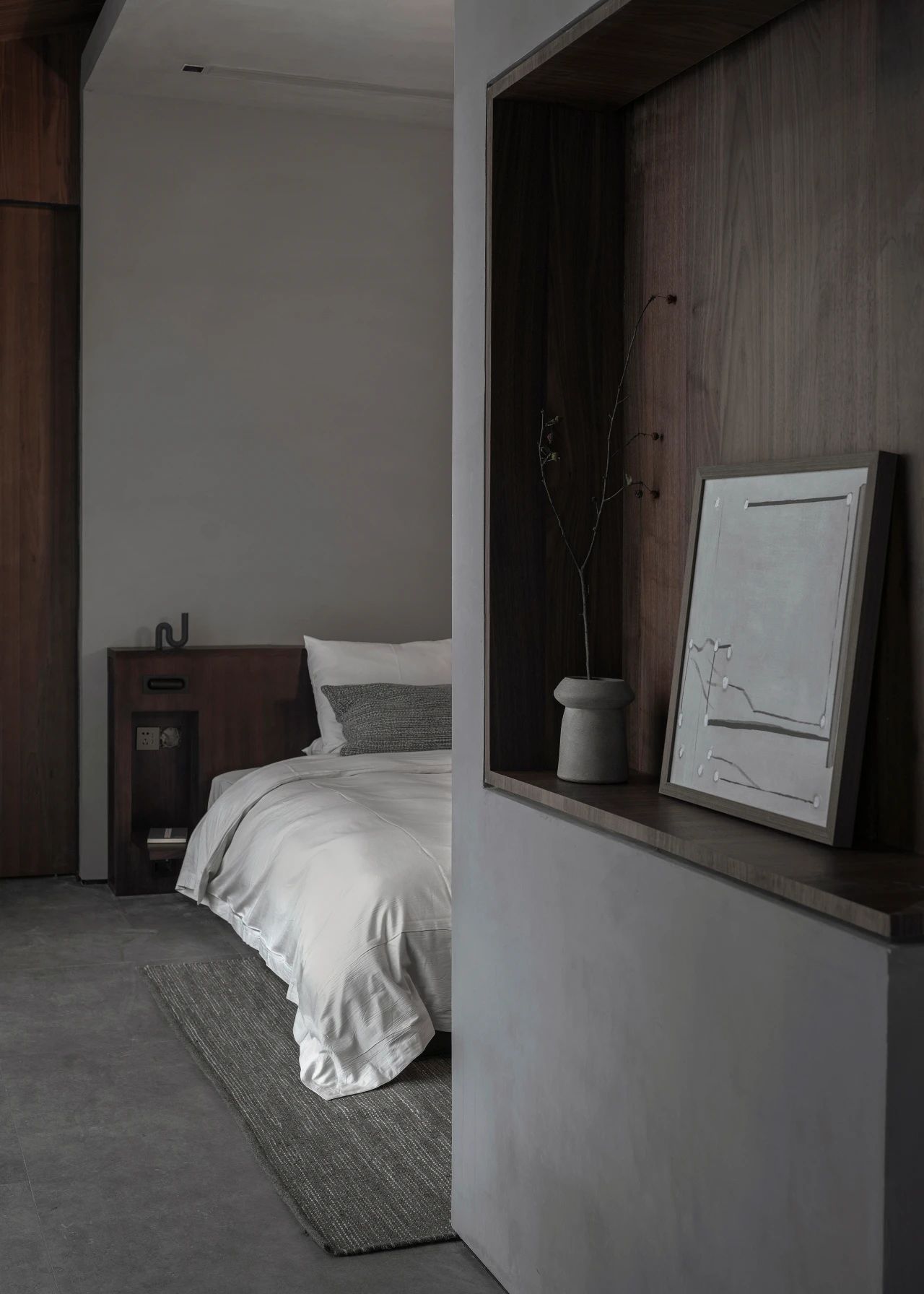
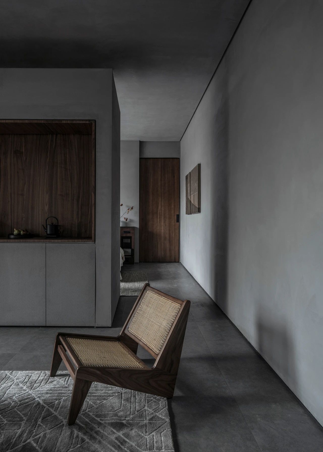
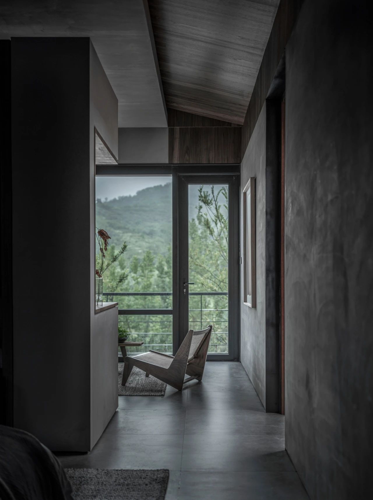
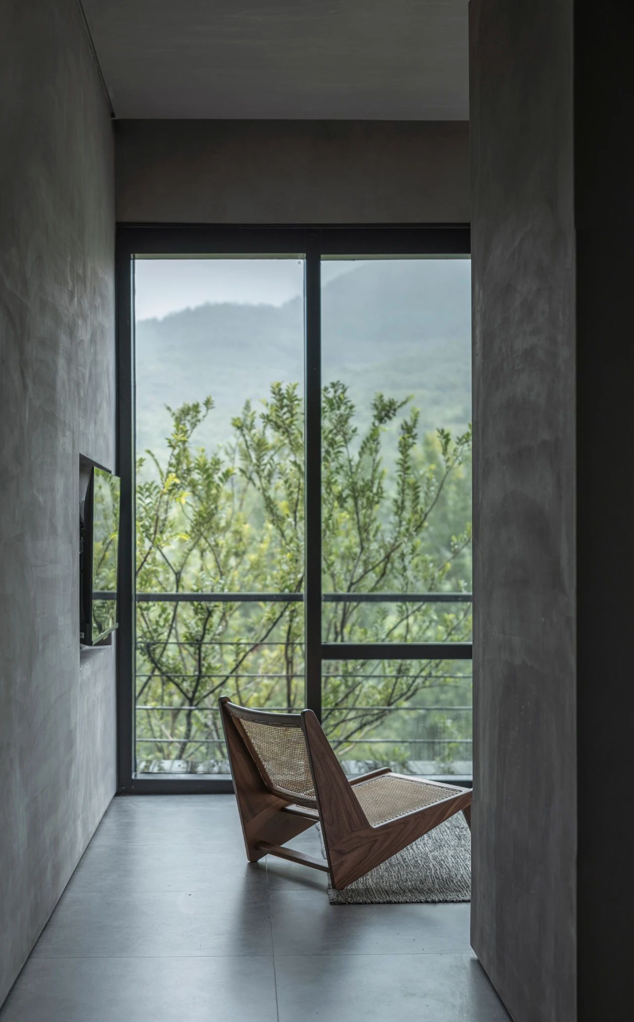
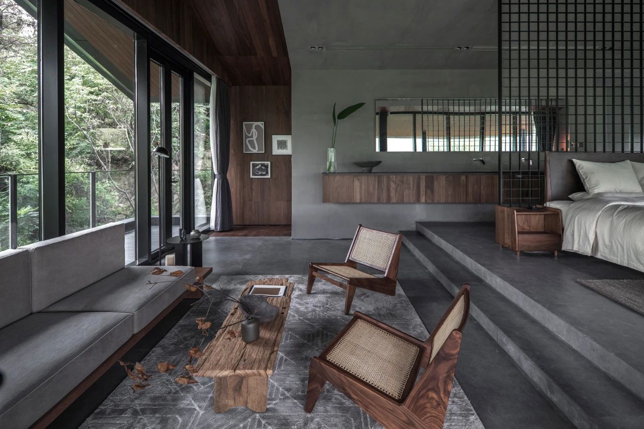
In the case of sufficient space and depth, the space is confined by the processing of the height difference, while providing a better viewing perspective. The washbasin extends horizontally turns into a bar counter space. Metal mesh set at the back of the bed separates the space but not blocks the view. The mirror surface also expands horizontally, presenting a picture of distant mountains.
05. Silent and Organic - Materials and Furniture
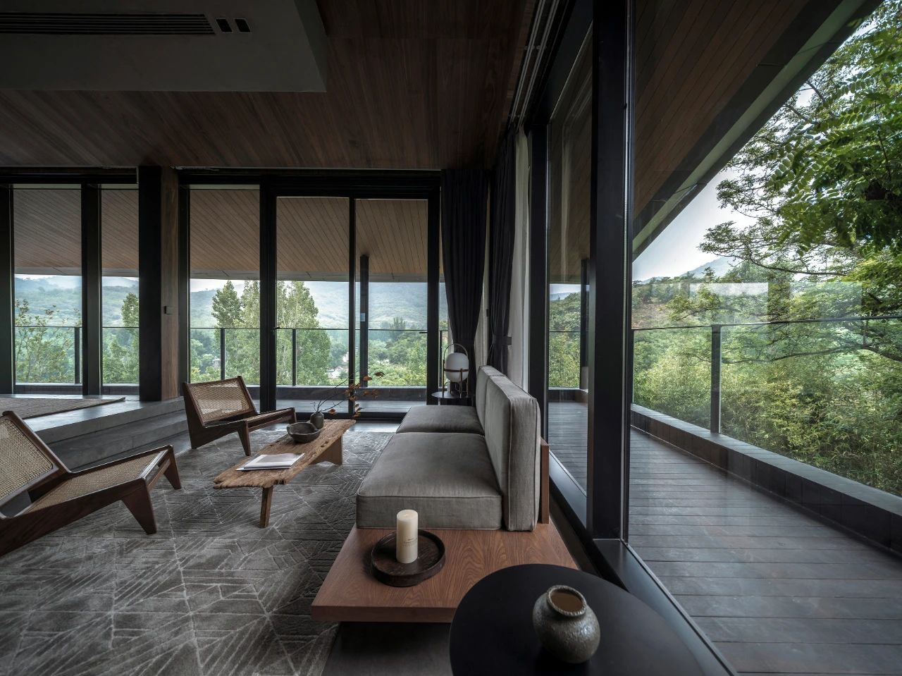
It is our pursuit to use gray color to operate the space atmosphere, which is different from other similar resorts. As the building with the heavy rubble is perfectly integrated into the mountain, we hope the interior is also in this way, so that the mountain, courtyard and indoor space are integrated into one.
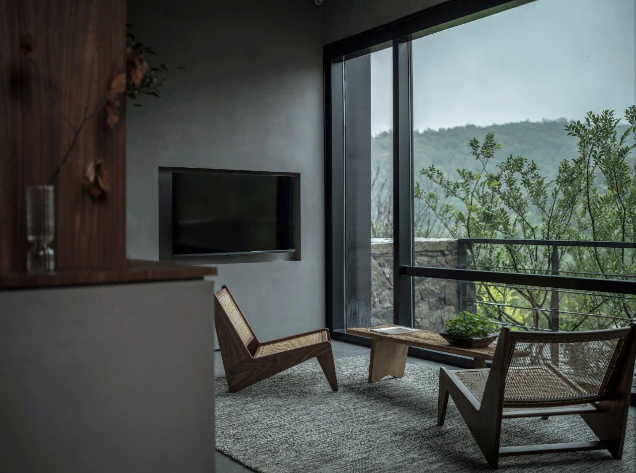
The grey surface is coated with concrete texture, which is rich in details while ensuring the purity of the overall tone. The pure colors and geometric shapes make the visitors feel calm and peaceful.
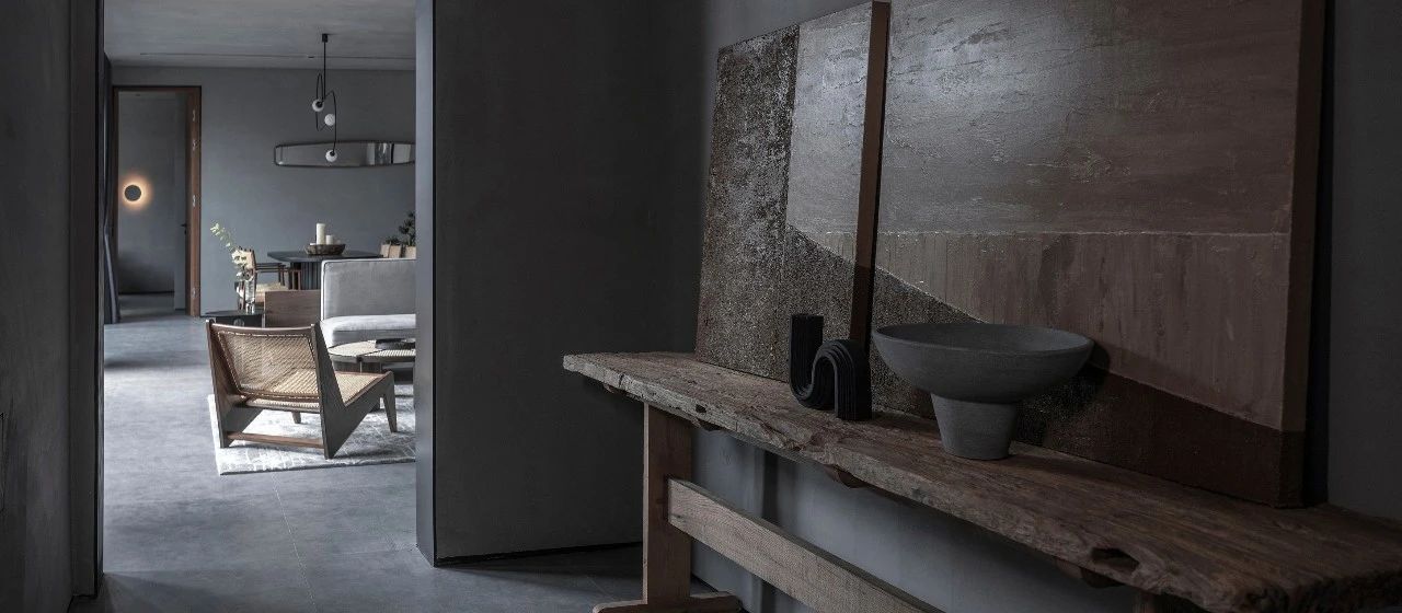


The convergence of gray concrete combined with the geniality of walnut wood grain makes visitors feel quiet rather than cool.

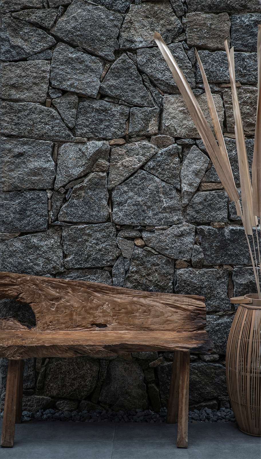
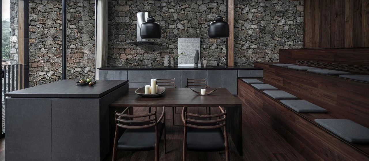
The rubbles carry the story of the place and become the main material of the building facade. We also extend them to the inside in the open public space. And the inside and outside seem to be in dialogue through rubble and wood facing.

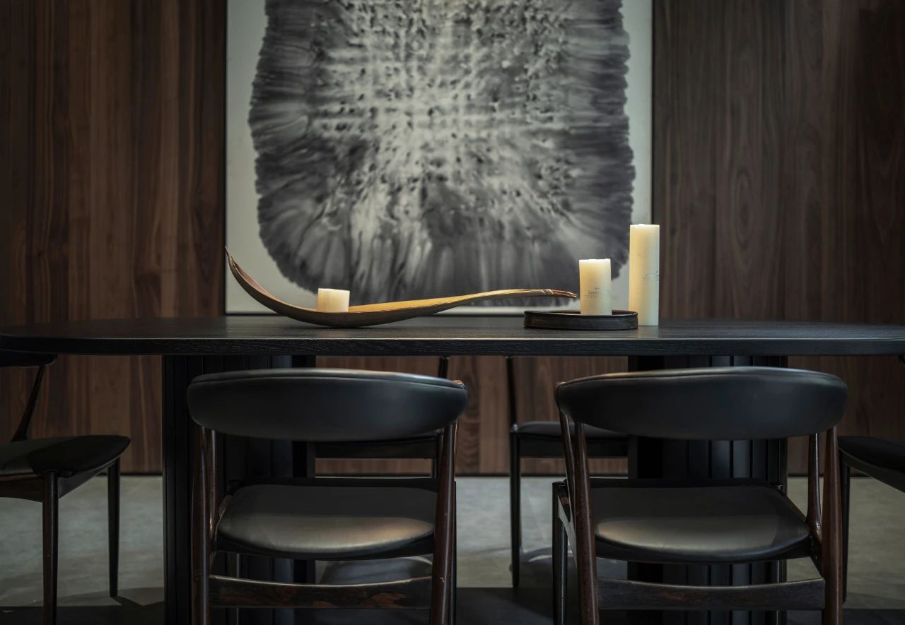
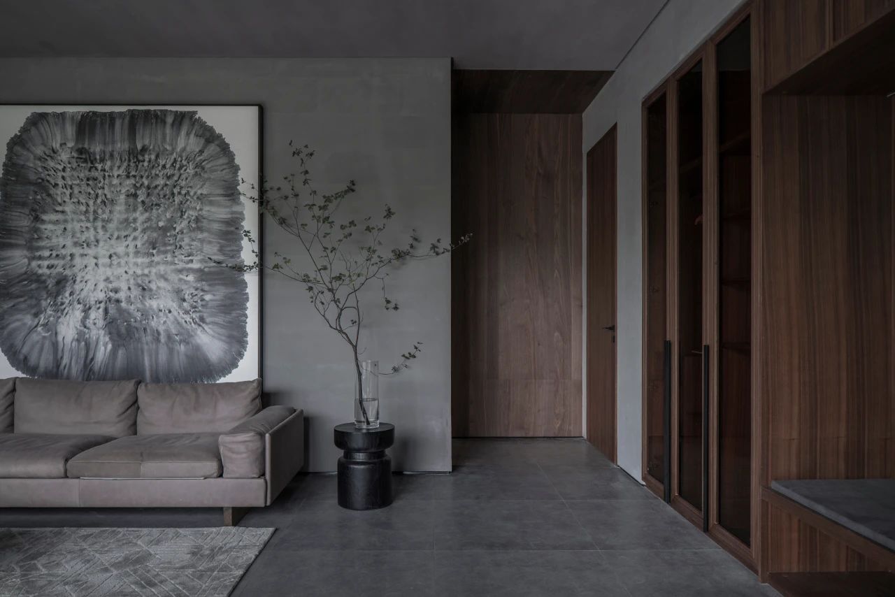
The furniture is highlighted in this clean space. The dark gray of the cabinets, the black of the countertops and the gray concrete walls form a plain system. The sofas, armchairs, dining tables and other objects echo the space through walnut wood.

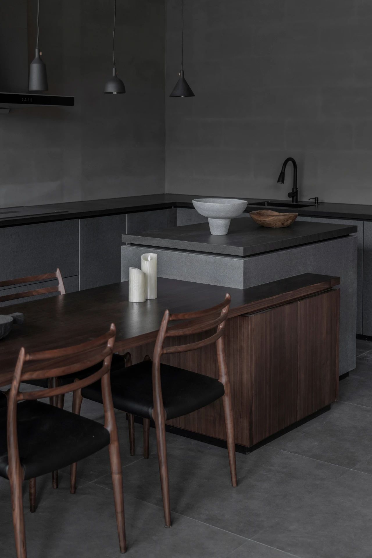
Light and warm colors of cotton, linen and rattan plaited articles add soft touch and natural toughness. The earthen jars, dead branches and old wood in the space are the continuation of nature and the precipitation of the years.

