
line+ office space has been in continuous development since moving into the old campus of Zhejiang Gongshang University in January 2018. Office space is not only a container for work, but also a catalyst for communication. "Being cold but also friendly" is the keynote of the space, and "being flowing and open" is to the meet ever-changing needs of the future.
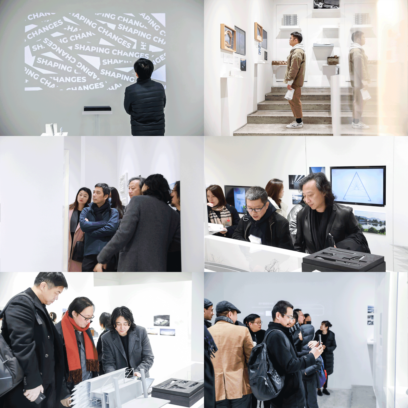
For line+, the office space is not a final product that will never change again, but an organism with the ability to renew itself. The end of 2020 marks the third anniversary of the establishment of the studio. Therefore, we held an exhibition in the stepped space on the ground floor to review and display the projects in these years, namely "Shaping Changes: Meng Fanhao & Zhu Peidong Design Practice Exhibition".
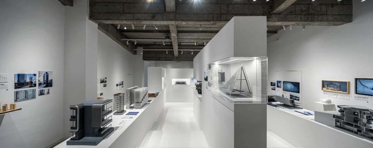
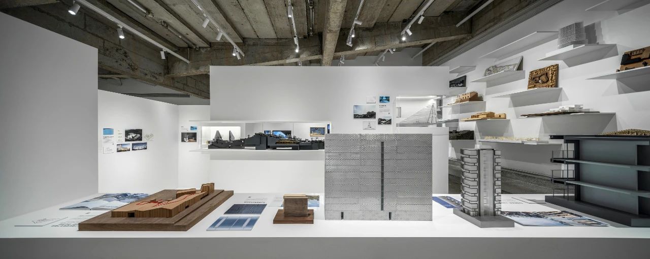
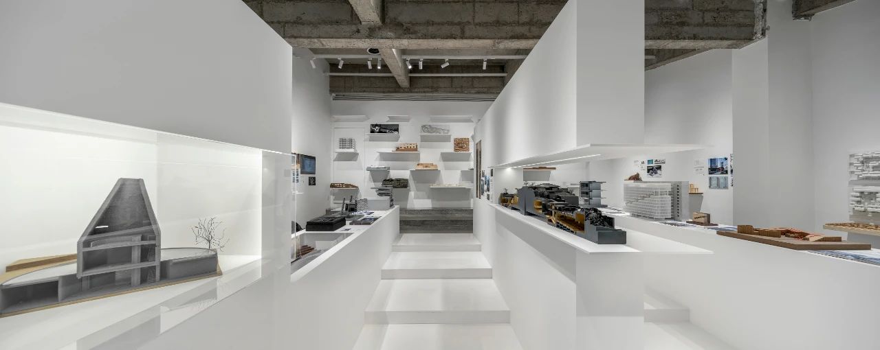
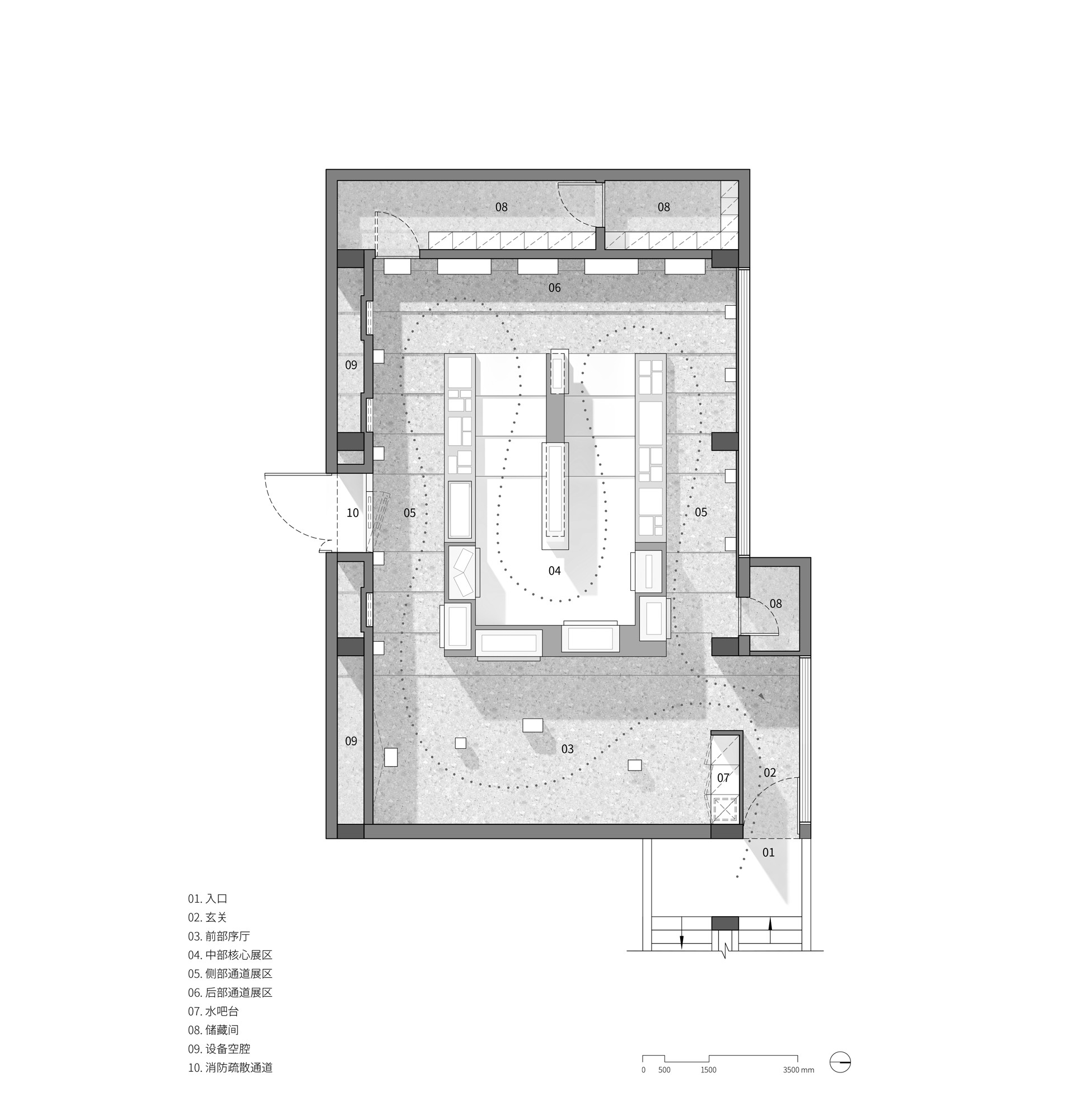
Since the area is only 120 square meters, we need to change the previously unobstructed space. The white block sits in the center of the space as a whole and becomes the sight core. The space of the exhibition hall is thus divided into three parts: the front lobby, the core exhibition area at the heart and the passage exhibition area at the side rear.

line+ office space has been in continuous development since moving into the old campus of Zhejiang Gongshang University in January 2018. Office space is not only a container for work, but also a catalyst for communication. "Being cold but also friendly" is the keynote of the space, and "being flowing and open" is to the meet ever-changing needs of the future.
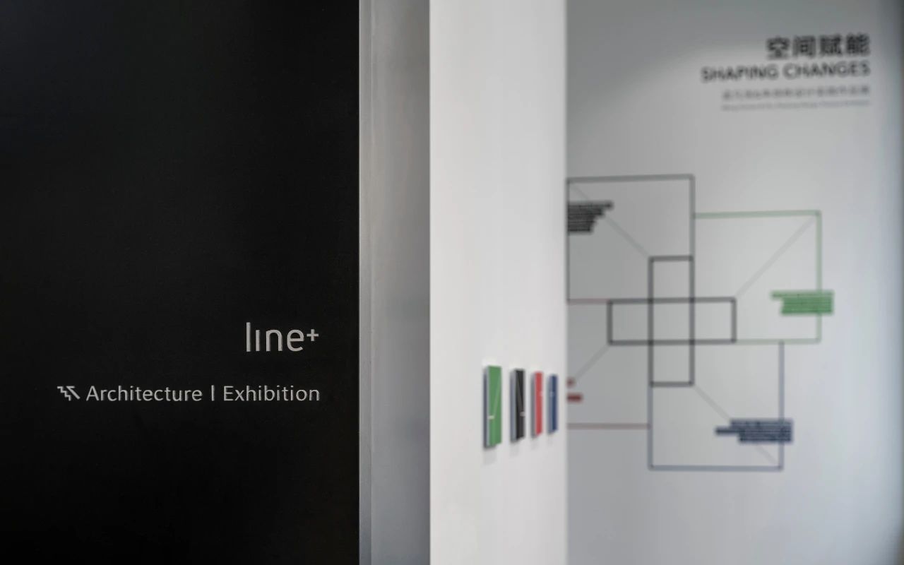
For line+, the office space is not a final product that will never change again, but an organism with the ability to renew itself. The end of 2020 marks the third anniversary of the establishment of the studio. Therefore, we held an exhibition in the stepped space on the ground floor to review and display the projects in these years, namely "Shaping Changes: Meng Fanhao & Zhu Peidong Design Practice Exhibition".
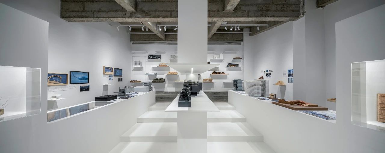
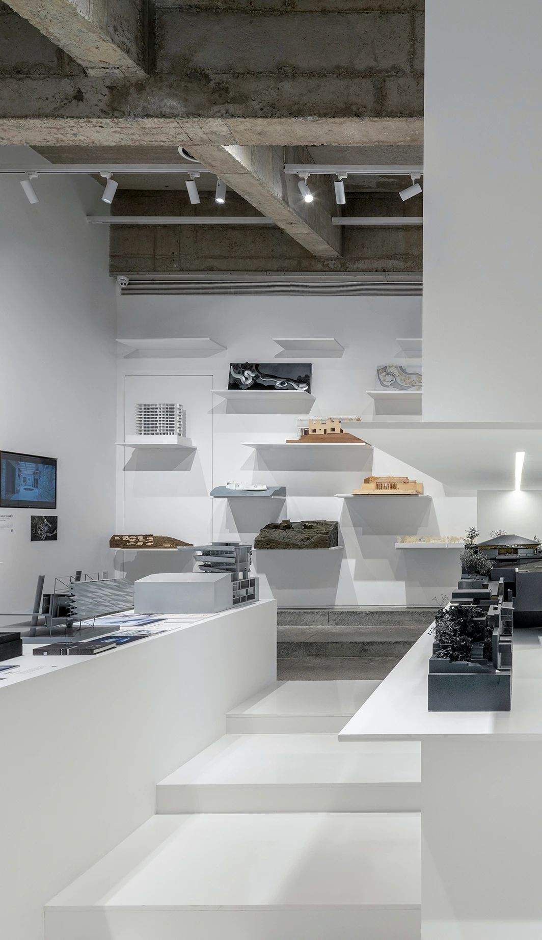
This is a small lecture hall typical in the 1980s, with stair-stepping ground and roof. After removing the original suspended ceiling, the oblique concrete beams and prefabricated slabs are exposed. Along with the gray terrazzo on the ground, these are architectural symbols of the last century. We take use of the column width and set up an equipment cavity on one side of the space, and create a storage space at the back. Complicated equipment pipelines are hidden in such cavity to ensure the purity of the space and highlight the original memory retained by the top and the ground.
The original space has the standard plan of a lecture theater, with the middle of the stairs serving as the main entrance, and one side of the front platform serving as a fire evacuation exit. Since the number of users in this space is less, we swap the exit and entrance of the exhibition hall to share the same entrance with the studio, so as to ensure the integrity of the interface in the exhibition hall.
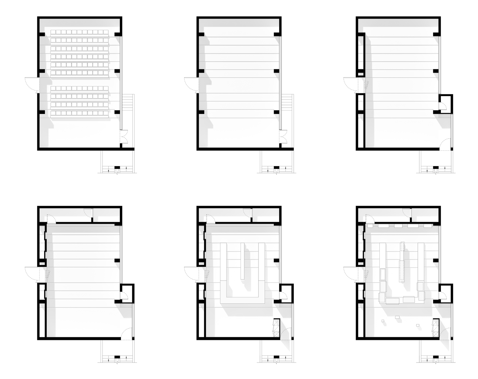
At the new entrance, we set a vestibule through bar modules, which divides the original overall space into two parts, namely the window for external display and the internal area, so as to make the space richer.
△Set up a bar counter to form a vestibule
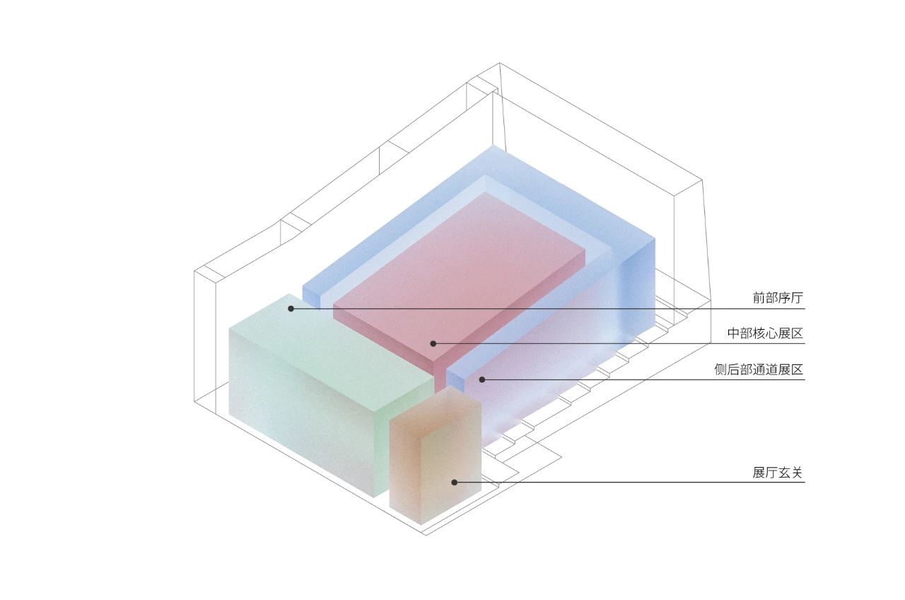
△Function analysis
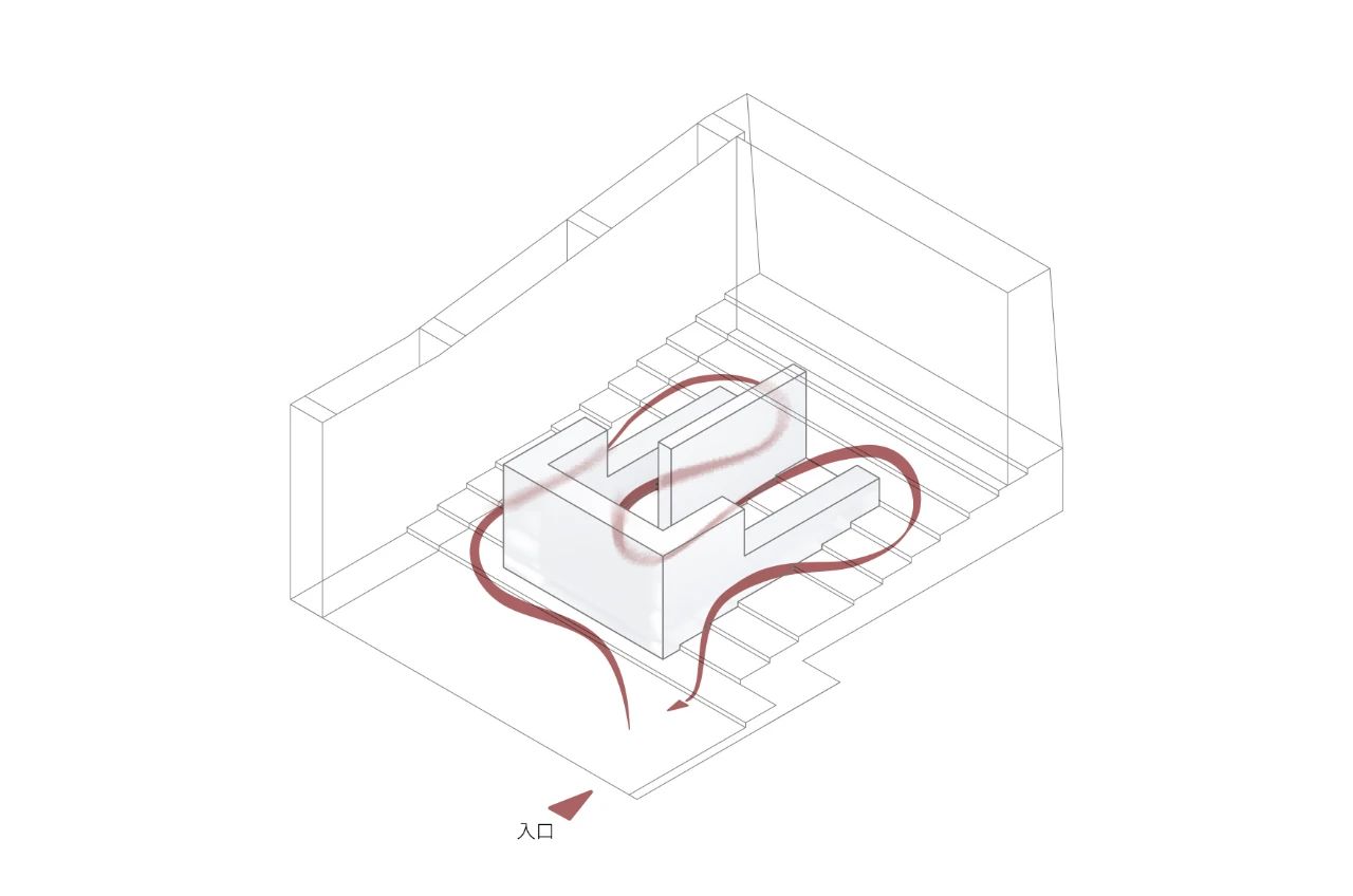
△Circulation analysis
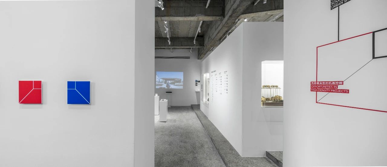
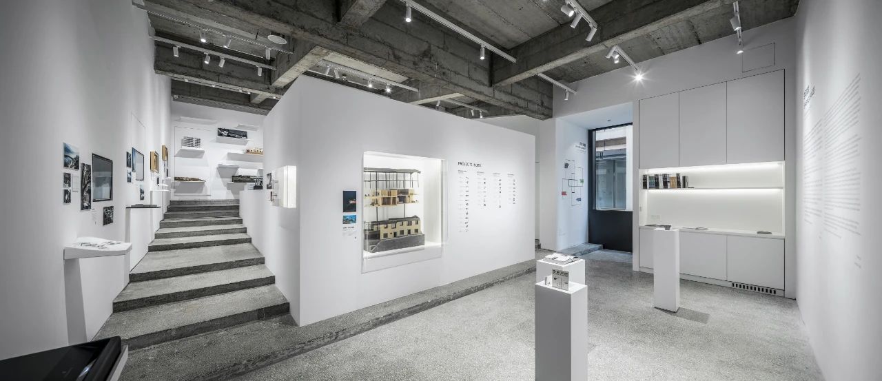
△Front lobby
The design cuts the white block into two volumes, C-shape and I-shape, thus forming an elongated circulation. The exhibits are embedded in a transparent box, the same as the building's facade. The transparent boxes are arranged in a staggered way on the inner and outer surfaces to use the display wall to the largest extent. The box is made of acrylic and will be installed through the original mobile method to control the cost and construction difficulty as well as to make it easy for the later update of the exhibits.
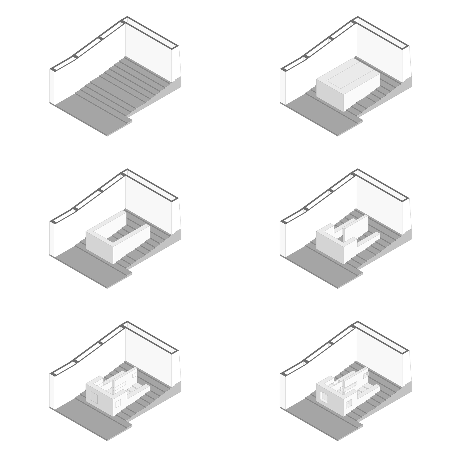
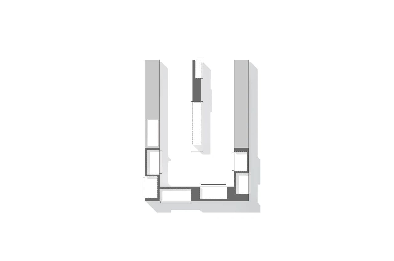
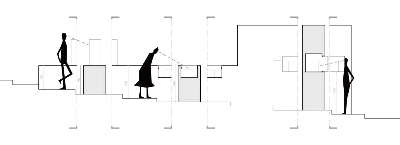
Setting of the height of the white block needs to consider the viewing modes corresponding to different types of building models and the height difference of the original stairs. Two different methods of wall display and countertop display are used in the front and back respectively to ensure the independent enclosure required by the front lobby and the transparency and fluidity of the central exhibition area at the same time. The heights of 750mm and 1050mm formed by the height of the countertop at different stay positions correspond to the different viewing methods due to different countertop placement and embedding.
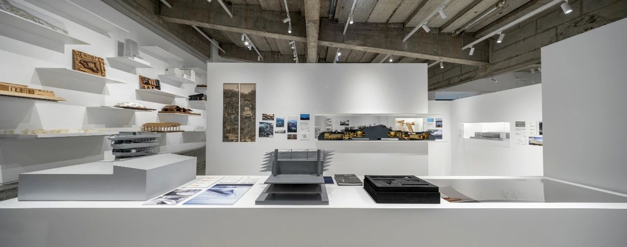
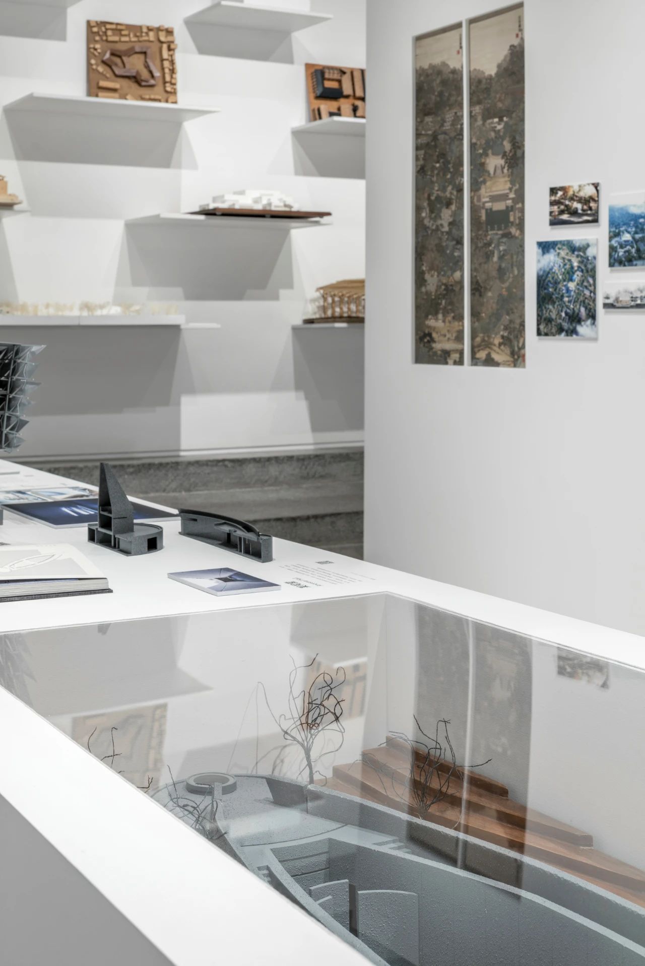
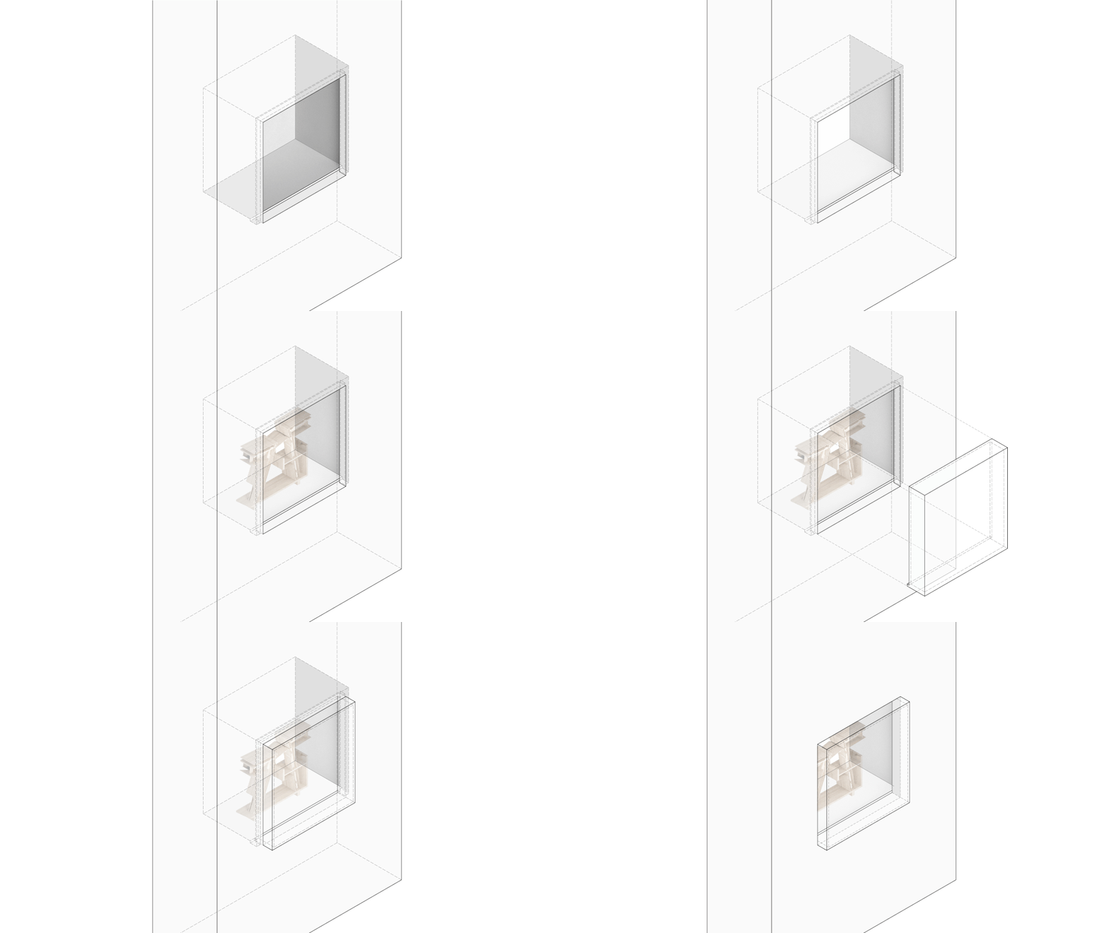
△Detail of window display
△Front lobby
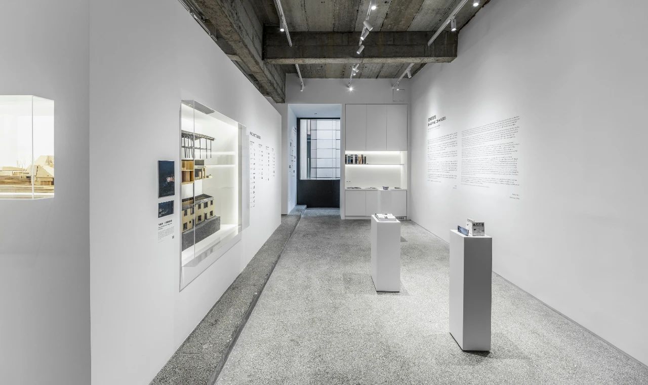
Three white cuboids with different lengths, widths and heights are arranged in a staggered way, forming a natural circulation in the front lobby. The different sizes and heights of cuboids correspond to the display size and using methods of the exhibition folds, postcards and books. In addition to being scattered, these three white blocks can also form a group to display the content in a concentrated manner.

△Details of exhibition stand
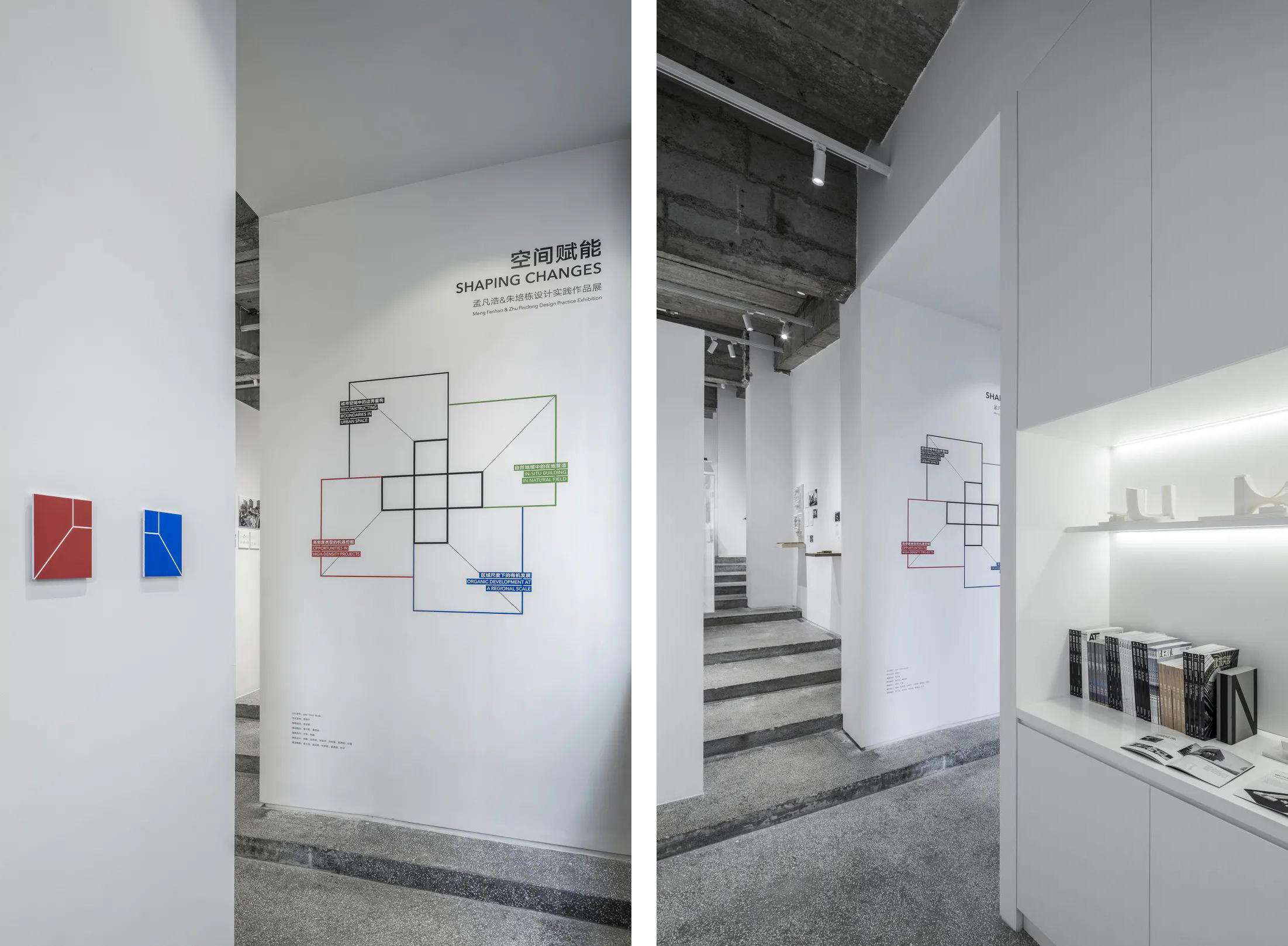
The index wall divides the exhibited works into four practical scenes. Through design, projects are presented in different gray levels to form LOGOs. The final matrix formed by LOGOs of each work shows the practice richness of the studio.

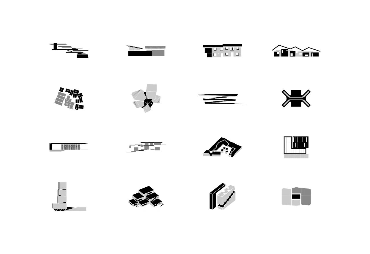
△Some project logos of index wall
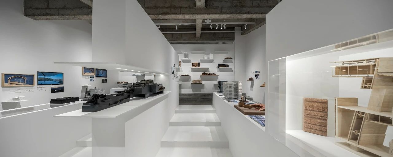
The model of Stray Bird Art Hotel which will participate in the Venice Biennale Armory Theme Exhibition this year is used as the starting point of exhibited projects this time and is juxtaposed with the project index. Its model demonstrates the project's materials and the strategy of craftsmanship and the excavation of the value of traditional rural construction, so as to reflect the design theme of inspiring nostalgia and being dedicated to restoring the memories of villagers and villages.
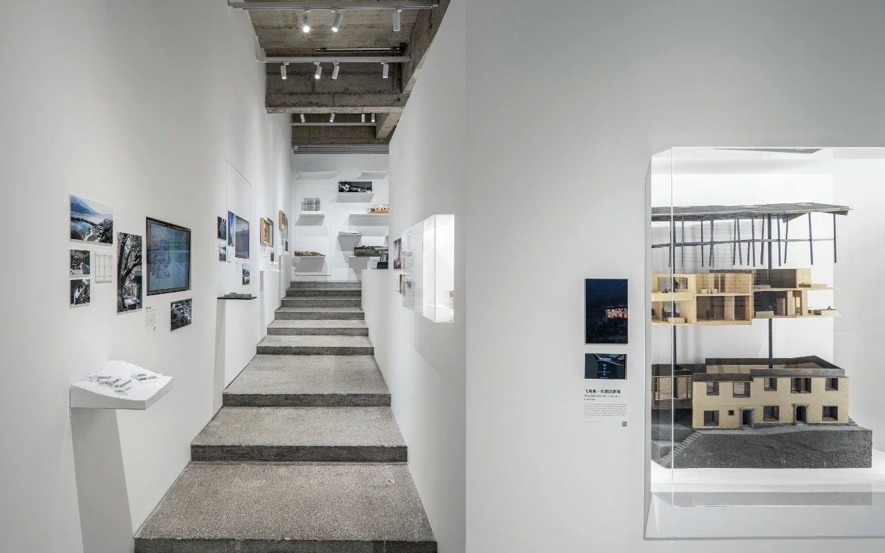
△ Stray Bird Art Hotel model as the starting point of the project
The passage exhibition areas on both sides correspond to the two practical scenes of the exhibition, namely "In-situ Building in a Natural Field" and "Organic Development at a Regional Scale". Projects such as Teahouse in Jiuxing Village and Tai'an Dongximen Village Renewal Project are presented in a form including small models, medium-sized screens, and pictures and texts, forming a sense of change and rhythm on the continuous and complete wall; Jiunvfeng Study on Mount Tai, through local structure and cross-sectional models, demonstrates the technical thinking behind the project's visual image after propagation, large-scale influence and activating media attributes.

△Passage exhibition area - organization method of wall projects
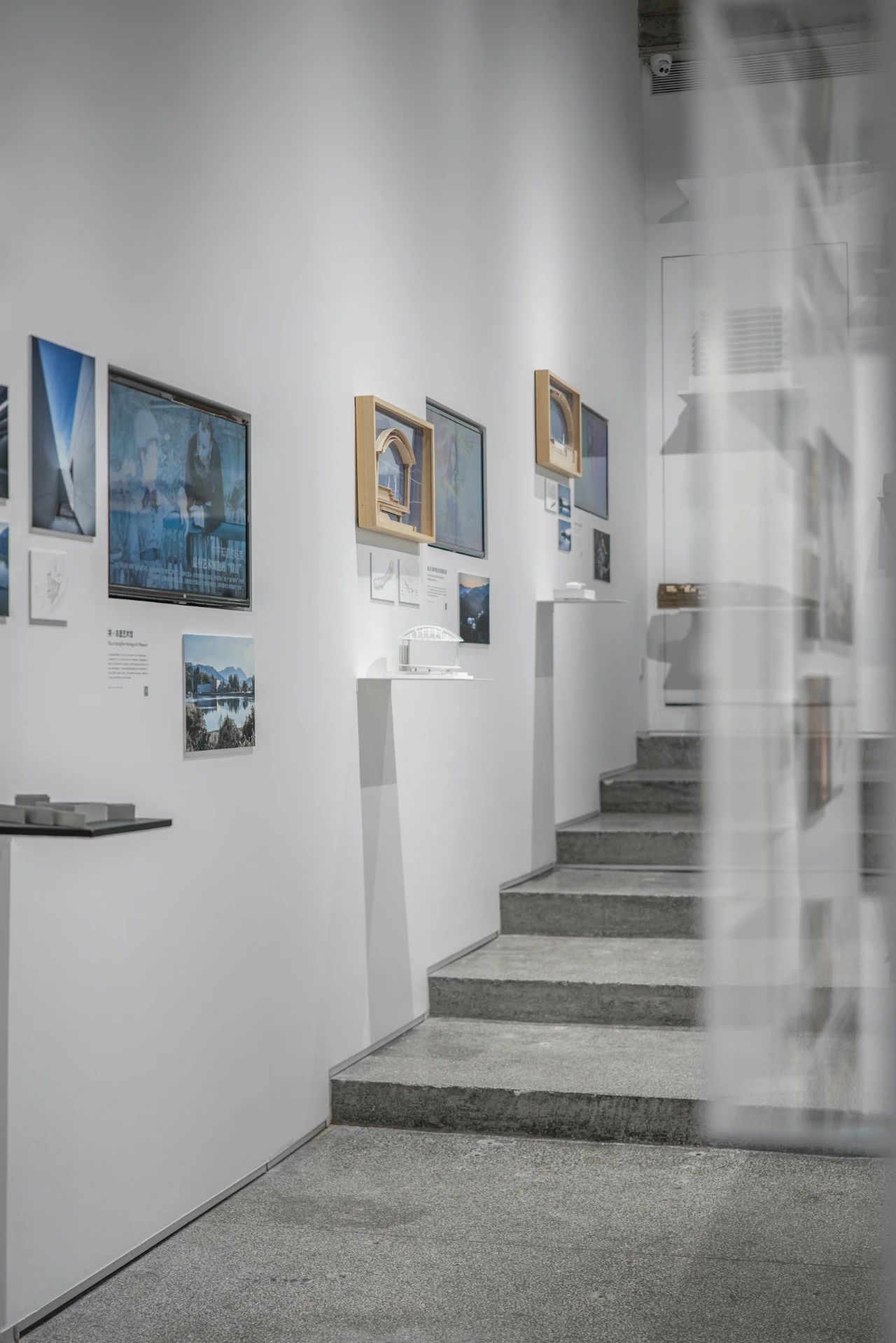
△Passage exhibition area-local construction in the natural field
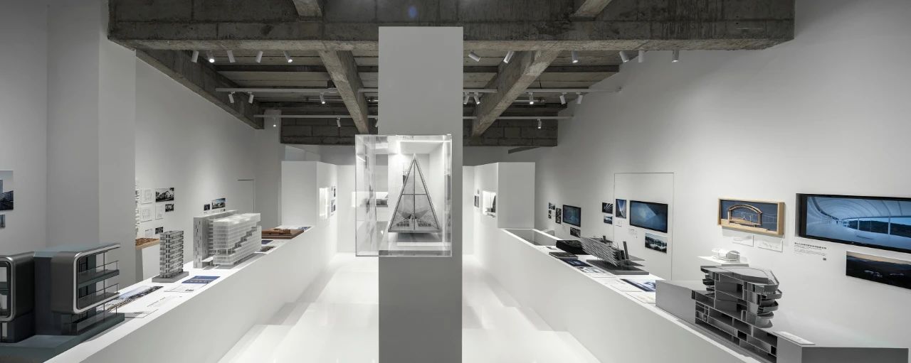
The central exhibition area focuses on the projects in "Reconstruction Boundaries in Urban Spaces" and "Exploration of Opportunities in High-Density Projects". Architectural models of different types become the focus of the exhibition, with embedded small screens and key graphics and texts. Qiantang River Museum expresses the type innovation of the "full-time public space" in the project through a cross-sectional model, reflecting the thinking of line+ on how to break the inherent boundary between urban public and private areas, and create a more fluid and open public space.

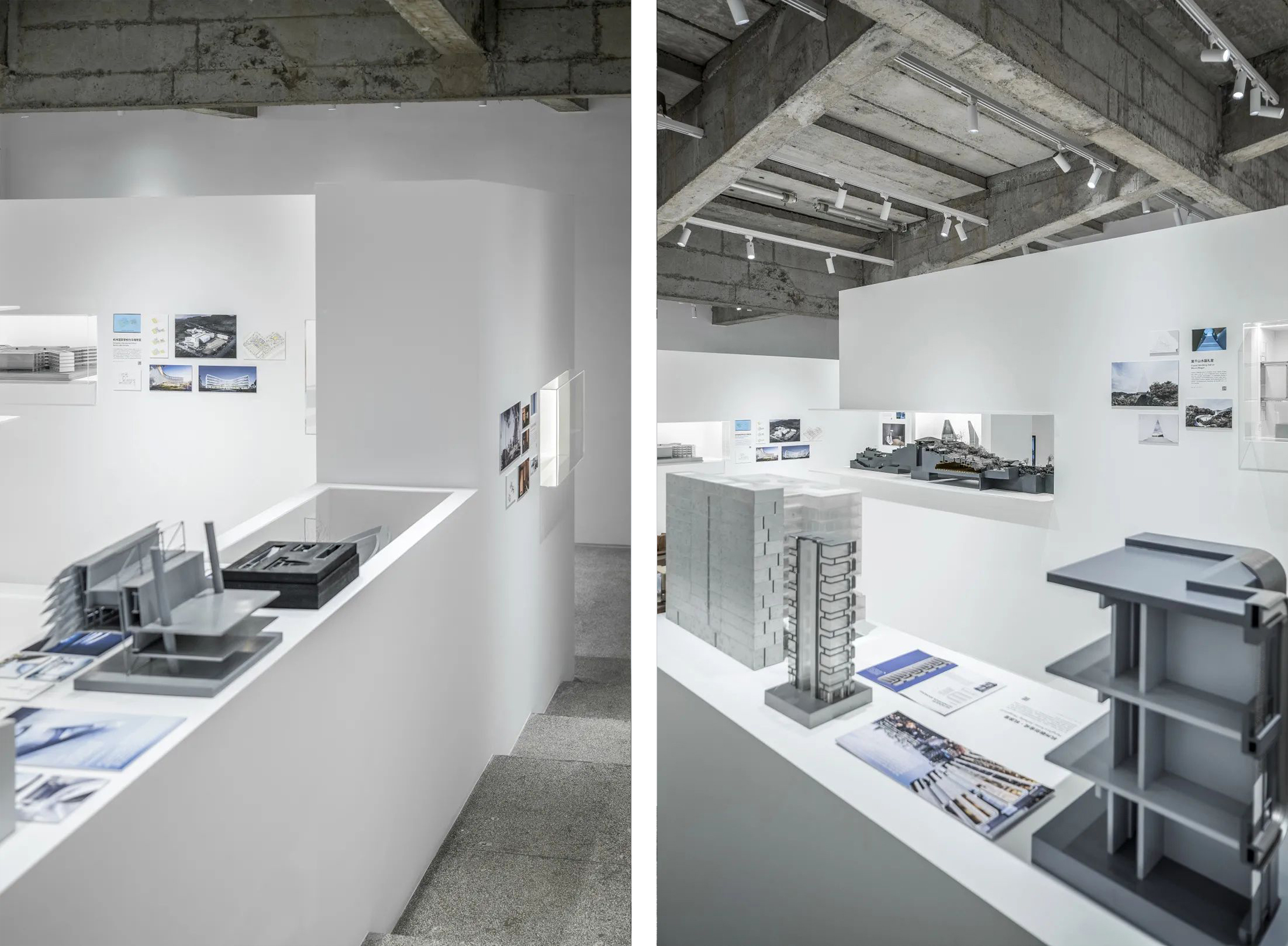
CECEP’s Shanghai Headquarters (International Competition) presents the entire process of design thinking in a video on a small screen, showing how the project uses natural forms to construct multi-dimensional connections.
The horizontal opening in the middle wall enables interaction between visitors and models or visitors and visitors, allowing the line of sight to penetrate while also framing an interesting scene. Inside the opening is Hangzhou Lingyin Temple Extension (international competition). The large-scale overall section model shows how spatial demands of modern temples are met through sites, functions and other constraints, and the natural response to the thousand-year-old temple, and finally creates a modern temple cultural center which is ecological, open, public, technologically intelligent.
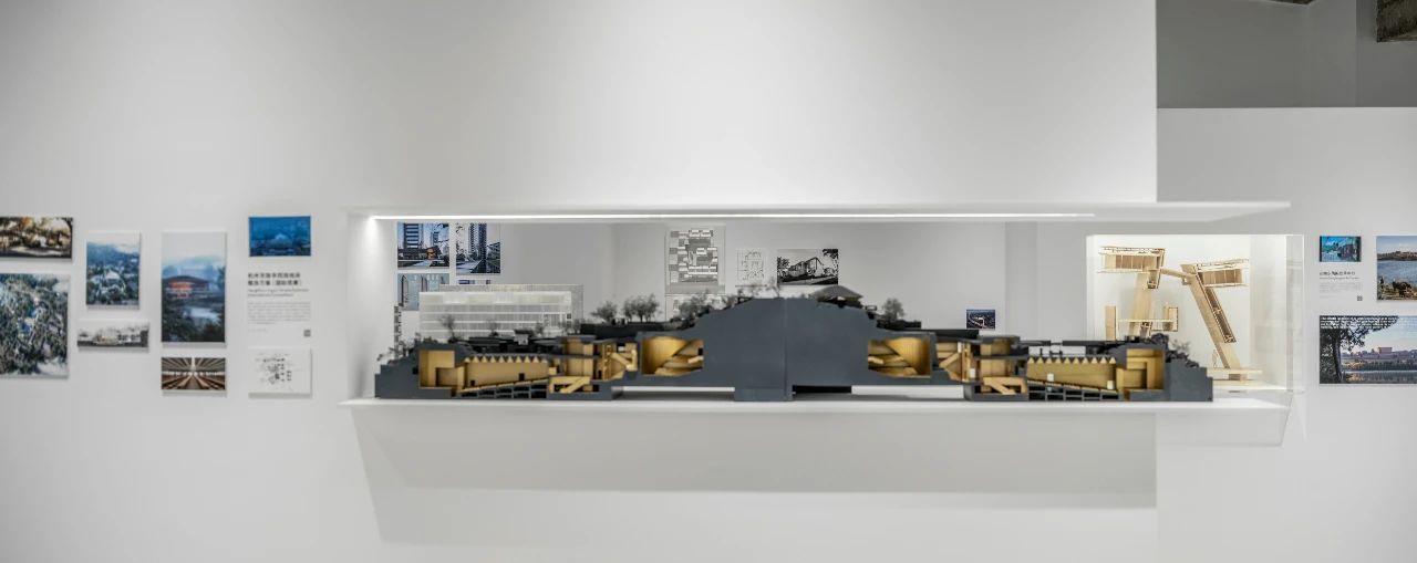
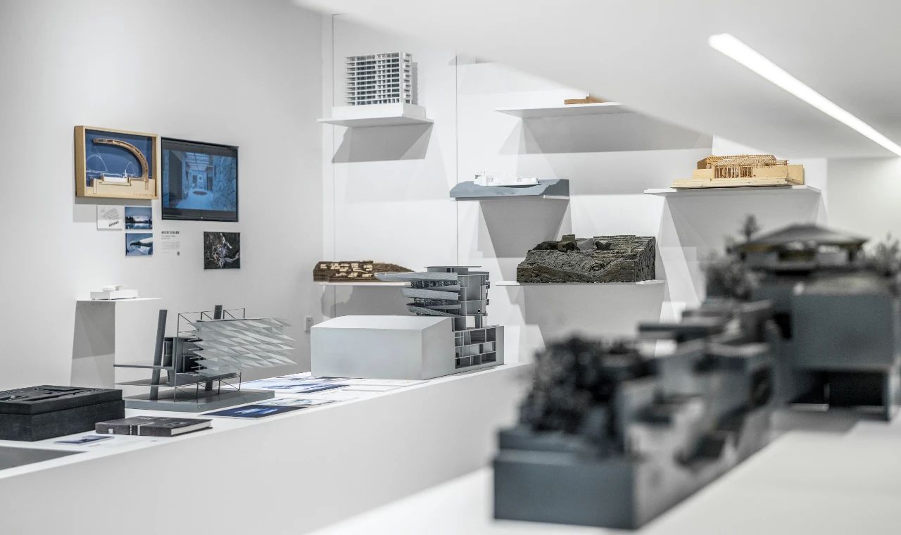
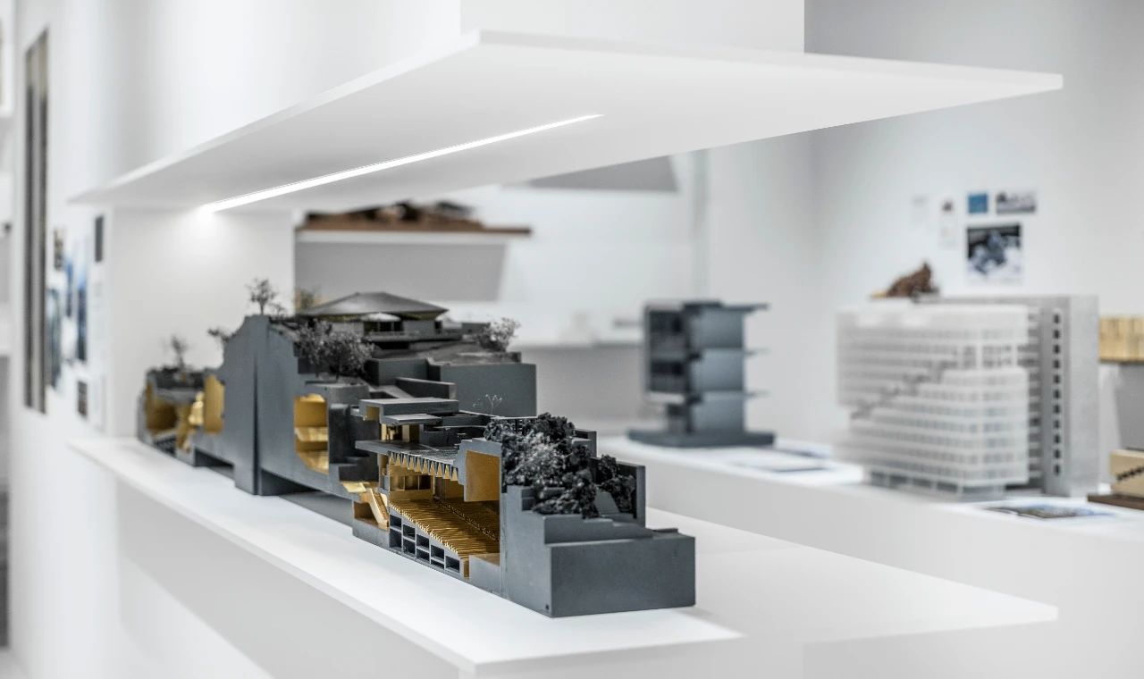
The materials and detail drawings of the project are cleverly combined and showed in a transparent box, showing the thinking in the design process from different scales and thinking levels.
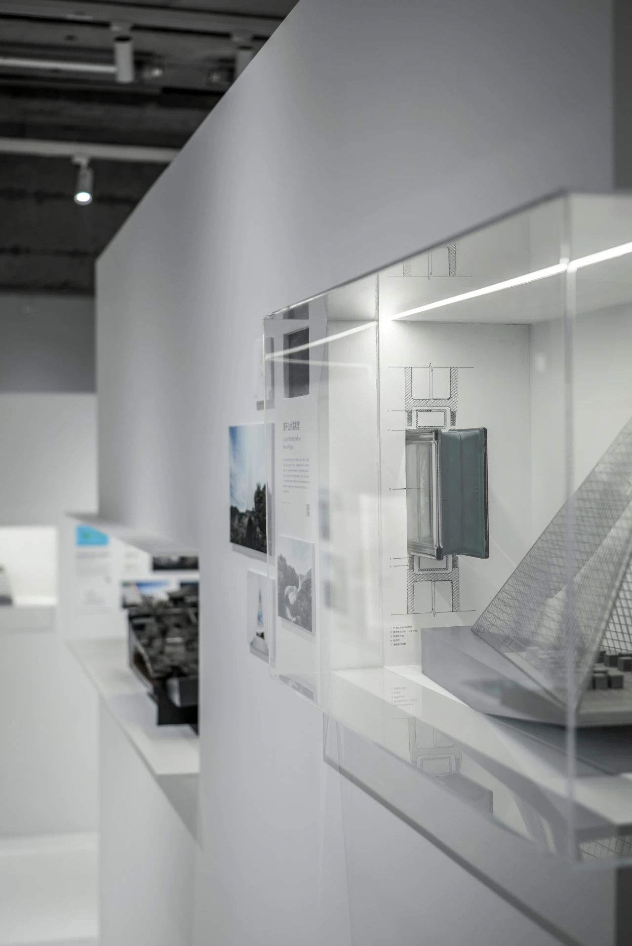

△Combination of real material and detail drawings
The model wall at the rear shows the project models at different stages through suspended white metal plates, which becomes the background of this exhibition and naturally shows the studio's project panorama.
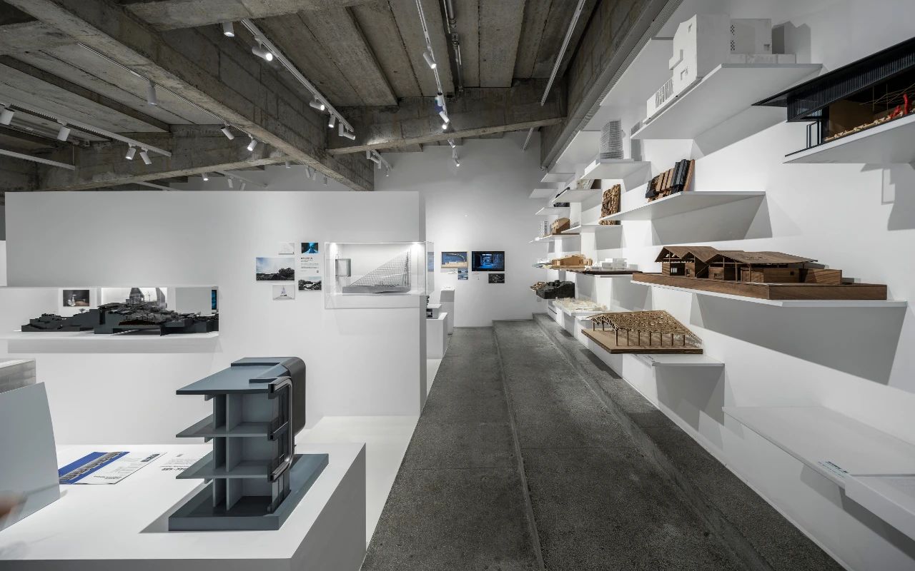

As a miniature of the real space, architectural models are presented by transparent cubes of different sizes, and such transparent boxes are scattered into pure white blocks, and finally wrapped by the years-old gray space. Entering the installation from the space and finally watching the building model is like opening layers of packages to get the final gift. These models, which represent the architectural practice of line + in different dimensions, will bring new surprises to the visitors with the development of the studio.
