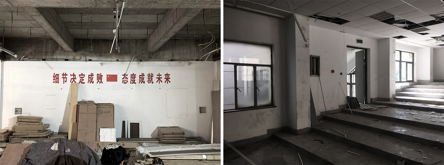
△ The ladder classrooms before renovation

△ Old drawings
Due to the expansion of the team, line+ urgently needs more free and spacious office space. When choosing the location of the studio, we immediately noticed this highly layered and non-standardized space, as well as the entire second-story space of the adjacent female dormitory building, which has become the beginning of infinite possibilities of line+.

The traditional office space is a single closed work "container". However, with the rapid development of information technology, the office space has gradually evolved into a "medium" for people's work and communication, which can accommodate various use scenarios such as exhibition, lecture, salon, entertainment, event space, etc., and encourage all kinds of formal and informal communication and sharing.


When there is an opportunity to design our own exclusive working space, our role is to switch between Party A and Party B, and we put forward a clear request to ourselves: on the basis of providing a comfortable office environment for 100 people, with a cool, approachable, circulating and open work space to accommodate the changing demands of the future. "line" is the boundary, and "+" aims to break through the boundaries, and the renovation design adheres to the core concept of the firm, breaking the boundaries of space and time, which also coincides with our own attitude towards contemporary new office spaces.

01 Break up the layout of architecture - A life on the other side
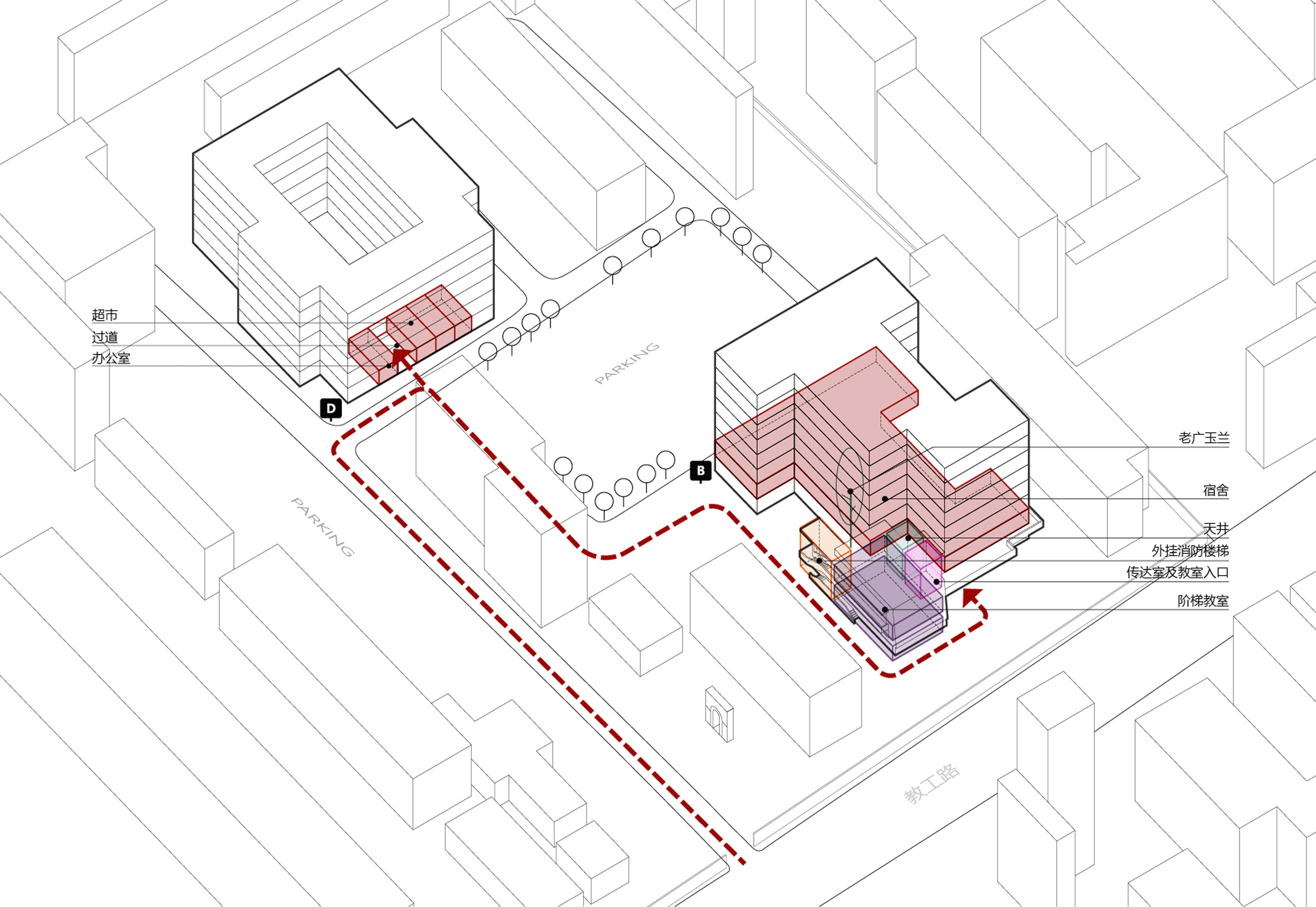
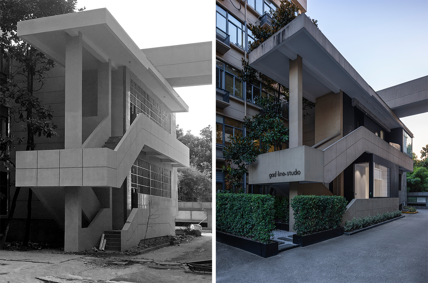
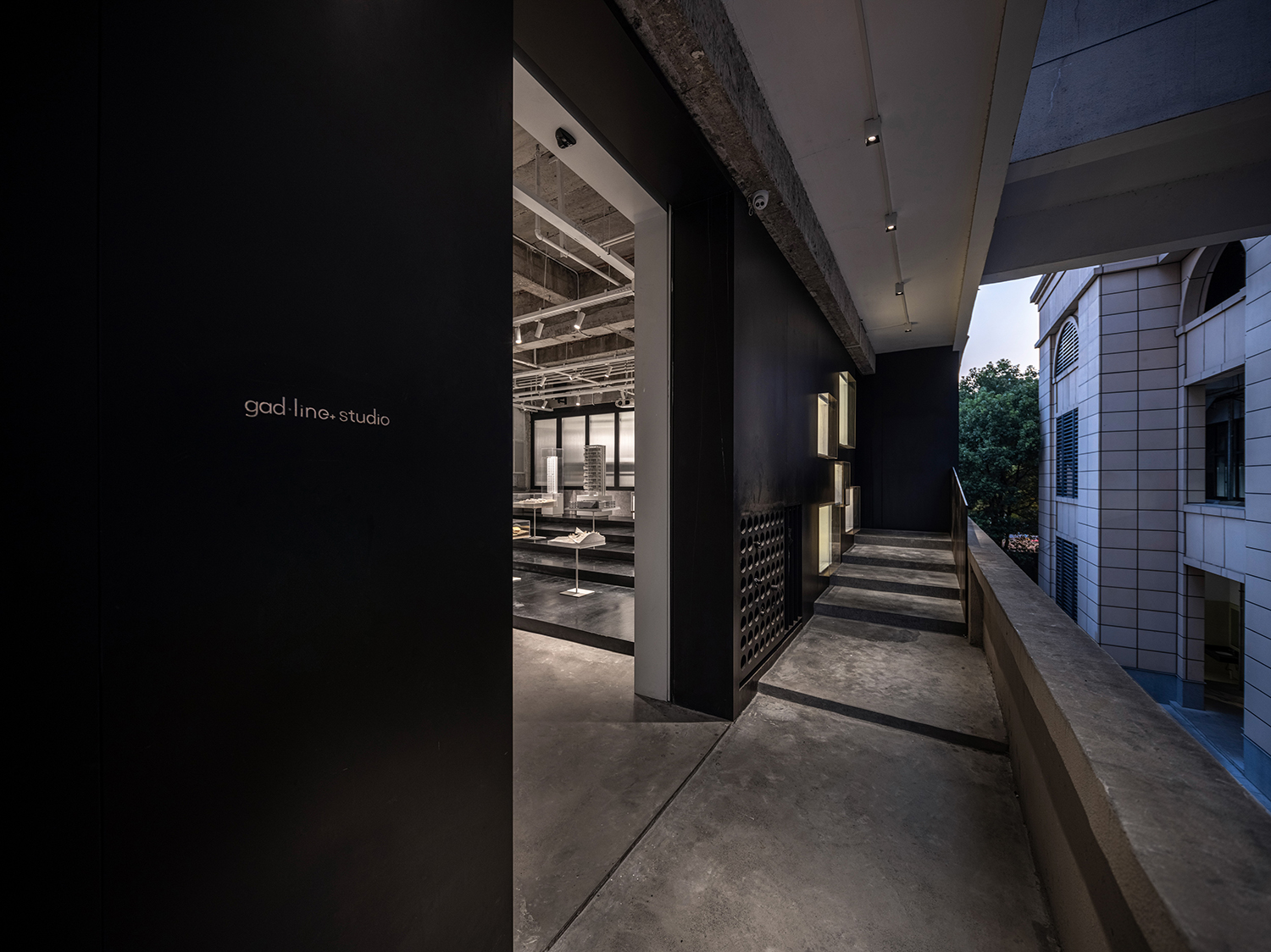
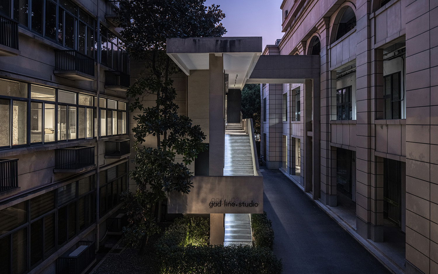
Rearranging the streamline is the first step in the design. The original Building B has a public entrance hall and a traffic system for the 8-storey office building. line+ hopes to enhance the independence and visual identity of the space by creating a courtyard as a new independent entrance by means of an external staircase connecting the two floors of ladder classrooms and the old trees on the side of the staircase, adding the sense of depth and interestingness to the space. At the same time, the entrance location of Area D is adjusted to establish the counterpoint relationship between the two office areas.

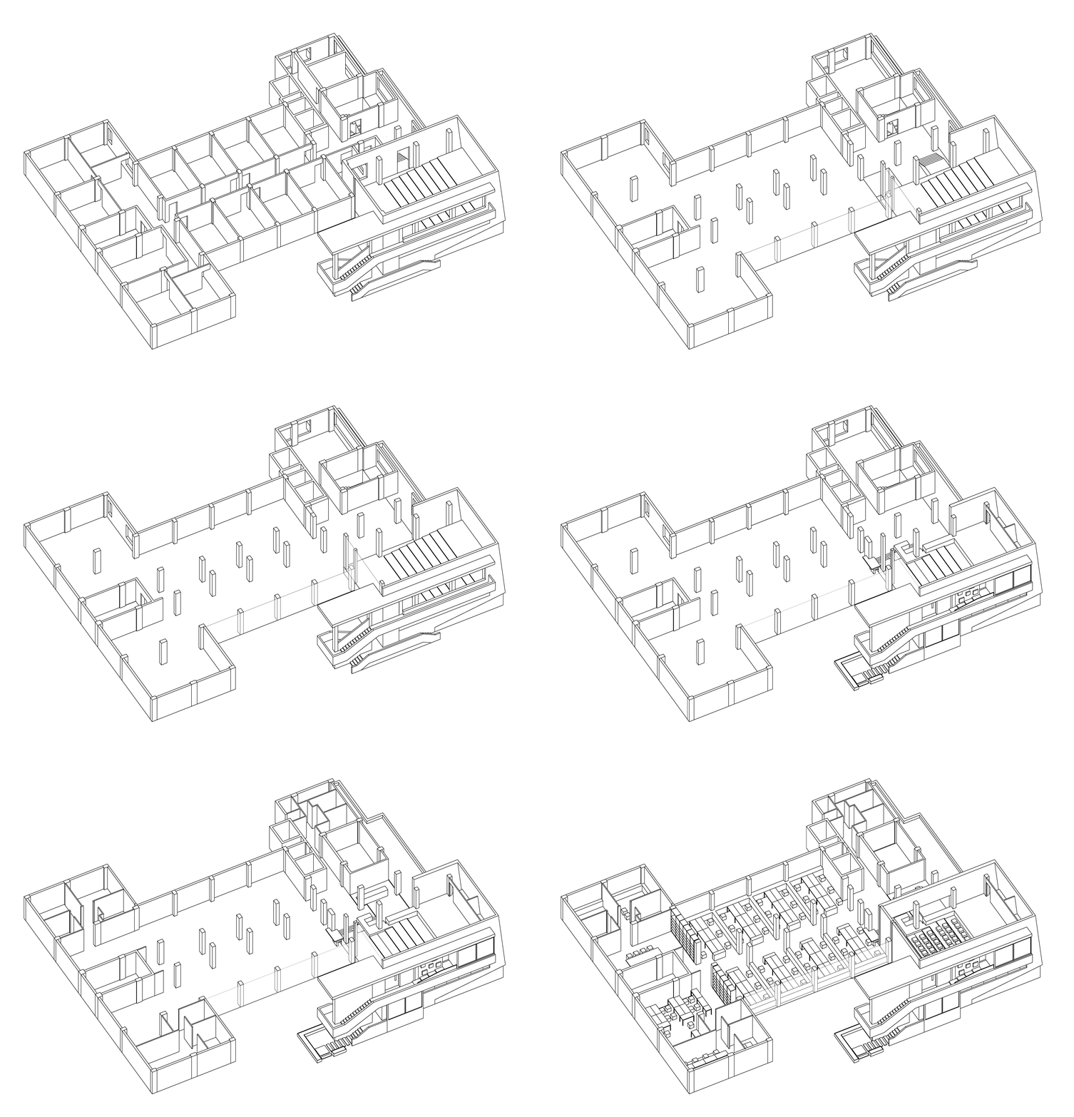
△ Analysis diagram

△ Before and after the renovation of the external staircase

△ Entrance courtyard space

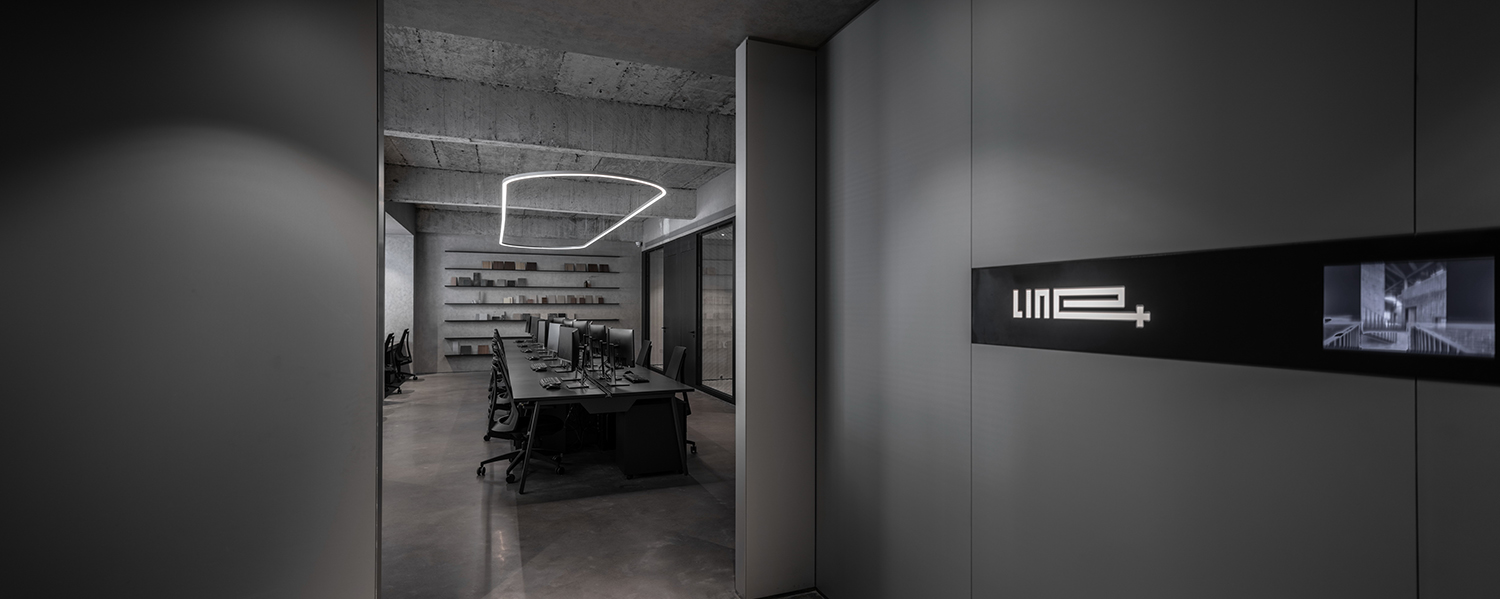
△ Entrance space on the second floor
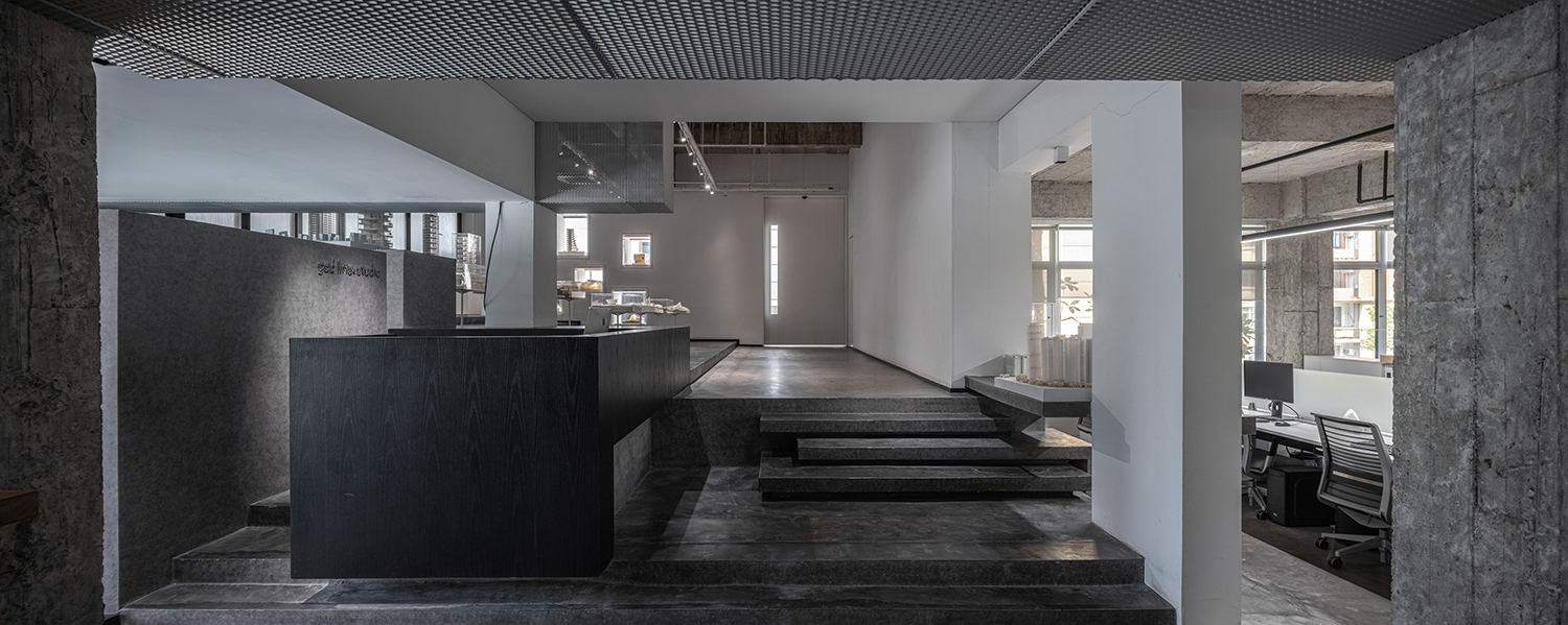
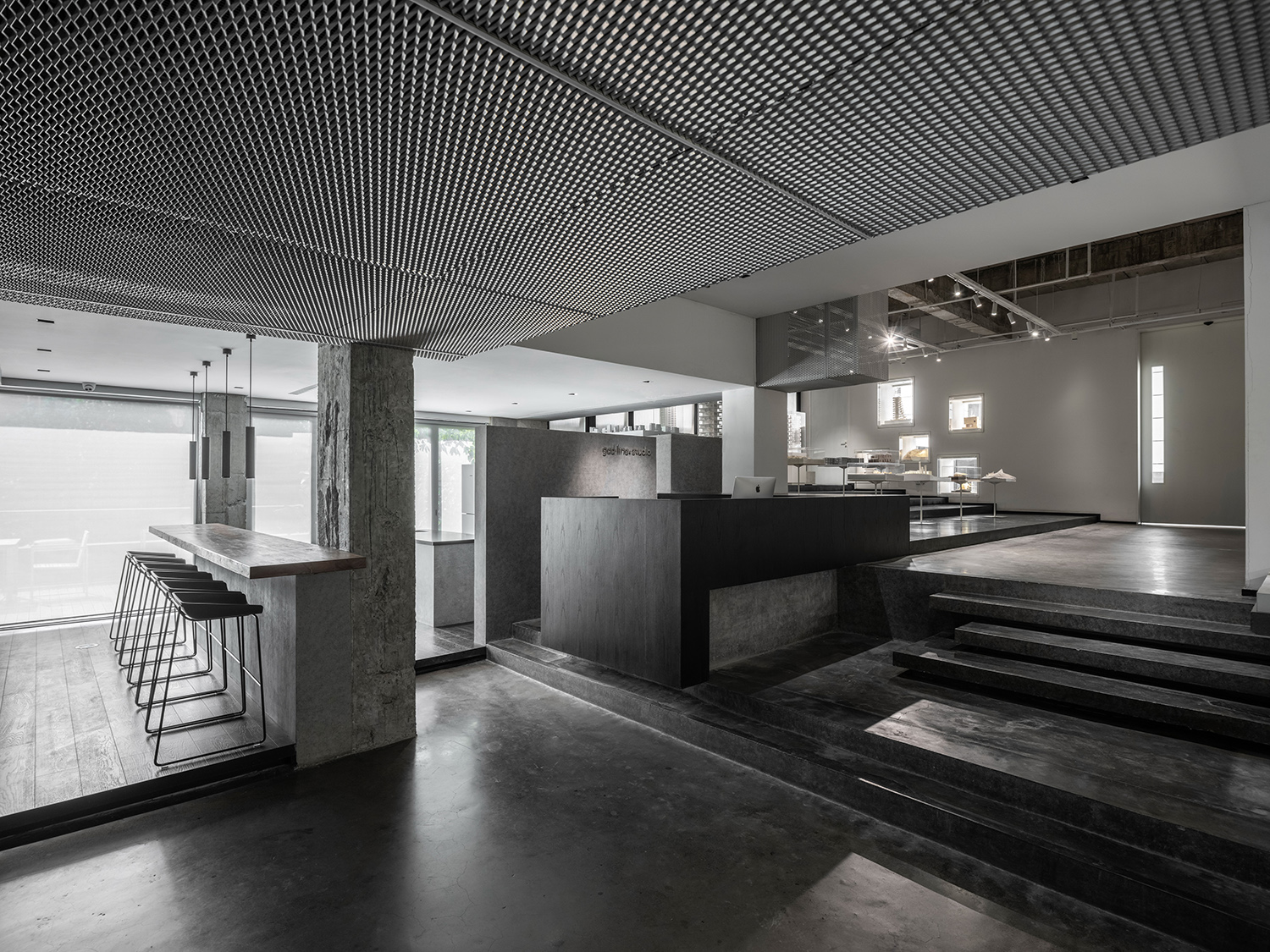
Reorganize the space and deepen the design. The original ladder classrooms and the dormitory area are separated by the patio and walls between them. line+ connects the two separated spaces by closing the patio, and breaks up the dormitory partition wall, implant the new steps to connect the exhibition hall, office space and break room, while completing the transformation of the height difference relationship and forming a complete and continuous office space system.

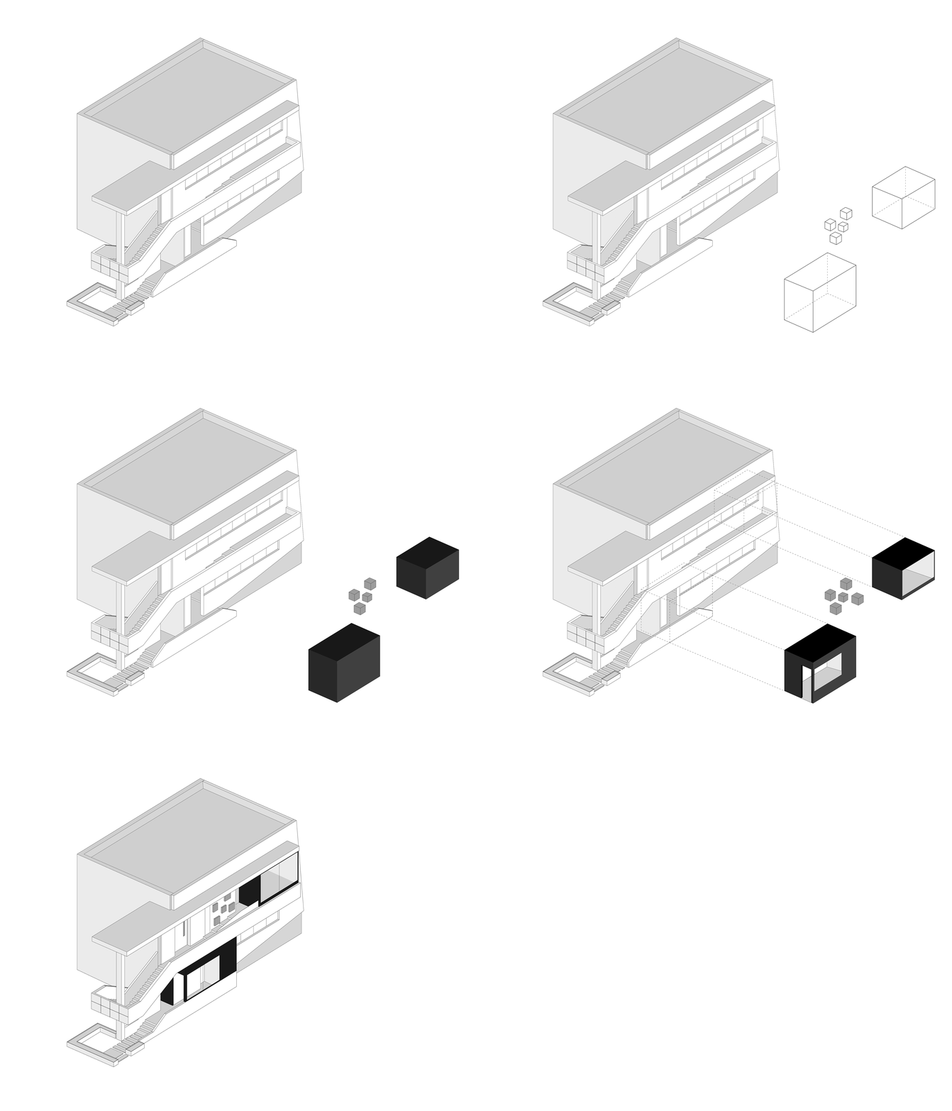
△ Generation diagram

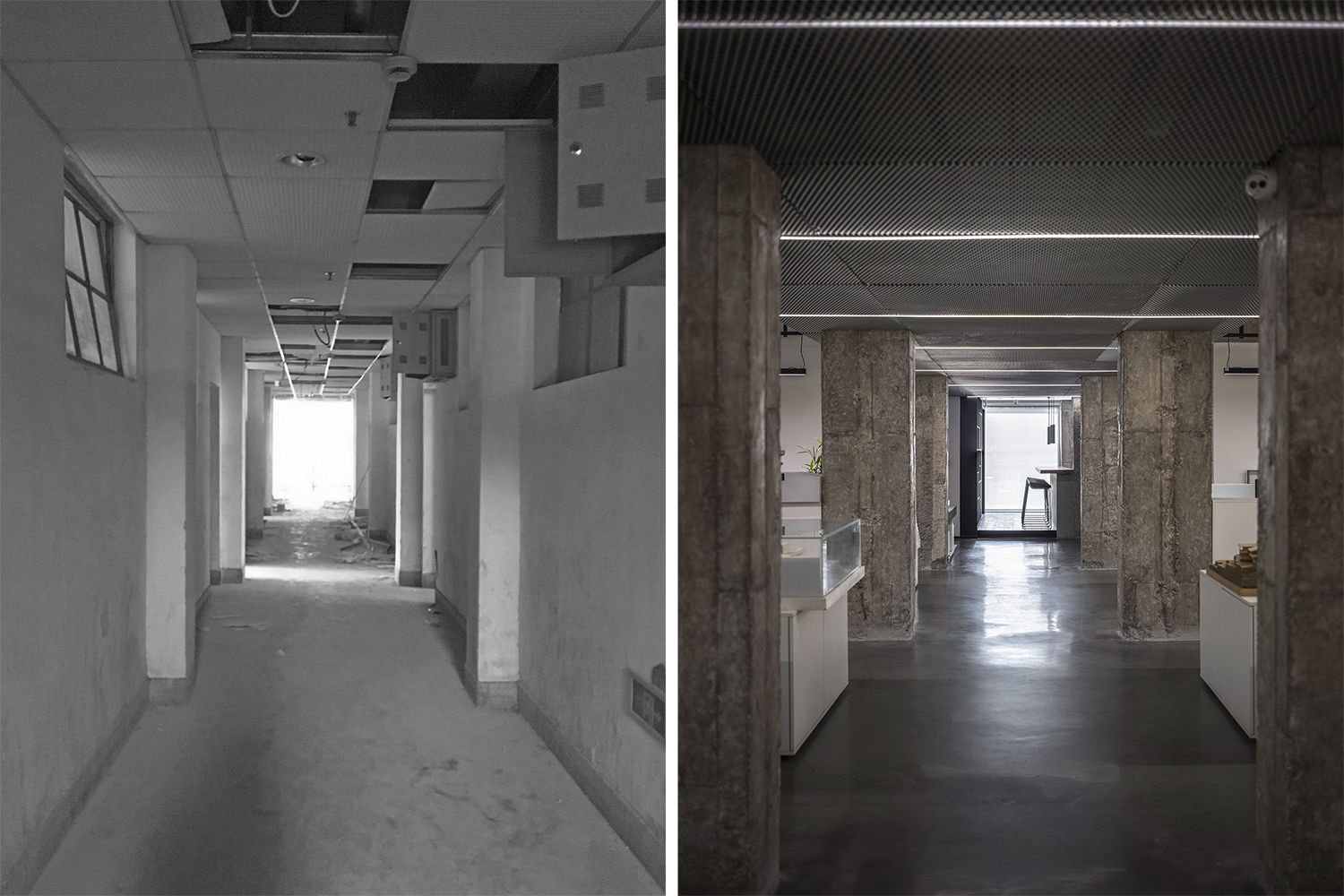
△ Before and after the renovation of the female dormitory

By changing the location of the public passageway, the two separated parts at the ground floor of Area D are combined into one, on the basis of which, the original small space is eliminated, and the internal partition wall is tore down to maximize the space potential.


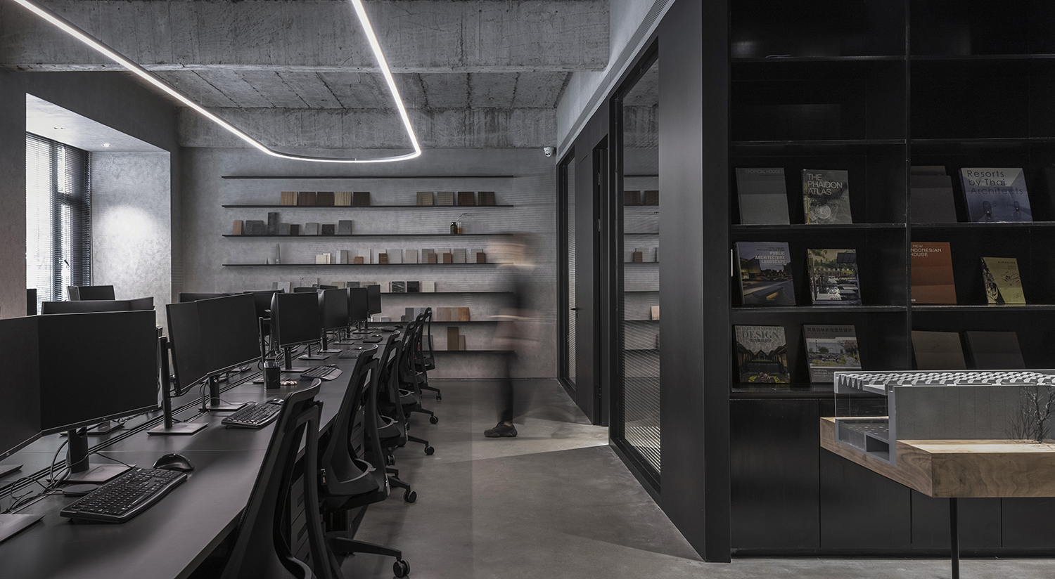
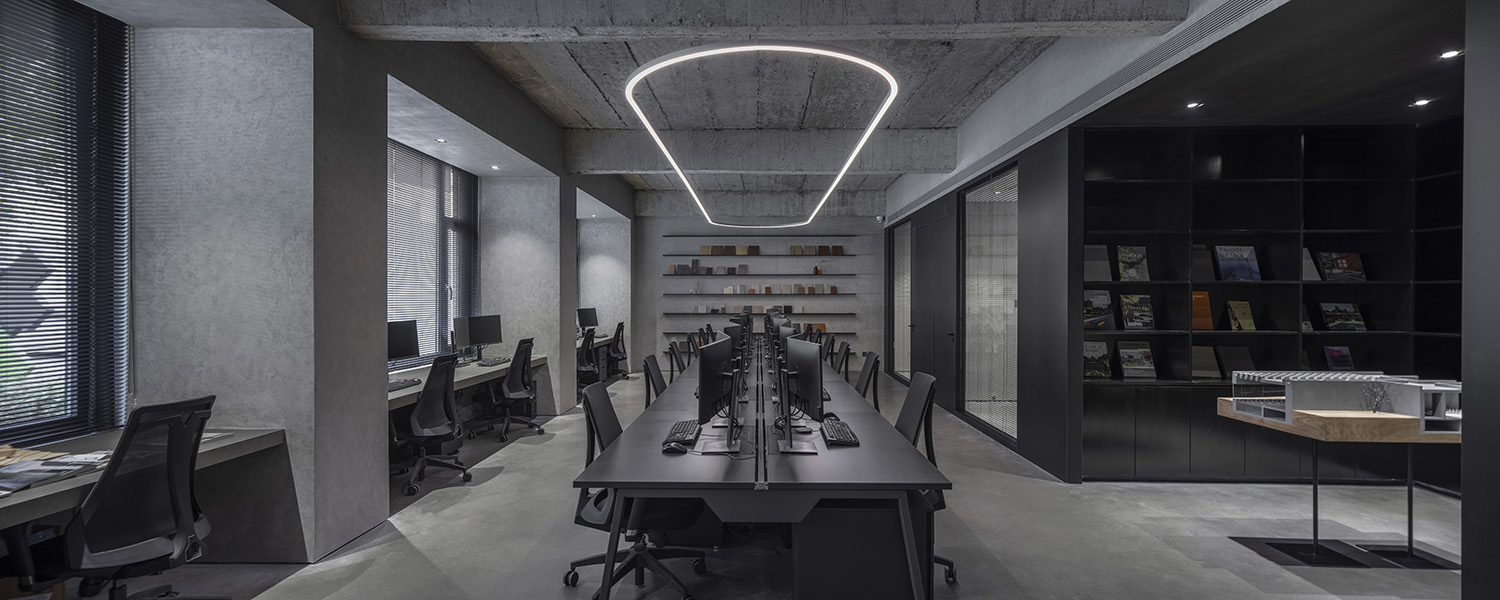
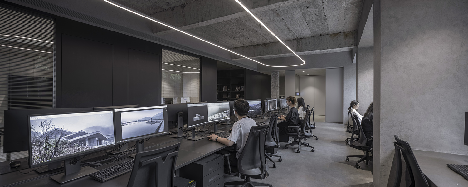
△Open office space
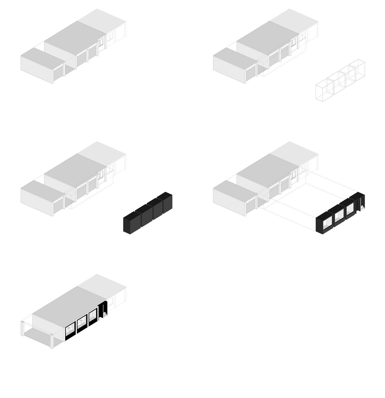
02 Break up the facade of the building – A growing Black Box
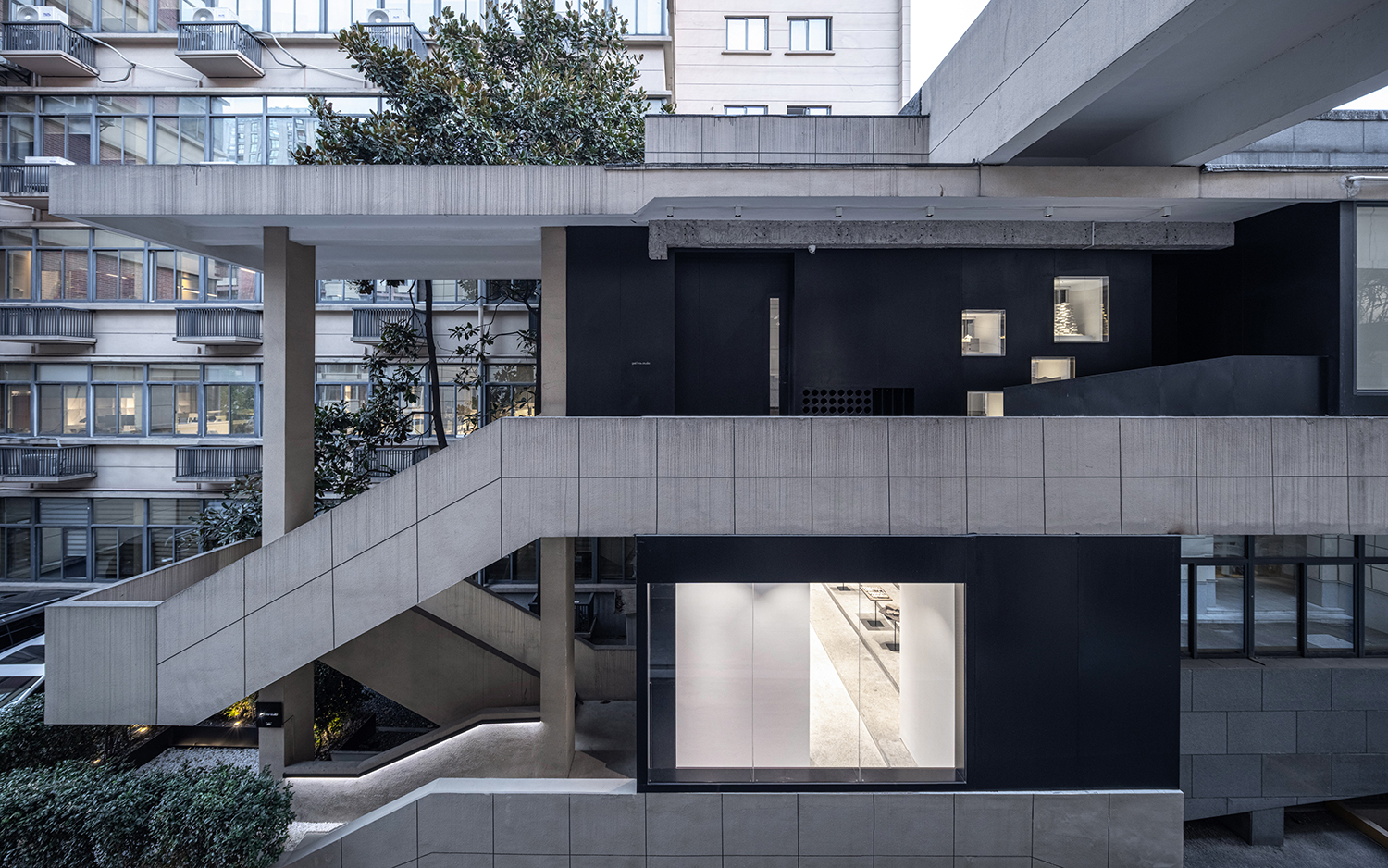
The space under the eaves attached to the original building facade is of extremely high plasticity. A black box made of ferrous metal and glass is introduced to replace the grey space under the eaves, widening the interior area while adding a sense of depth to the space. At the same time, the sense of field belonging to line+ is established. The continuous glass surface brings more sunlight into the room, creating a circulating relationship between the internal and external space. The transparent boxes that display the models are slotted into the ferrous metal façade, which becomes the display window of the firm.
△ Black box in B Area

△ Façade of B Area

△ Black box in D Area

△ Black box establishes the sense of field belonging to line+, as well as showing it outward
03 Break up the definition of space —— A “Talk & Link” diverse space
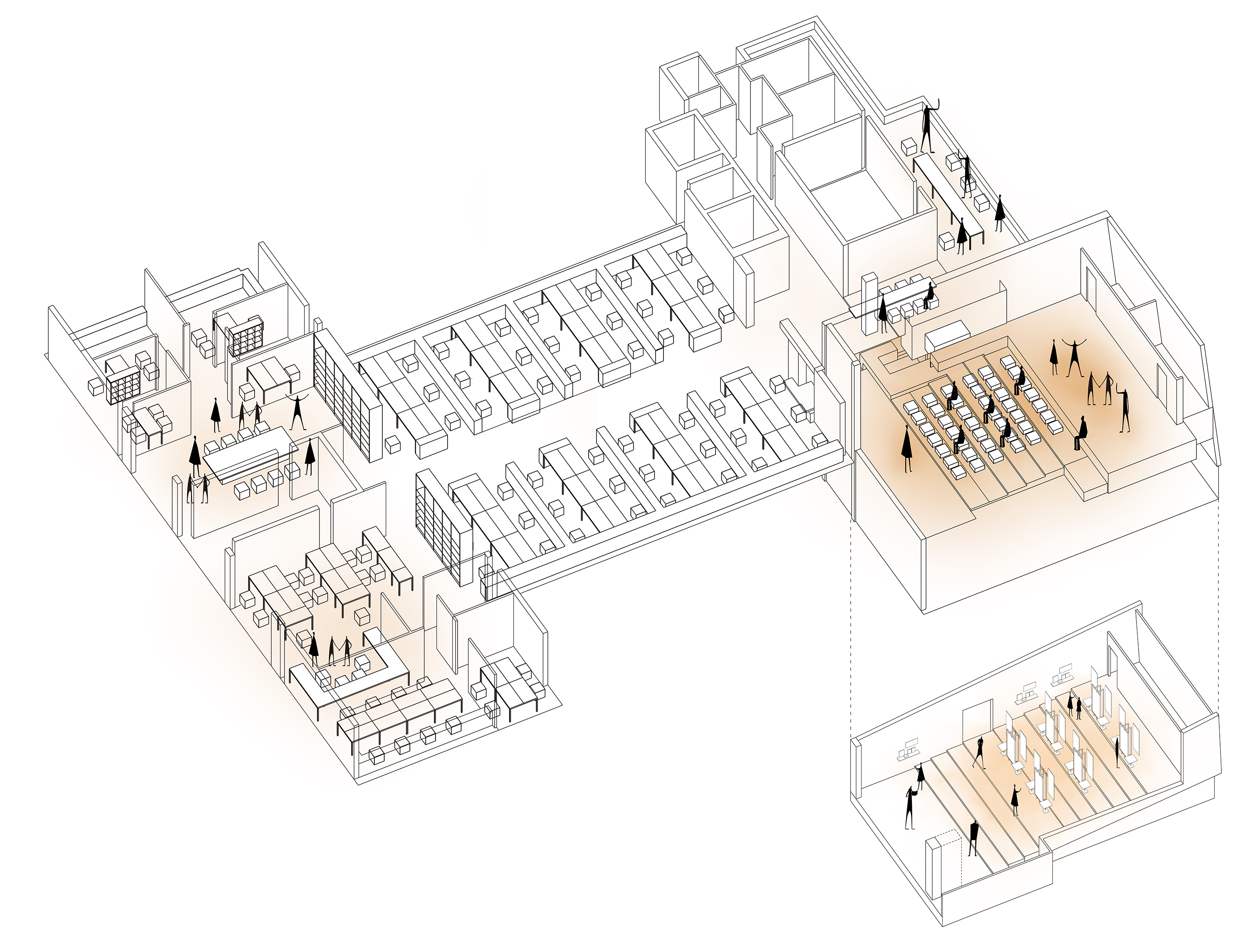
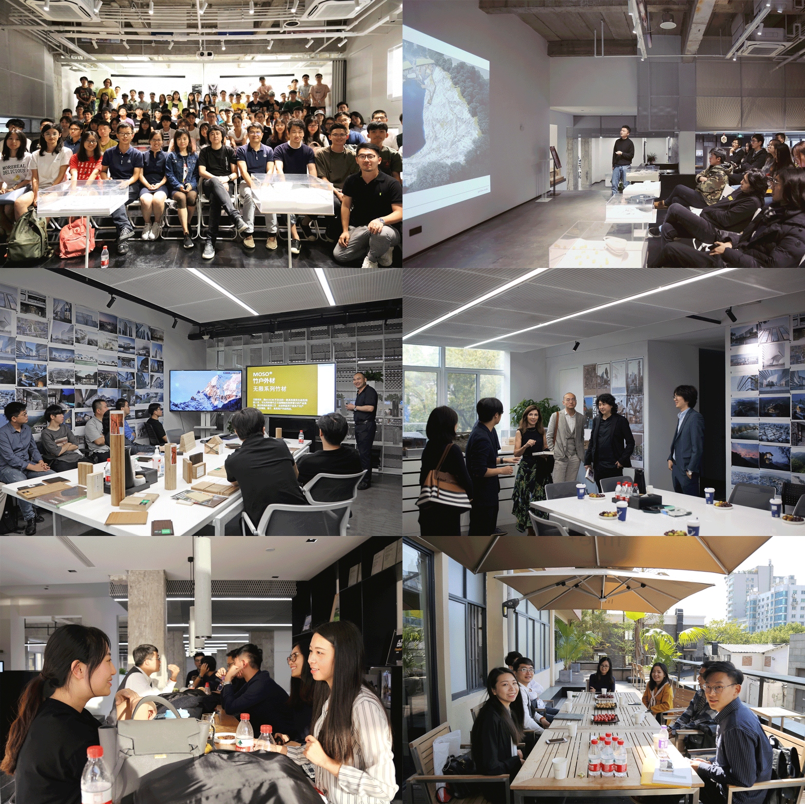
“Talk & Link” is a featured activity of line+ that engages in internal sharing and dialogue with industry experts. We inject this exchange gene into the ladder classrooms, the meeting room, the material room, the model room, the break area and the terrace. These hot spots are distributed in different locations of the open space, forming a multi-center radiation network to trigger more exchanges among designers, creators, clients and experts.

△ The concept of TALK & LINK

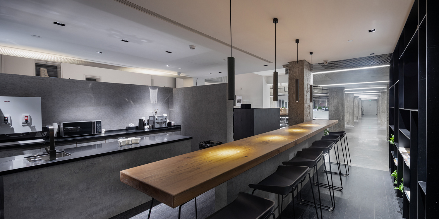
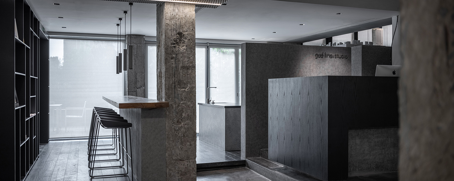
△ Break area

△ Large meeting room

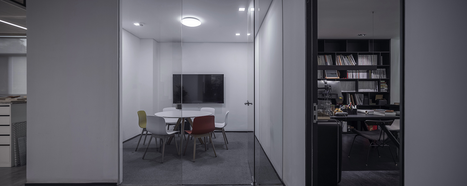
△ Small meeting room


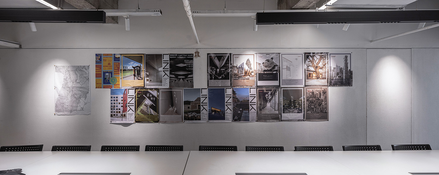
△ Materials and open discussion area
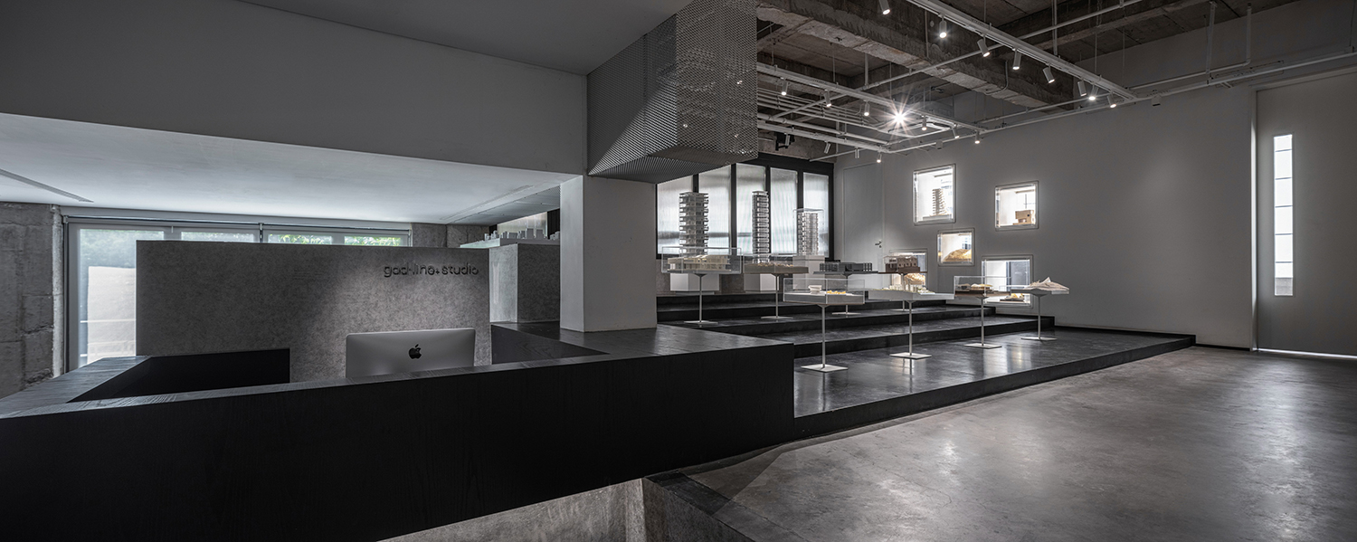
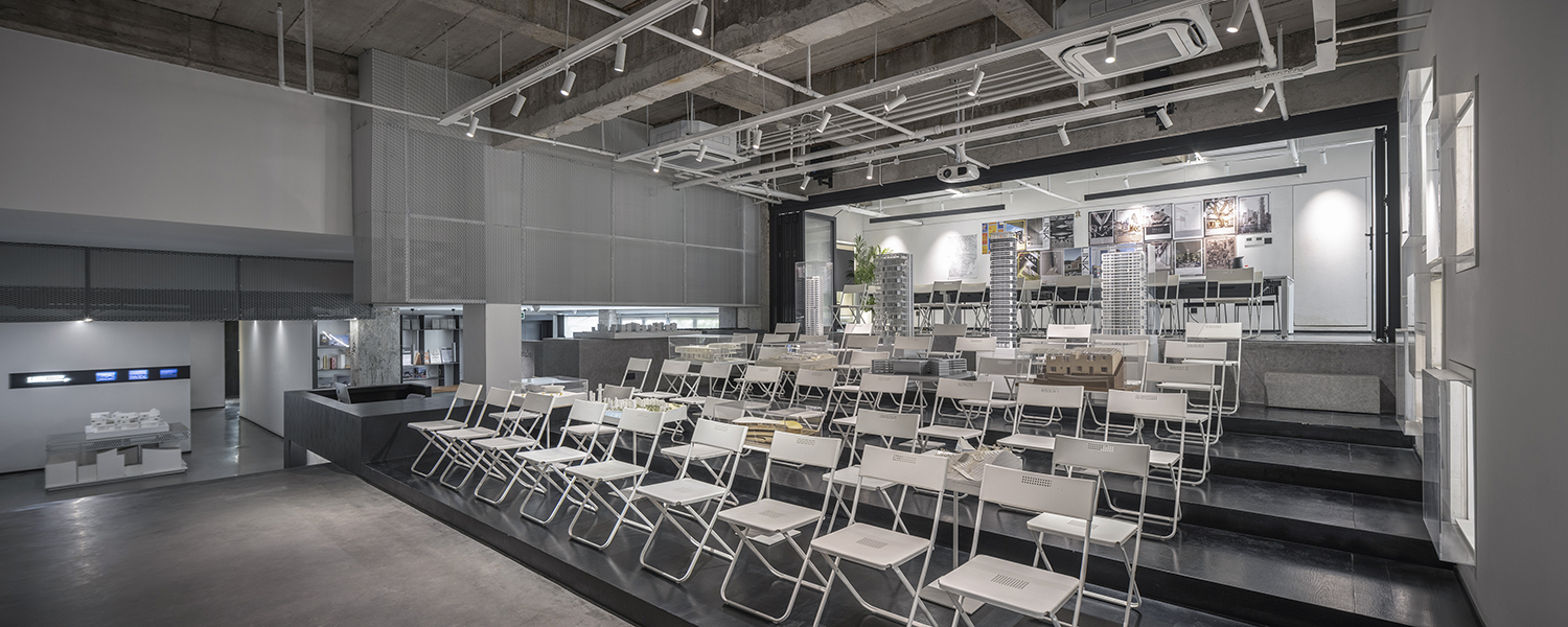
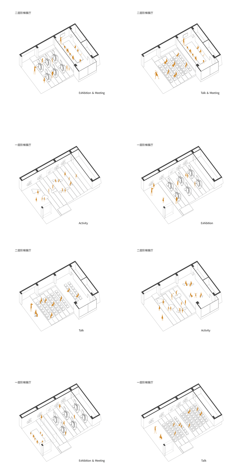
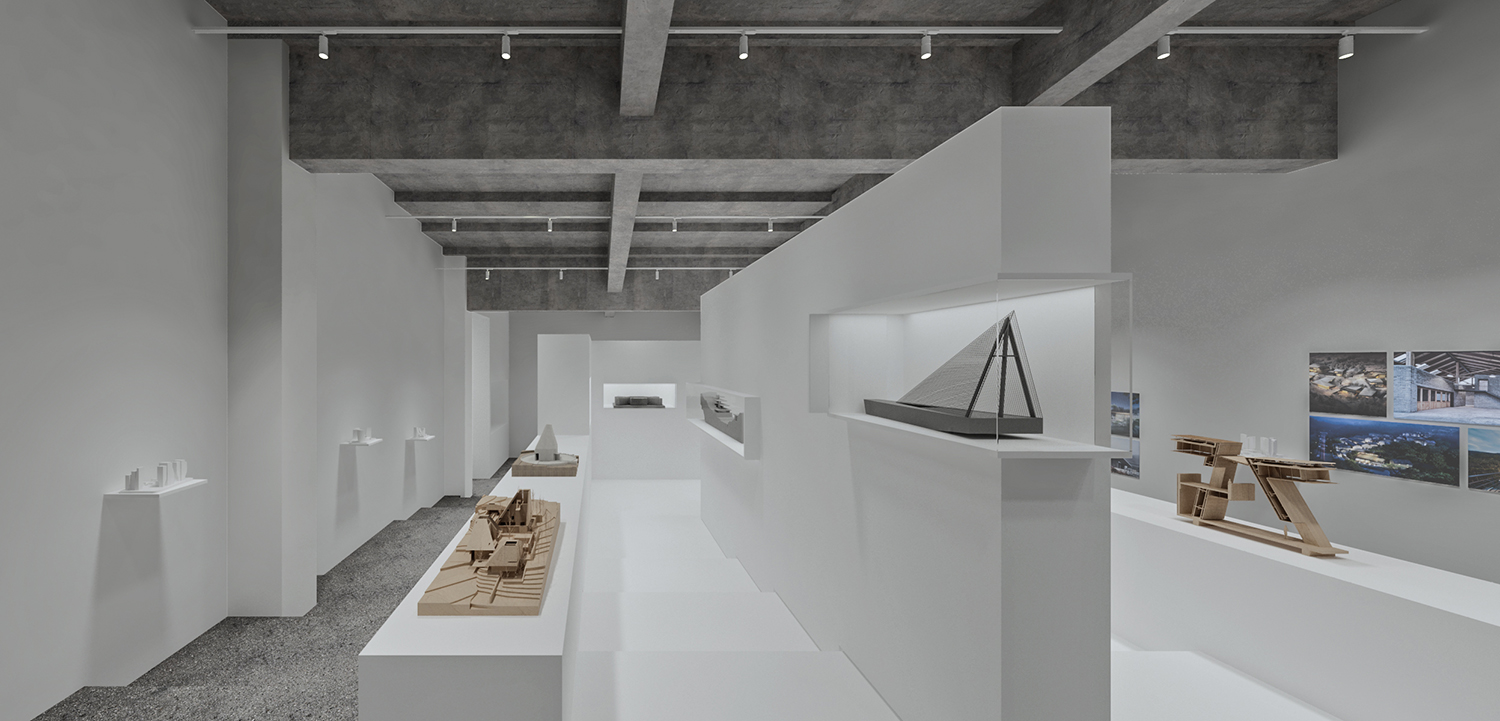
The ladder classrooms on the ground and second floors are the symbolic space of “TALK & LINK”. The two form a whole vertically, together with the outdoor staircase, serving as a prelude and window to line+ studio. The linkage of the two exhibition halls can meet the needs of holding large-scale events such as exhibitions, lectures, salons and conferences at the same time.


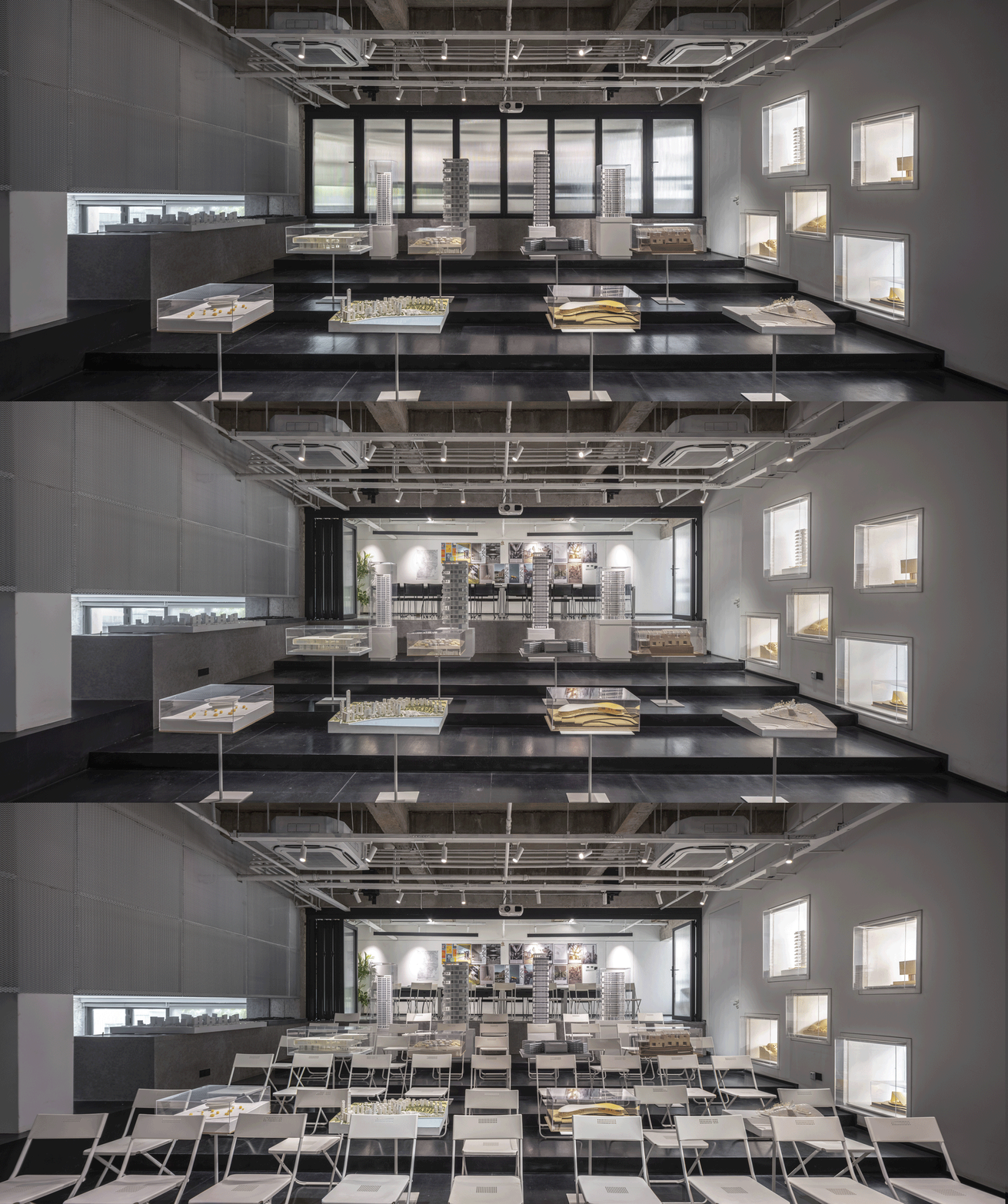
△ Different usage status of 1F & 2F staircase exhibition hall
In the design of the interior space, the ground-floor ladder classroom eliminates the interference of equipment pipelines and auxiliary rooms by means of hidden design to ensure the purity of the space.


△ 1F ladder exhibition hall
The second-floor ladder classroom has a deep depth, therefore, the steps at the back of the classrooms are raised to create a flat meeting area, and a movable partition is placed between the multifunctional area and the meeting space on the second floor, allowing the space to switch freely between large events and formal meetings, enhancing space utilization and flexibility through integration.

△Before and after the renovation of the ladder classroom

△ Different usage status of 2F ladder exhibition hall
04 Break up the boundaries of time - The new and old of materials
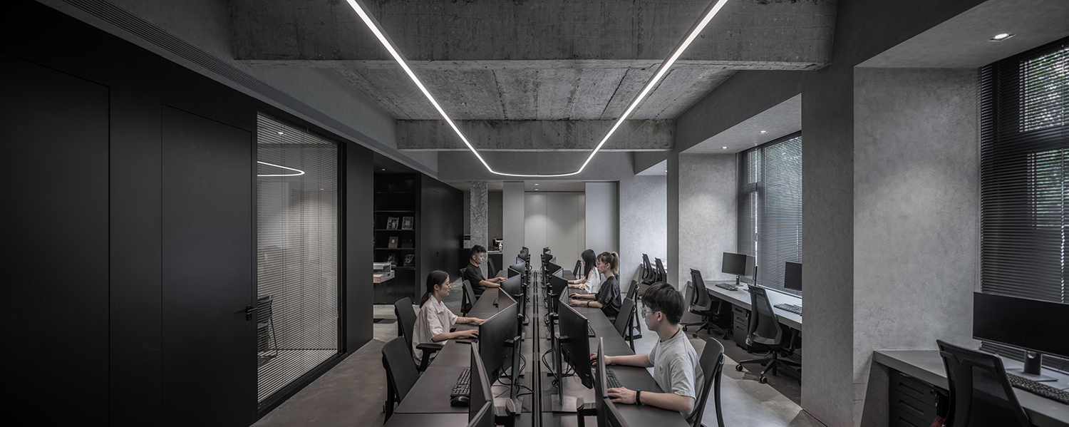
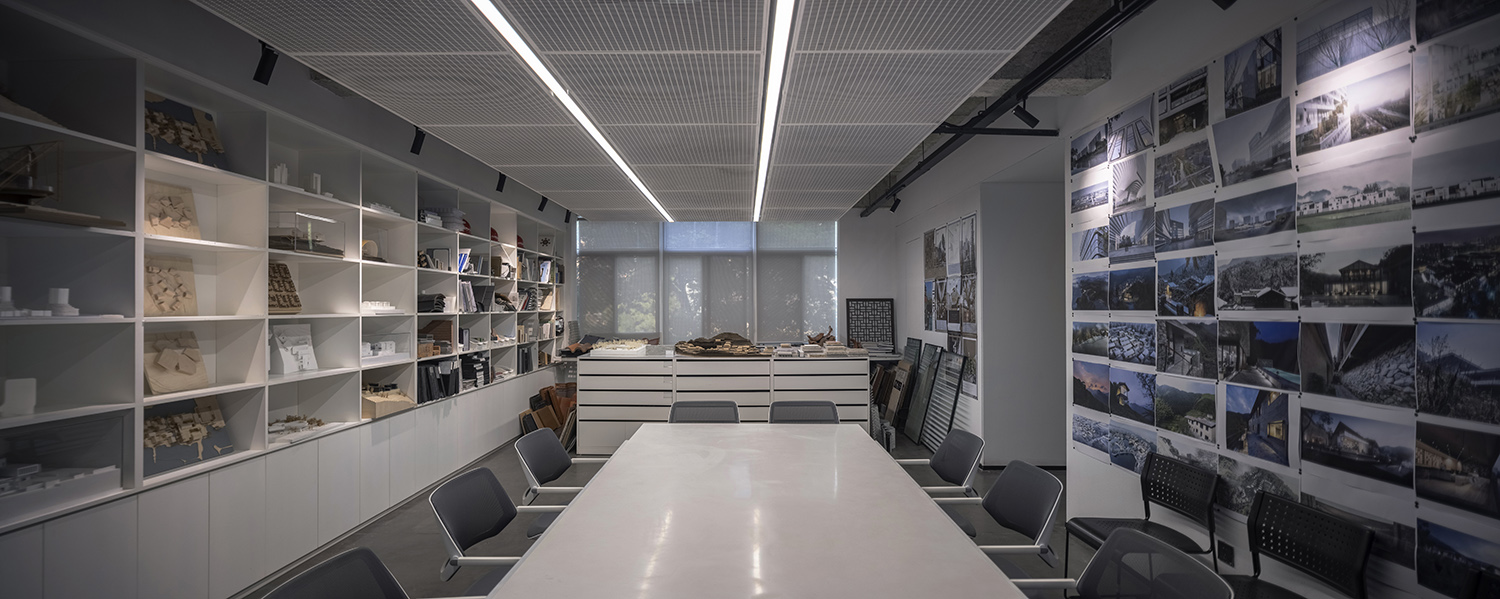
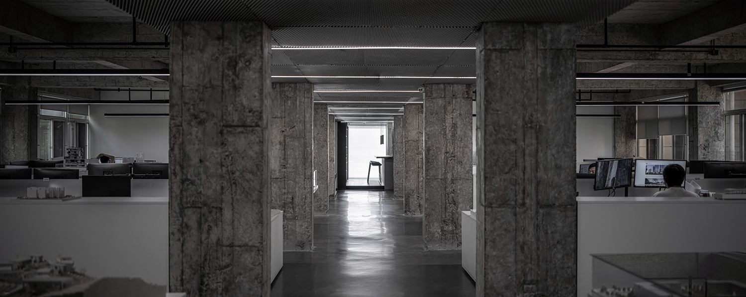
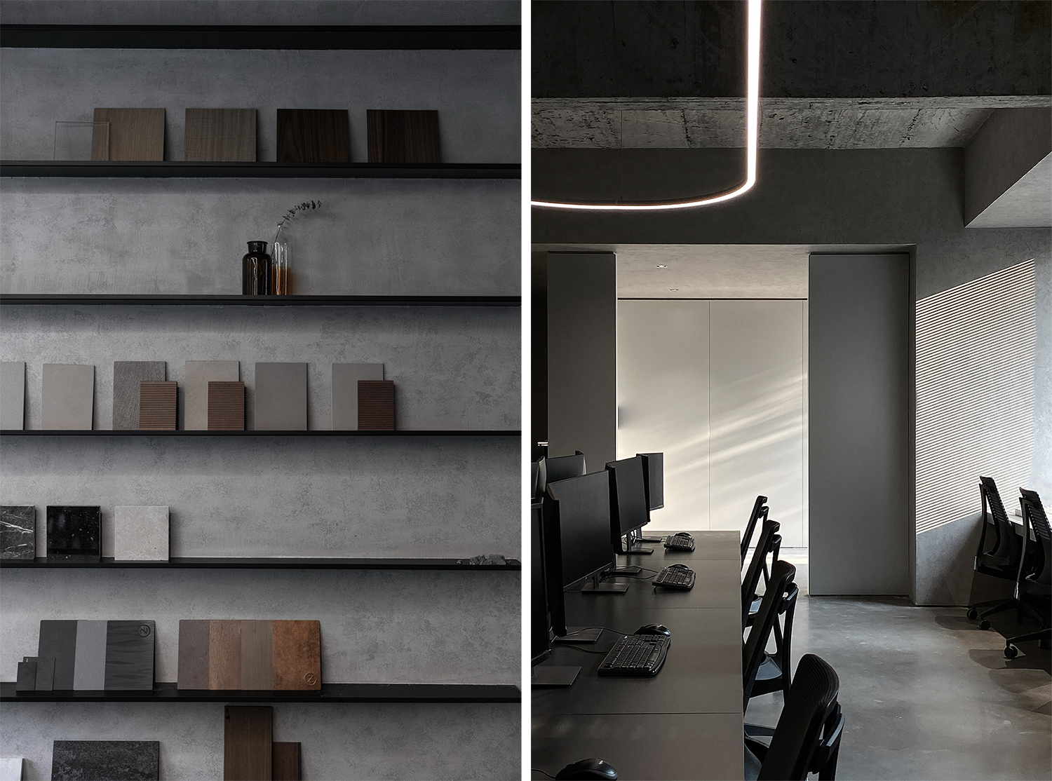
Through the control of materials, colors are reduced and the plain color space of black, white and gray is formed. We remove the original suspended ceiling and the cladding of the beams, columns and ceiling, leaving the rough concrete texture exposed. Plain polished concrete is used on the ground to form a system with the concrete structure and roof. On metope strategy, Area B chooses metope whitewash to form a contrast between white and gray, delicate and bold; Area D uses concrete paint metope to emphasize the integrity of the space.


△ Comparison of rough concrete and white painted walls in Area B

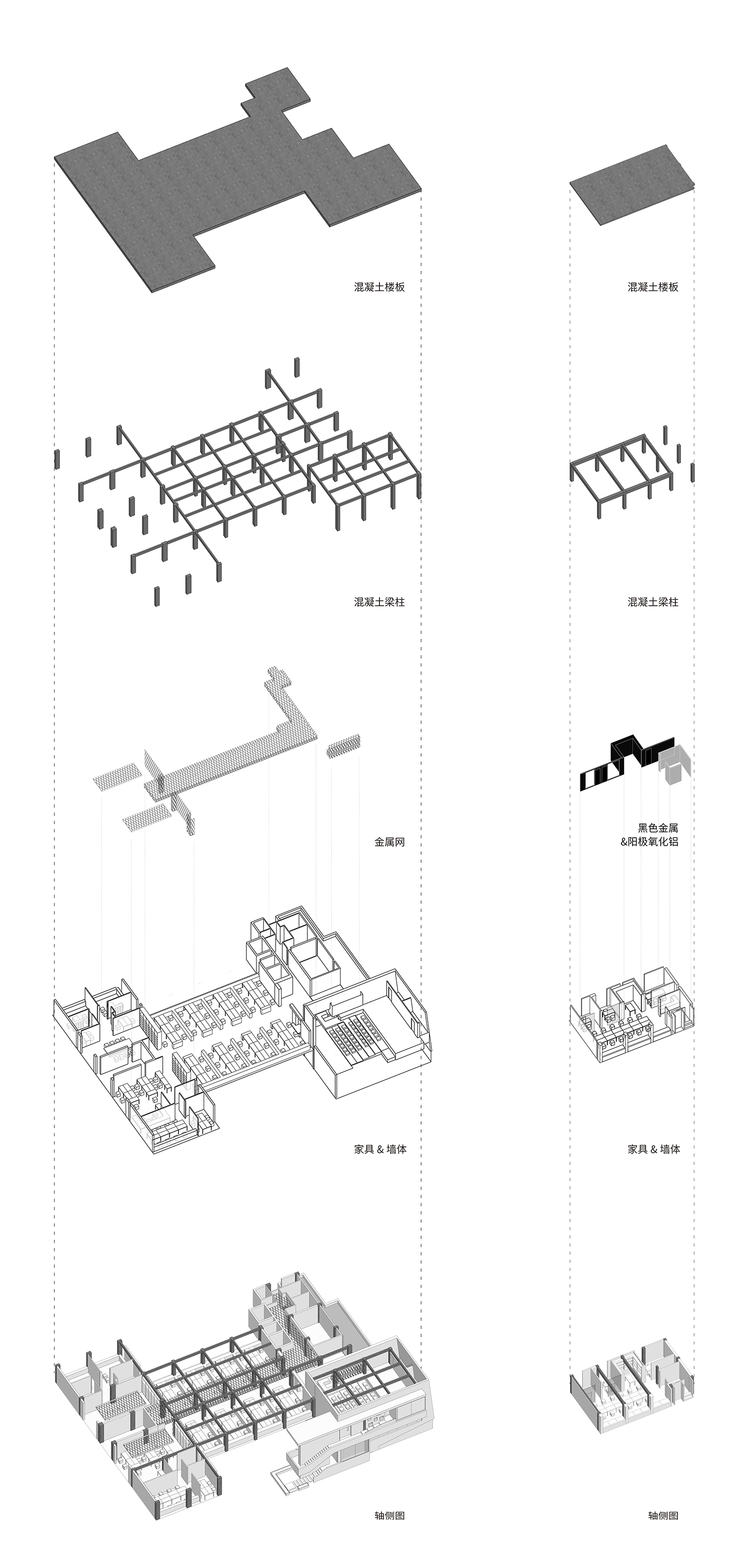
△ Design strategy explosion diagram


△ Concrete painted walls in Area D emphasize spatial integrity
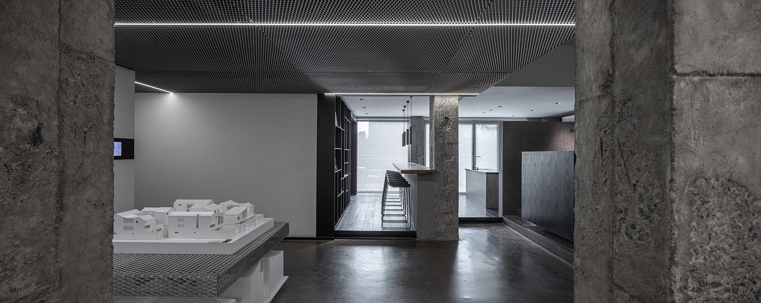
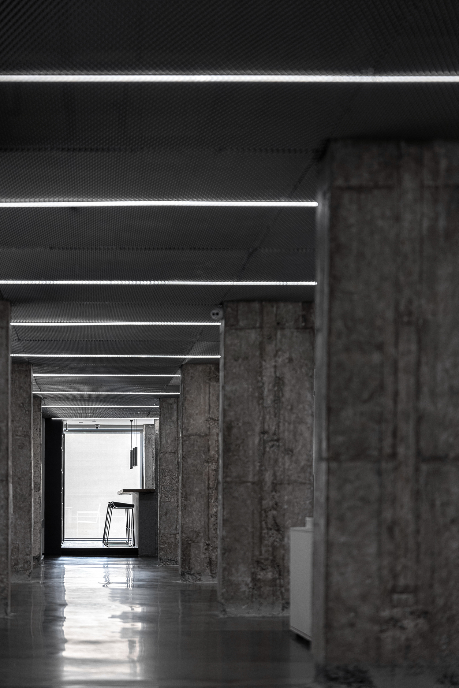
The intervention of metal, as a modern material, brings into the system of plain color a modern sense of refinement. The metal stretching meshes of Area B extends from the partition wall of the ladder classroom to the top of the office area, and erects on the display shelf at the end of the office space, creating a multi-layered space between transparent and untransparent spaces. Light strips are embedded in the u-shaped buckle between the top stretching meshes, forming a sense of sequence in depth.

△ The light strip is embedded in the top metal stretched net, forming a sense of sequence in depth
Area D extends the ferrous metal of the building’s façade to the interior, creating a new interior façade. At the same time, silver-gray anodized aluminum is used to enclose a lobby, highlighting the sense of future science and technology.


△ Black steel plate and anodized aluminum in Area D
The entire renovation design adopts subtraction to separate space and present the structural prototypes, and includes materials into the gray system with restraint. This closed campus, which has been idle due to changes in social functions, has become a shared and open hybrid space adapted to the time, which is brought about by the space design. At the same time, we also take this opportunity to explore new models for future office space development for enterprises with the purpose of innovation. The resulting contrast between the old and the new creates the most lasting visual tension, where the infinite possibilities of line+ in the past, the present and the future will unfold.


△ Our usage status in the space
△ Ground floor plan in Area B
△ Second floor plan in Area B
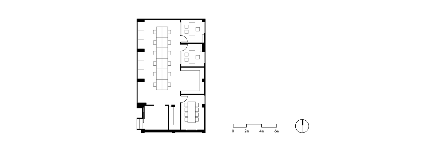
△ Ground floor plan in Area D


